How to make effective slope charts in Power BI

Slope charts are an effective way to show change for a single or multiple metrics. It shows increase/decrease as well as magnitude.

Time to Implement

Difficulty

Usefulness
Use-Cases:

PERIOD GROWTH:
A slope chart is an easy way to visualize a metric like year-over-year or month-over-month, for example to look at sales across between two years.
Worth noting that this chart can be very fun to explore for users. If formatted well, it shows extremely clearly whether a selection has improved or not. Looking by customer, for example, can be an interesting exercise to explore the data.

COMPARING CATEGORIES:
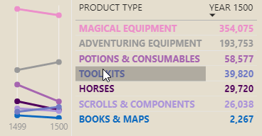
The advantage of a slope is that you can show both the relative and absolute change across a dimension. This adds value to category comparisons because users can not only visually identify large relative changes, but focus on the larger absolute differences. Having multiple lines - one for each category - gives the user a lot of information expressed concisely in a single visual.

ADDITION TO KPI CARDS:
KPI cards are good for showing the numbers and calling out the result, but not visualizing the relative impact. In a KPI card, a -70% gap will look the same as a -1% gap. In a slope, however, this is far more pronounced. Thus, putting a slope chart adjacent to a KPI card can really bring up the value of the 3-second overview.

When to not use it:
IF THERE ARE TOO MANY CATEGORIES:
Power BI doesn’t yet have a way in default visuals to conditionally colour both lines and markers. One use-case of the slope chart is to have many categories and highlight the top / bottom performers using colour or interactions. In Power BI, this is not possible without custom visuals, since each category is coloured manually.
WHEN VISUALIZING METRICS THAT HAVE BINARY TARGETS:
If you are visualizing a metric and the evolution or change is not important, then a slope chart is not relevant. I.e. if you are looking at an operational report for service desk, the # critical incidents is such a metric. Here, a user typically wants to just see if there are critical incidents or not, and if so, what the details are. However, if the user wanted to evaluate the change in critical incident resolution time this month vs. last month, this is a good use-case for a slope chart.
How to do it - Ingredients:
DATA STORAGE MODE:
IMPORT
COMPOSITE
DIRECT QUERY
METHOD:
VISUAL MACGUYVERING
ELIGIBLE WITH:
LINE CHART
AREA CHART
COMBO CHART

How to do it - The Recipe:
Step 1: Make a line chart and add the metric you want to visualize. Make the chart a small size, like 100px x 150px. Under the visualization format pane, in the ‘General’ tab, disable ‘Responsive’.


Step 2: Do some basic formatting, like colouring the line, turning on markers, and setting the stroke width and line style.
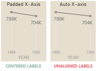
Step 3: Set the start of the Y-axis to 0. Turn off the Y-axis. If you can, change the X-axis from ‘Categorical’ to ‘Continuous’, so that you can turn on the X-axis grid.
The Y-axis we can turn off because the focus of the chart is the slope, not the absolute numbers. If the metric is not clear, we can leave on the Y-axis title, else we should turn that off, too, to improve the information:ink ratio. Because we are turning off the Y-axis, we need to ensure our chart is not misrepresenting the data. If we use the default Y-axis (auto), the slope will always appear more pronounced than in reality. We want to ensure the angle of the line reflects the actual change. To do that, we set the lower bound of the Y-axis to 0.
The reason why we add an X-axis grid is so that the user has a ‘track’ which shows them the upper bound of the Y-axis while it is gone. If we do not have this, then they do not know where the top of the chart could be. Similar to setting the lower bound of the Y-axis to 0, this is done to ensure our chart is interpretable and honestly presenting the data.

Step 3: If you will only have a single line, turn on and format data labels.
When comparing years, it is best to use a continuous axis This way, you can set the bounds of the x-axis to better align the data labels in the center of the X-axis grid. I.e. for 2019 and 2020 you can set the minimum to 2018.8 and the maximum to 2020.2, thus providing horizontal padding around the visual.
Step 4: If you are comparing categories with multiple slope lines, add the category to ‘Legend’ and select the colours.
If you are going to use a slope chart this way, it is best to limit the categories to ~2-6. More than that will clutter the view too much and make it difficult to interpret without interactions. Furthermore, you have to make sure that it is easy for users to identify each category visually. There are a number of ways you can do this. One way is to have a table labelling the values adjacent to the slope chart, with the labels conditionally coloured to match the slope lines.