

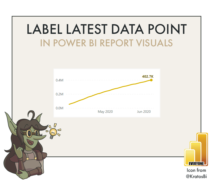
How to label the latest data point in a Power BI line or area chart

LABEL / FORMAT A CHOSEN DATA POINT
…to single it out for more efficient data display.

A simple trick that can make all the difference in an effective time series visual. Note that this also works in other visuals like bar charts, area charts, etc., and not just with labels but also all formatting.

Time to Implement

Difficulty

Usefulness
Use-Cases:

MTD / QTD / YTD VIEWS:
In these views, the advantage of having a line is to be able to see the trend and acceleration vs. a target. However, it’s always important to know where we are at now. This is the latest data point, and if it’s labelled, it’s more efficient for users to see.

MORE ELEGANT VISUALS:
Having a label on every single data point can be clunky, as the extra ink doesn’t always bring extra value. This way, you can have a clear label for a specific point on the X-axis without cluttering the view with other markers.

DATA STORYTELLING:
You can use this method to call out specific points-of-interest in your data narrative. For example, you can point to outliers where sales were exceptionally high or low, or points where a specific event happened.
When to not use it:
REDUNDANT CALLOUTS, I.E. SPARKLINE VIEWS:
Sparklines are a chart type that have a row-like layout for multiple KPIs or categories. Here, the added value of the sparkline is to show the trend. The latest data point is already called out left of the sparkline in a separate card. In general, being concise with your visuals means reducing redundancy in the information shown. If the latest data point is already clear in other nearby visuals, it doesn’t necessarily bring added value to have it in the line chart, too.
LINE CHARTS WITH CATEGORIES / MANY MEASURES
This method involves creating a second measure for every primary measure to label each non-adjacent data point. Depending on what you are trying to do, this can quickly result in many measures existing in the same visual. This makes a default legend ineffective or confusing for users, as well as the default tooltips. Furthermore, it is not possible to do if you are already splitting your line chart by a dimension, instead of showing 1+ measures in the same view.
How to do it - Ingredients:
DATA STORAGE MODE:
IMPORT
COMPOSITE
DIRECT QUERY
METHOD:
DAX
VISUAL MACGUYVERING
ELIGIBLE WITH:
LINE CHART
AREA CHART
COMBO CHART
(CREATIVELY - REQUIRES ANOTHER POST TO EXPLAIN…) STACKED BAR CHART
How to do it - The Recipe:
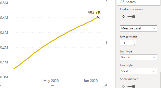
Step 1: In your existing line chart, check whether your visual is eligible to have another measure placed in the ‘values’ Portion of the report
Click on your visual and check whether you have any fields in the ‘Legend’ portion of the ‘Fields’ pane. In the below image with the yellow line, this chart type is eligible for this approach, as there is nothing under ‘Legend’ and a space beneath the measure in ‘Values’. This indicates that we can add another measure. If you like, you can also confirm it by adding one, yourself.

In the below rainbow road, however, the field ‘Wk #’ is dropped in the ‘Legend’ field, and the space is no longer visible under our single measure. This line chart is not eligible for this approach.

Step 2: Create a new measure that filters the original (already in the line chart) to only show the latest date (or X-axis field). If the X-axis is categorical and not sorted alphanumerically, you can also explicitly state this using column filtering.
There are multiple ways to do this. For example, if you are reporting a MTD measure, you could use a conditional statement to hide the original measure unless it’s showing the latest date in the fact table.
IF (
MAX ( 'DIM_Date'[Date] ) < CALCULATE ( MAX ( 'FACT'[Date] ), ALL ( 'FACT' ) ),
BLANK (),
[Measure]
)
However, this has two disadvantages:
“This approach I learned from the below article on SQLBI.com / daxpatterns.com”
It will only show the latest date for the whole FACT table
It is not optimal DAX
A better solution would be to create a calculated column in your Dimension table from which the X-axis field derives - in this case, the DIM_Date - which specifies the record you want to show. For example, in a MTD view, it is useful to not only see the latest date in the FACT, but also the latest date in the month. To do this, we create a calculated column called ‘IsLatestorEoM’ that identifies this in our [Date] column.
First, we create a measure that calculates the latest date, which we can use elsewhere in our report.
// Calculates the latest date in the 'FACT' table
CALCULATE (
MAX ( 'FACT'[Date] ),
ALL ( 'FACT' )
)
Next, we create the calculated column in our Date table.
// Evaluates 'TRUE' if the date is the latest date or the end of the month.
'DIM_Date'[Date] = [Latest Data Point]
|| 'DIM_Date'[Date] = EOMONTH ( [Date], 0 )
Finally, we revise our measure label to a simple CALCULATE statement with a column filter on this new calculated column that we created.
// Filters the measure to only show the value on the latest date or at the end of the month .
CALCULATE (
[Measure],
'DIM_Date'[IsLatestorEOM] = TRUE
)
It is important to keep in mind the measure which we are filtering for this label. We might alter our approach in DAX depending on the performance of the original measure, what it calculates, and how.
Step 3: Add the new measure to the line chart and turn on data labels. Turn off the legend if you want (It can be confusing to users).

Step 4: Go to “Customize Series” and turn off labels for your original measure. Leave them on only for the label measure. Format how you wish, but use a clear, accessible font and colour.
Step 5: Match the colour of the two measures and make any final formatting changes. You can also use ‘Customize Series’ under ‘Shapes’ to change the marker icon and colour.

Step 6: If you are labelling multiple points (i.e. Latest Point + End of Month in one line), turn the ‘Stroke width’ to 0 for the label.

Step 7: Finalize formatting and test
Obviously there are a lot of applications for this approach, but also a lot to consider, mainly when writing your DAX. It can be easy to filter your label in an unintended or unexpected way, resulting in added bugs in your report and visual.

