Power BI Dashboard Checklist
CREATING A GOOD POWER BI DASHBOARD
Various considerations for creating more professional & secure dashboards (not reports)
Note: A dashboard in Power BI is different than a Report. For the Report checklist, see below:
A dashboard is created only in the service and made up of tiles pinned from visuals in reports or added manually. It contains multiple visuals from different reports, and cannot be interactive with i.e. filters.
A report is created in Power BI Desktop or the service and consists of visuals built using fields & measures from a connected dataset. It is interactive for filtering, drill up/down/through and is the most common report type. Reports are sometimes incorrectly referred to as ‘dashboards’.
🔮 PART 1: HANDOVER OF DATASETS & REPORTS
CHECKLISTS
📝 PART 2: MODEL / DATASET
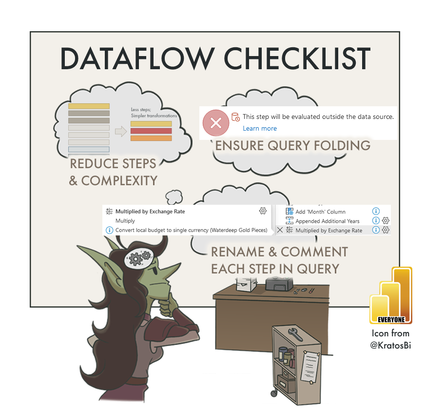
📝 PART 3: DATAFLOW
📝 PART 4: REPORT
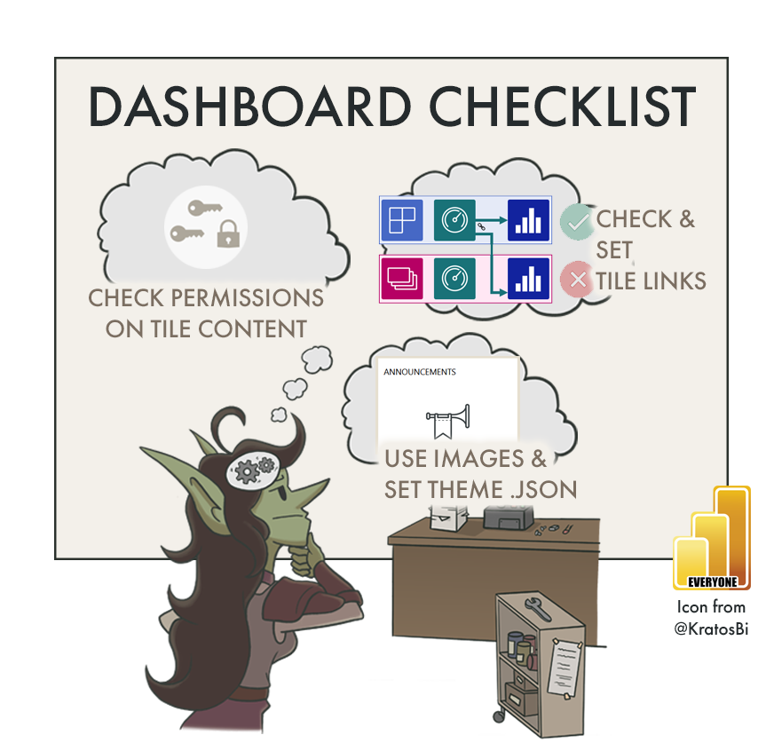
📝 PART 5: DASHBOARD CHECKLIST 👈
📝 PART 6: POWER BI APP
📝 TBD: ON-PREMISES DATA GATEWAY
📝 TBD: DEPLOYMENT PIPELINE
📝 TBD: PAGINATED REPORT
📝 TBD: ANALYZE-IN-EXCEL
📝 TBD: METRICS (FORMERLY GOALS)
📝 TBD (After GA): DATAMART

Dashboards are a great way to provide a simple overview, drawing attention to important metrics & linking to alerts, even automating downstream actions
DASHBOARDS IN POWER BI
While not as popular as interactive or paginated reports, Dashboards are an important instrument in the Power BI visual toolbox. Numerous report visuals (or entire reports) can be pinned to a single dashboard to provide a high-level, aggregate view of a reporting suite. They can also be used to unlock specific functionalities, for example:
Data Alerts from specific visuals, which trigger automated actions if the value matches a set rule
Adding videos and embedded web content to a Power BI user experience
Creating a dashboard in Power BI is very easy, but there are some important considerations when sharing a secure & professional-looking dashboard. Following this checklist will help you make a good dashboard and avoid unpleasant surprises or frustrations, down the road.
Power BI Dashboard Checklist
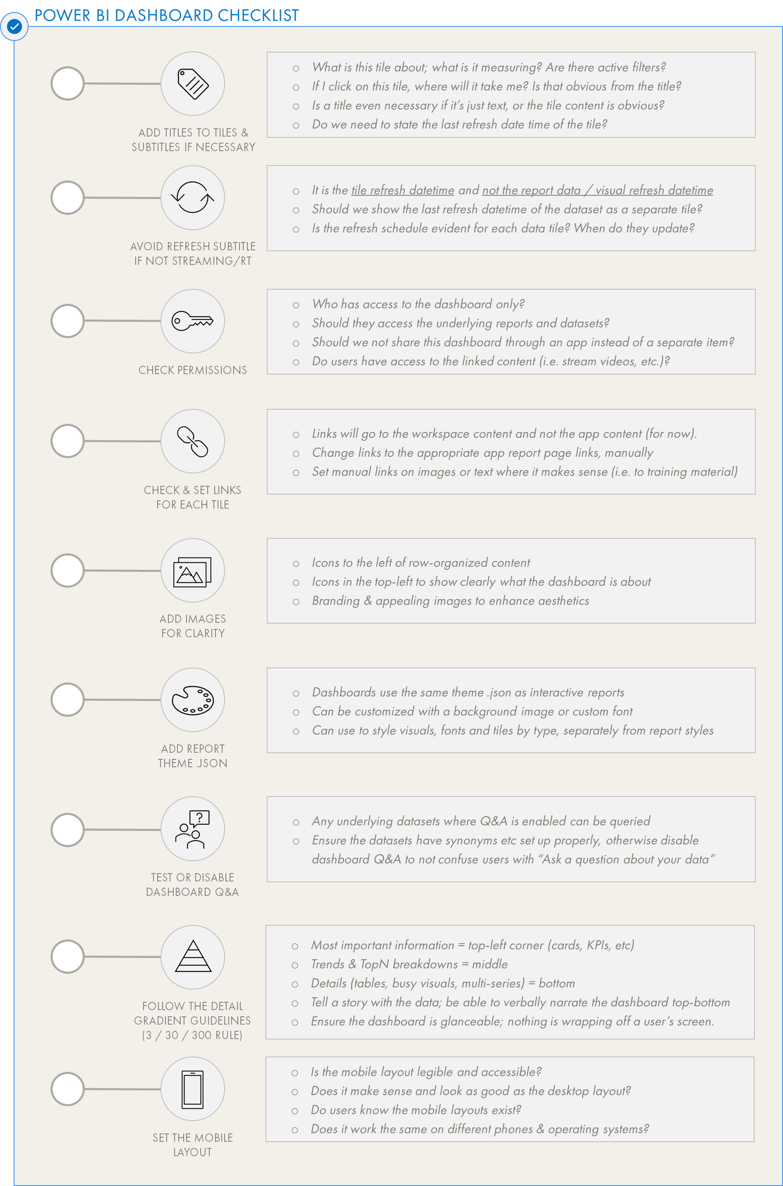
ARE TILES APPROPRIATELY LABELLED WITH TITLES/SUBTITLES?
Adding a clear, concise title to each dashboard tile is a simple way to help users know what they are looking at. By default, the tile inherits the title of the visual. In tiles created on the dashboard (i.e. not pinned), there is no title. Be sure to be consistent in the casing and naming conventions, both among the tiles in the dashboard and across content with other reports. I.e. if you call something ‘GROSS SALES’ in the tile title, don’t call it ‘G.S.’ or ‘gross’ in the report, or another tile.
A good practice is also to add a subtitle to clarify wherever a user can take an action. For example if clicking on the tile will direct them to the report or another site, this can be clarified in the subtitle. That way, the user is prompted to do something if the information triggers them, and know what to expect.
ARE YOU SHOWING THE REFRESH DATETIME CORRECTLY?
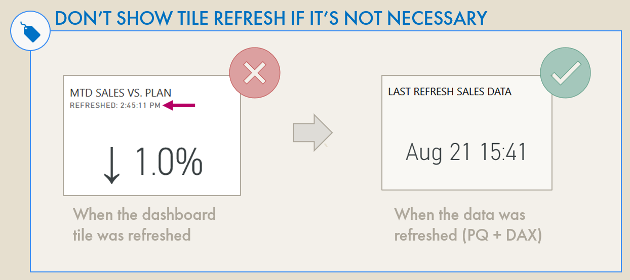
There is sometimes a misconception that the ‘Display Last Refresh Time’ option will show the data freshness. This is not true; when toggled, this will only show when the tile was updated.

This will not show data freshness unless you are using a real-time streaming data source.
One subtitle option is to add the “Display last refresh time” instead of a manual subtitle. Unfortunately, this is often misunderstood to mean the “last refresh time” of the underlying dataset, and thus a measure of data freshness. Unless you are connected to a real-time or streaming data source, however, this will not be the case. This only shows when the dashboard tile was refreshed. For visuals connected to import datasets, it says nothing about data freshness, and is misleading to an end-user.
Thus, it is considered a best practice to disable ‘Display last refresh time’ unless a direct query or streaming data source is used. Alternatively, if you wish to show the data freshness, this can be done by referring to a card with a DAX measure that returns the last refresh datetime as a string. This method is described in detail, here.
ARE PERMISSIONS & LINKS CONFIGURED APPROPRIATELY?


If you want to link to a report page, use the “set custom link” and “external link”. The other option “Link to a…” will link to workspace content, and not app content.
When pinning content to an end-user-facing dashboard, there are access and security implications:
If the report is in the app but excluded from the app audience, a linked tile in a dashboard the user can see will allow them to bypass audience permissions and see the report content.
If the report is not in the app, a linked tile in a dashboard will appear “broken” for app users.
If the link in the tile refers to the workspace content, the user will be prompted to request access to i.e. the workspace report.
If a user is given access to a dashboard or an app containing a dashboard with “build permissions”, this will apply to all underlying datasets linked to report tiles, even if the report is excluded from the audience scope (the permission will “traverse” to the dataset from the dashboard).
To avoid these things, it’s important to be aware of who has direct access to the dashboard, and to minimize this as much as possible. It’s also important to check the “Lineage view” for how the data and visuals arrive at the dashboard, so as to avoid making assumptions about content aggregation & distribution.
CAN IMAGES & ICONS IMPROVE THE DASHBOARD?
A simple way to improve the layout and organization of dashboards are to use icons and images to direct user attention to specific “rows” and “columns” of tiles. A simple example might be icons used to symbolize the app or dashboard, or associated with the tiles to the right of the image. A good source for images and icons can simply be Office 365; in PowerPoint you can find plenty of stock images and icons to use. Another source is from the Noun Project.
Finally, multiple lines of text can sometimes be made more readable when prefixed with icons or emojis. This depends on the audience and their preferences; it should be used in moderation to prevent your dashboard from looking like a teenager’s cellphone. To use icons/emojis in text, press “Win + .” in order to get the shortcut menu.
IS THE DESIGN & BRANDING ALIGNED WITH OTHER REPORTS?
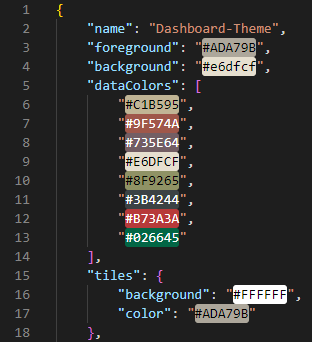
In the theme the ‘tiles’ key lets you modify tile formatting elements.
If you are using a report theme, you can upload the .json to the dashboard so that all tiles are consistently formatted across content. When pinning visuals, you also get the option to “keep current theme” or “use Dashboard theme”. Generally, it can be good to keep the current theme. This might not be a good idea if you are pinning visuals from different reports that have unique formatting applied, though. To get consistency in tiles and also customize the Dashboard appearance, you can modify the theme .json. This will work both for the dashboard itself (i.e. background, tile colour / transparency) as well as the visual styles (data labels, titles, axes, etc.). Some visual types seem resistant to formatting, however (like cards). If you want to format the dashboard tiles, you can use the “tiles” class. For more about report themes, see here.
An important consideration, however, is that if you choose “keep current theme” when pinning a tile, the tile will keep the current theme and no longer be affected by future dashboard theme changes. This means if you want to change the look & feel of that tile in the future, you need to delete & re-pin it.
IS Q&A DISABLED WHEN UNUSED, OR WHEN USERS AREN'T TRAINED?

Under file > settings, disable Q&A if you don’t intend on using it or users aren’t prepared for that functionality
As mentioned above, Q&A can apply to any dataset which has linked report visuals pinned to it. This can both be a way to create tiles on a dashboard without pinning visuals, as well as a feature for end-users to explore data. However, this can become problematic if Q&A is not an expected functionality in that dataset, or if there are redundancies across multiple dataset fields. For example if the measure [Sales] exists in two datasets, the semantic ambiguity will make it difficult for the user to retrieve expected results in the Q&A.
Q&A is enabled by default in Power BI Desktop. Any dashboard tiles from datasets where Q&A is enabled will themselves enable Q&A in the dashboard. However, if the aforementioned situations arise or the Q&A functionality is not required, it is best to disable it. This is also recommended if users have not been trained to use the Q&A functionality, or given an explanation of the data model in light of Q&A.
IS THE DASHBOARD FOLLOWING DETAIL GRADIENT GUIDELINES?
Inconsistent and ineffective layouts can render a dashboard useless; it becomes difficult and time-consuming to decipher the meaning in the data, so it won’t be used. Dashboard layout involves several steps:
1. Selecting the right visual types to pin from reports
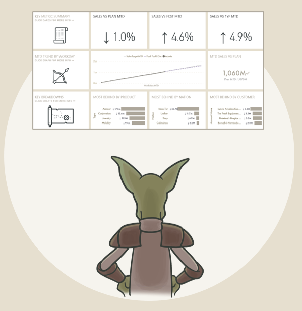
For example, pinning large, complex or detailed visuals to dashboards is a bad design idea. Generally, they can become difficult or impossible to read, and defeat the purpose of having a dashboard high-level overview. Dashboards should be reserved for simple, glanceable visuals like cards, KPIs, and simple trendlines, bar charts or bullet/barbell charts.
2. Selecting the right visuals to pin from reports
Just because you can pin things on a report doesn’t mean you should.
- What is the value of having this on a dashboard?
- What added benefit is there compared to the user just navigating to the report, itself?
Remember, a dashboard tile cannot be filtered or interacted with. A dashboard should thus serve as an extremely quick glance to capture the situation. For example, a manager might want to glance across a dozen metrics to see where we’re off target; if one tile calls their attention, they can click on it to go to the underlying report for more information. The added value is that they don’t need to sift through a dozen reports to see where they should spend more time; the dashboard helps them be efficient.
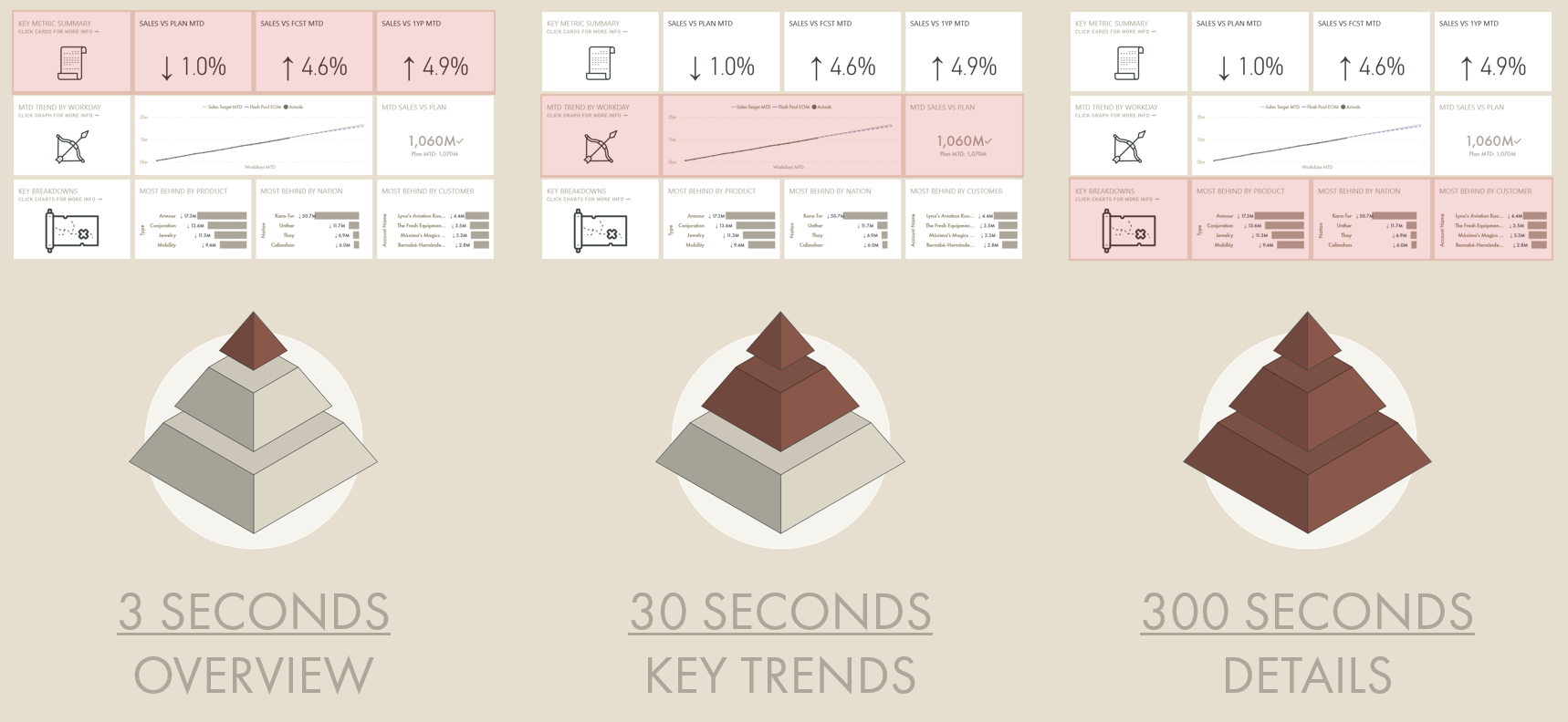
3. Less detailed, more important tiles in the top-left, more detailed/busy tiles in the bottom-right
These detail gradient guidelines are general data design rules that should be followed for not just dashboards, but also interactive and paginated reports. In the West, we read from top-left to bottom-right. Our primary attention goes to the top-left of the page. Knowing that, we should put the most important information in the top-left, and the more detailed and complex information in the bottom right. If we are confronted immediately with detail and complexity, we easily get lost. We can easily remember this by following the below:
Top left: What questions can we answer in 3 seconds with an overview?
Middle: What questions can we answer in 30 seconds?
Bottom: What questions can we address in 300 seconds (5 min)?
If you want to learn more about the 3/30/300 rule, I have a presentation about it, here.
A future (currently WIP, date TBD) article & course will be released specifically about this topic.
HAVE YOU SET A MOBILE LAYOUT?
Given the simplicity of the dashboard tile layout, it is a perfect candidate for mobile reporting. Creating some simple mobile-friendly dashboard views can really enable users to check their data on-the-go. Even if you don’t plan to target this use-case, though, Power BI will still create mobile-specific layouts of dashboards and reports. Unless you intervene to set the layout of the dashboard, tiles will be arranged for you in a random way; generally, they will be 6 x 3 and ordered top-to-bottom in the order in which they were placed. This often results in a disorganized and messy user experience.
Instead, it’s recommended that you re-size and re-position tiles in the mobile layout so that the data is most optimally displayed (again, following the detail gradient guidelines put forward, above). The mobile view won’t affect the web view, and you can even hide tiles specifically on the mobile view which don’t render in a visually appealing way.
TO CONCLUDE
Dashboards can bring a lot of value to your reporting suite when used correctly. However, it’s important to be aware of the nuances with their design, capabilities as well as access / security implications of the upstream content. By following a few key points, we can make good dashboards that help drive efficiency in the reporting user experience and bring value in new ways.
DATA GOBLINS DASHBOARD CHECKLIST
Version 1.0 - Last update: Oct 17, 2022
Use the below interactive checklist to follow-up on your Power BI Dashboard:
Click the question mark (?) for a link to a reference document. This will be learn.microsoft.com documentation; if none are available, this may be a Data Goblins article, or another blog post reference.