Visualizing Microsoft Planner & Tasks data in Power BI
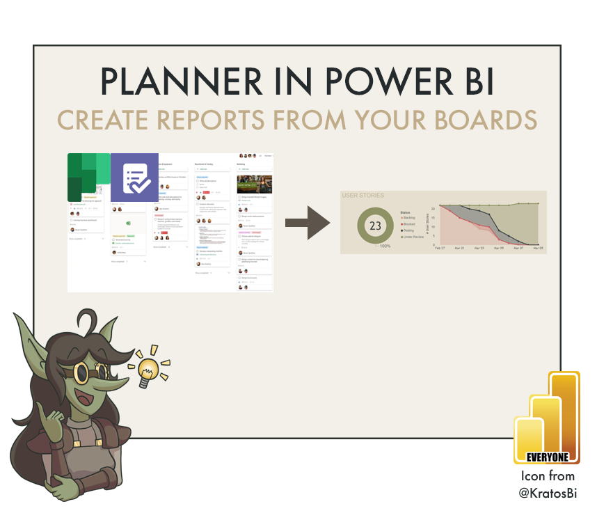
GET PLANNER DATA INTO POWER BI
Using Power Automate cloud flows to capture the data

Turning your Teams Planner into a powerful, automated project management dashboard.
Task management and KanBan tools have been all the rage in recent years. There’s more of them than you can shake a stick at. Because of its simplicity & integration capabilities, MS Planner has always been my favorite. One thing that it lacks, though, is a flexible, visual overview - good thing you can make your own!
In this blogpost I’ll show you how to get that data into Power BI - completely automated!

Time to Implement

Difficulty

Usefulness
Use-Cases:

USER STORY TRACKING
Being able to log the user-desired features and needs for your report is important. In the digital age, we can’t go around sticking post-its all over the walls. Well, we can, but it will just be to our own benefit, not our teams. Planner task cards are structured in a really convenient way for this, and pulling out, aggregating and visualizing that information can give a very nice overview of your user stories.
This is particularly useful when exposing these boards to users so they can add & edit their own, while the designers analyze the results.

PROJECT MANAGEMENT
Once you’ve built your backlog, you need to follow-up. A lot of teams use tools like Jira or Trello, but integration options are not so appealing. Planner is free, easy and already integrated into the Microsoft toolkit.
What really makes it excellent is that you can have everything contained in a single Teams channel as separate tabs - so users and team members never have to leave Teams in order to follow up on or review their tasks.
Finally, low-code automation options from Power Automate facilitate fully automated data handling that is super easy to set up. A good project management solution is concise and sustainable - and that’s exactly what you get!

ORGANIZING YOUR UAT
Similar to following up with user stories or project management, user acceptance testing (UAT) requires bug logging and tracking. This can be a very laborious process. I have seen monster Jira boards full of bugs, yet they are too complicated and no one can follow them up.
With some simple buckets and set-up you can do this all through Teams. Planner lets users log bugs, developers can follow-up and everyone gets a concise visual overview from a Power BI report. Nice, right?

Without tracking, things get… messy
When to not use it:
IF ANOTHER SOLUTION IS ACCEPTED:
Typically, tools like this tend to have leniency to personal and organizational preference. If your organization already has licenses for other solutions that are adopted in your teams, then there’s little added value in switching to something else; you’ll just be adding to the noise. Likewise if someone in your team is already well-versed with another solution.
IF IT DOES NOT ‘CLICK’ WITH THE USERS / TEAM
Sometimes these tools and solutions can be technically good, simple and automated, yet it just doesn’t match with people’s way of working. Even if you feel it is more effective, it doesn’t necessarily mean that it is the right tool for them. Like a good report, the tool should fit with the people. So if you find that using Planner in teams like this isn’t taking off, you might want to re-assess whether it’s the right solution.
It’s important to try and make it approachable to people, though, and demonstrate the value.
Reasons it doesn’t work could include:
They feel it is ‘extra work’
They’re unfamiliar with teams / KanBan methodology
They had a negative experience with it in the past
They have a superior pushing for more traditional updates, i.e. via Email, Excel or PowerPoint.
How to do it - Ingredients:
EXTRA TOOLS:
MICROSOFT POWER AUTOMATE
MICROSOFT POWER AUTOMATE - PREMIUM (OPTIONAL) -
AUTOMATES REFRESH OF PBI DATASET
MICROSOFT BLOB STORAGE (OPTIONAL)
MICROSOFT TEAMS WITH TASKS/PLANNER, POWER AUTOMATE & POWER BI TABS
DATA STORAGE MODE:
ALL
METHOD:
POWER QUERY
DAX
ELIGIBLE WITH:
BRING YOUR OWN DESIGN (BYOD)

Keep organized with Teams & MS Power Platform!
How to do it - The Recipe:
Step 1: Set up the planner.

Identify buckets with dummy tasks
Create the buckets you want.
Examples are: Blocked, Backlog, To Do, In Progress, Under Review, AcceptedFor each bucket, create a dummy task that has “Bucket:<BucketName>”. Replace <BucketName> with the name you chose. Mark them as completed, but leave them in their respective buckets! This is to be able to automatically identify and tag each bucket ID later in our Power BI model.
Name your colour categories. In Power Automate, we can only identify the first 6 colours - Blue, Pink, Purple, Yellow, Green & Red. Since you cannot easily identify the “priority” field in planner data, you can artificially use the colours to indicate priority (i.e. Red = Urgent), or however else you want to organize your plan.
Create some dummy tasks to test in each bucket. Leave one bucket empty (except the label).
Step 2: Set up the flow.
The flow is based on a community-created template. All you need to do is populate it with the appropriate information from your resources.
I also recommend considering adapting it in the below ways:
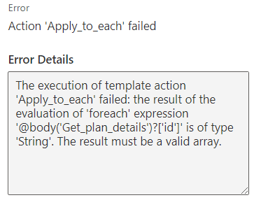
Error if you try to iterate on 1 plan
All Plans vs. One Plan: The default template lists all your plans. This could be convenient, as one flow will get all your data across all plans and put it in appended into the same blob container. You will just have to be sure that you have the PlanId’s noted down so you can key them into your Power BI model, later. However, if you want this to be plan-specific, you should do the below:
Swap out the step “List my plans” with “Get plan details (preview)”. Then you just include the PlanId for the plan you want.
Remove the first “Apply to each” step which will iterate over each plan. Since you only have one plan, you are not going to be able to supply this step with an array and the step won’t work. Instead, just list all tasks for that one plan and iterate over the tasks.
Point-in-Time vs. Snapshot: If you need to have daily or even hourly snapshots (strongly recommend daily or every 4-8h), you will need to set a custom function to get the DateTime every time the flow runs, and format it as a concatenated string to the blob container name. Otherwise, your blob container will be overwritten every day. Having snapshots is useful because it will give you trend / time series data.
Tasks-within-Tasks: If you have lists within a single task card, you may need to do extra steps to format that data in an easily parse-able way. Otherwise, you can also rely on a semi-structured output and handle it in Power Query, later.
Automate the Power BI dataset refresh (Premium only): In my opinion, this isn’t so necessary, but can just be convenient. This will trigger a dataset refresh at the end of the flow, ensuring the Power BI report is up-to-date. You can easily do this in Power BI with ‘scheduled refresh’, as well. The added value, here, is you only have to update 1 schedule (the flow) and not 2 (+ the dataset refresh).
Add downstream notifications: This can be a good practice if you are new to using Power Automate, as it’s reassuring when you get a mail or notification letting your know that the flow completed when you expected, possibly with some summary information.
Add automated triggers: If you need near-real-time view’s, you can arrange this. Every time a new task is created, or a task is edited, you can have Power Automate trigger the flow. In most cases, though, this is not necessary.
A simple flow to get all plans and end with a dataset refresh
Step 3: Set up your blob container.
If you are trying this out on your own, you can register for a free trial with Azure and do this yourself.

From portal.azure.com, navigate to your resource group.
Under ‘containers’, create a new container and name / set it up, appropriately.
Populate your flow and Power BI data sources with the data source information so that you can push / pull the data.
Step 4: Test your flow
From flow.microsoft.com, manually trigger your flow and see if the run successfully completes.
If it completes, use MS Azure Storage Explorer to access your Blob Container and check if the blob you created appears with the appropriate naming syntax. Check the size of the blob - if it’s 0KB then you should troubleshoot your planner steps in the flow.

The blob has been created and dropped in the container
Step 5: Set up the Power BI connection
Set up a new data source from Azure Blob Storage.
From here, you just have to process the data to the desired structure in Power Query; it’s essentially the same as a Folder / SharePoint folder connection.
Ensure you have the below tables
People: A table linking the person’s ID; you can use this to identify and group people.
Tasks: A table linking the tasks to their IDs, useful for searching certain tasks to see how they moved between the buckets.
Buckets: A table linking the buckets to their IDs. Here, you have to make sure you keep only the tasks that have the “BucketName:” prefix. Using “Extract Text After Delimiter”, you can then identify the bucket name, and link this to the bucket ID to easily build your dimension table.
Status: This is a dimension table for the colour categories.
Date: Standard date table; you can do this in DAX or Power Query.
Step 6: Build and Test the Power BI report, then publish to the service.
There are a lot of really nice visuals that you can make using planner data. My recommendations:
Burndown Chart: This line chart shows the # tasks in the “To Do” bucket at the start of a sprint, and shows their decay until the end of a sprint. This helps a project manager or stakeholder see if the team is progressing at a consistent rate or not. Sometimes a linear line can be used as a base; normally, the X-intercept should be at 0 by the end of the sprint.
Status Stacked Area Chart: This shows the evolution of the project progress over time; it reveals in which buckets the most time was spent. This can be particularly interesting if the buckets are well-defined, and used appropriately. It can become completely useless, however, if the buckets are ambiguous or mis-used during some of the snapshots.
Current Summary: A parts-of-the-whole chart (waterfall, etc.) that shows which status occupies the greatest %. Here, it is usually best to group the statuses into as few as possible, i.e. “Doing / Done / Problem”.

Some simple (goblin-styled) charts; examples #2-3
Step 7: Plug everything into Teams as tabs
Planner: You should have already done this in Step 1!
Power Automate: This lets users (and you) manually trigger your flow.
Power BI: Here’s where everyone can see the report, without having to go to the service. Great!

Save time, make value!