Bar Charts in Power BI

HOW TO CREATE BULLET CHARTS IN POWER BI
…and other chart types using only the core visuals (i.e. without custom visuals or SVGs).
YOU COULD ALWAYS USE A BAR CHART…

Bar charts are the most commonly used cartesian chart type in Power BI. They are simple, useful, and easy to understand. However, there are many variants of these charts that you can use for different use cases:
Bullet charts help you track figures against a target for different attributes in a concise and elegant way.
Divergent bar charts can be more effective ways to focus on the magnitude of difference between figures and a target instead of than the absolute values.
Stacked bar charts let you compare absolute volumes while also seeing part-of-whole for a second dimension.
These are only a few examples; there are many more. Knowing how to create these different bar chart variants is important to address these use-cases. While many of these visuals can be created custom in Deneb or from SVGs, you can also create them in the core visuals. However, it’s important to know the limitations of the core visuals in Power BI, and when this “Macguyvering” of the core visual formatting settings goes too far.
 The purpose of this article is twofold:
1. To share templates to create different bar chart variants with the core visuals.
2. To highlight how too many report-specific objects can be "unhealthy" for a Power BI dataset.
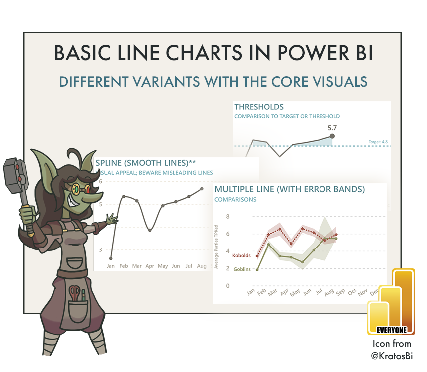
Examples of different ways to use bar charts with the default Power BI visuals
Goblin Tip:
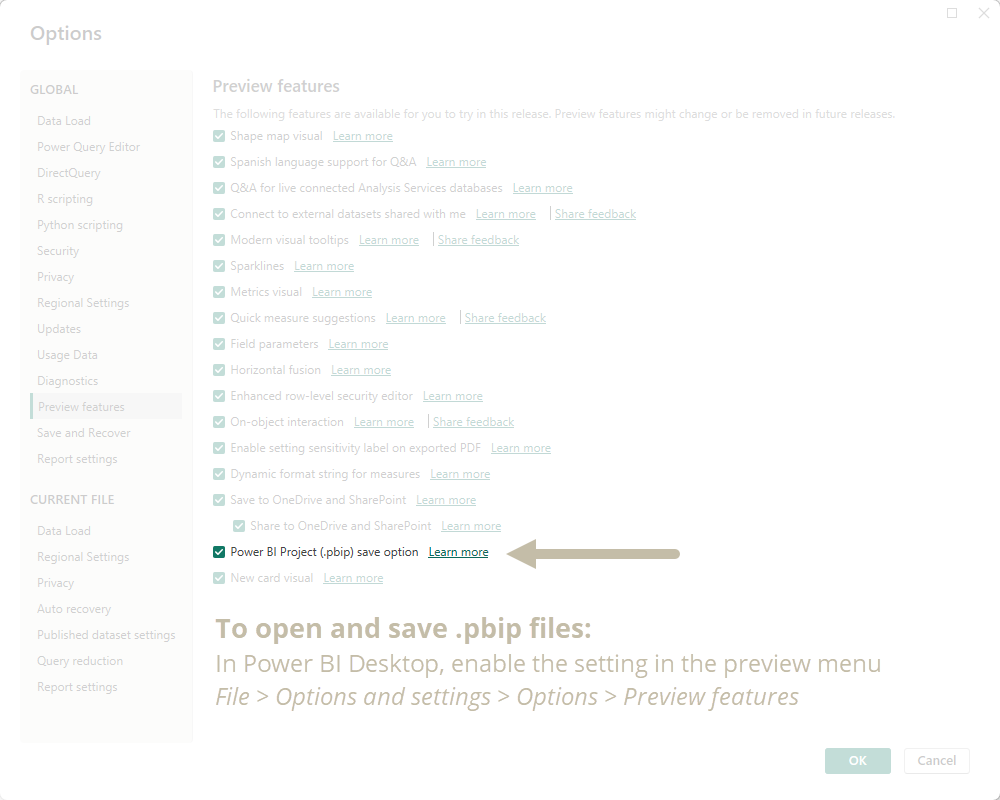
These are shared as .pbip files. This format is in preview as of July 2023. You must enable .pbip save option in Power BI Desktop in order to open and use these templates. Why do I use .pbip?
- Lightweight sharing of report + model metadata.
- Report metadata allows you to programmatically modify the templates before opening them.
- Track changes of the individual objects and formatting in the GitHub repo.

REPORTING OBJECTS
Over time, Power BI is becoming more flexible and supports more visualization types and use-cases. For instance, I created all of the above templates in only 5 hours (in part, thanks to the productivity enhancements of Tabular Editor 3 when writing DAX). However, this flexibility comes at a cost — the more Macguyvering you do, the more the model becomes cluttered with report-specific objects.
Report-specific objects are measures, tables and columns created to fulfill specific visual requirements, instead of addressing a broader range of business data needs. When unsegregated from the rest of the semantic model (Power BI dataset) they make it more difficult to use and find what you need. This is particularly true for model consumers in managed self-service scenarios. To date, there are no out-of-the-box solutions to consistently and elegantly isolate report-specific objects from the model. Instead, it’s essential that you:
Organize these objects into display folders and tables, away from other model objects.
Hide them or mark their parent tables as private so that they don’t clutter the model.
Place report-level measures in the report file, or or in a downstream composite model.
Limit the number of reporting objects as much as possible.
Also consider that the more you Macguyver a visual, the harder it is to understand and maintain. Just look at the templates I’ve shared above. For example, the “bar chart & candlestick” template looks really nice, but it’s an absolute pain in the ass to understand, adjust, and maintain. For chart types like this, it’s debatably better to use Deneb, until additional features come out that provide the native flexibility for the core visuals. Furthermore, you always should critically appraise whether your desired visual is the best option. Sometimes the simplest solution is best; don’t strive for whatever looks best to you or what seems the most unique.
Goblin Tip:
When you need to create a "variant" visual (a visual that is different from one of the named core visual types), you have several different options at your disposal, with pros and cons for each:
- MacGuyver: Using out-of-the-box functionalities of the data model, DAX and formatting options to bend an existing core visual into the visual type that you seek. MacGuyvering can be a nice, low-code way to do what you want, but you have to balance the number of report-specific objects you create. Further, you need to ensure that the visual is flexible for all filters and users; it requires good testing.
- No code custom visual: Getting (or buying) a pre-made visual from AppSource. These pre-made, custom visuals can be a quick fix to getting something off-the-shelf, but you are beholden to these developers for the functionality of the visual. Furthermore, not all functionalities of the Power BI visuals are available to custom visuals APIs, and they can occasionally exhibit performance issues. Last, they may be disabled in your admin tenant settings.
- Deneb custom visual: Deneb is often an excellent solution, but the cost is a significant step up in complexity. You use the Vega/Vega-Lite grammar of interactive graphics to specify the visual with a json-like syntax. This gives you unlimited flexibility, but is harder to maintain and change, particularly when handing over to clients or teams that don't know Vega/Vega Lite. Deneb may also be disabled if custom visuals are blocked in tenant admin settings.
- Custom SVG measures: You can encode dynamic SVGs inside of a single DAX measure, then mark the "data category" propery as "image URL" and use this measure in any field that accepts it and renders the visual. This is commonly used in tables, matrixes, and the new card visual to create elegant, custom "microvisualizations". However, these SVGs can pollute the model if they aren't placed in the report, and can be difficult to maintain or understand if not well-formatted and documented with comments in the "DAX" code (the SVG specificiation).
- Python or R visuals: Python or R integration are natively supported in Power BI. You can create custom visuals with libraries like seaborn or ggplot2, leveraging (most of) what they have to offer. However, the Power BI (Fabric) service may not support all libraries, and you can run into performance issues if your python/R code is not well-optimized together with your DAX. They may also be disabled in your admin tenant settings.
- Custom D3.js visuals: Here there be dragons. With this approach, you are full-on creating your own Power BI visuals with the custom visuals APIs and your knowledge of D3.js. This is the ultimate approach in terms of complexity, cost, and effort to build or maintain, but the one that gives the most flexibility and positive results when done right (see Zebra BI for an example of "doing it right").
Recall that there is no "best" solution. The validity and suitability of your approach depends on the context. Ensure that you critically appraise each approach and select the one that suits your needs, balancing:
- Effort to create
- Effort to maintain
- Complexity
- Flexibility
- Performance

TO CONCLUDE
Bar charts are the most common cartesian chart type used in Power BI. However, there are many sub-types of bar charts that you can use for different use-cases. Ensure that you are aware of the different ways that you can format the bar chart core visuals to make the most of these different subtypes and formatting options, so you can most effectively visualize and explore your data.
However, consider carefully the cost of Macguyvering visuals in Power BI. Remember that elegance is not only how something looks, but how effective it is in delivering insights over the solution’s lifespan. That includes ensuring that the visual is flexible for different users and use-cases, and also easy to adapt and maintain.