


KPIs and cards in Power BI

EFFECTIVELY CALL OUT IMPORTANT NUMBERS
…by using KPIs and Cards in reports to inform decisions and action with the right context.
 This article was a collaboration with Štěpán Rešl of Data Meerkat. Check out his blog, here!
INFORMING ACTION WITH CONTEXT

When a user arrives at your report, they should be able to answer their most important questions in a few seconds. To do this, we typically put the most critical information in the top-left of the report (where we often look first). This information should provide a high-level overview, whereas additional details should be placed at the bottom of the report, behind interactions, or on later pages.
An effective and popular way to call attention to important numbers in Power BI is by using cards and KPI core visuals. These simple visuals let you show an aggregate number, like total sales or percent achievement of the budget. However, recent updates to Power BI have added additional options to make these visuals more effective at giving the right context to inform action:

Dynamic titles and subtitles: Turn any core visual into a KPI. For example, you can use a line chart to show a trend, then set up large titles that call out the key metric and its target. Combined with conditional formatting, this can be a valuable way to effectively convey the context of key figures.
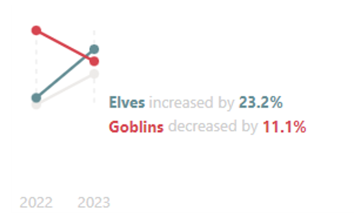
New card visual: Additional formatting options to create performant, multi-card experiences and incorporate images for icons or custom elements. As described in the following bullet point, advanced users can also use the new card visual to create custom SVG microvisualizations, like a slope or waffle chart.

Custom SVG microvisualizations: An advanced feature that lets you specify an image URL to produce dynamic shapes combined to create a custom visualization. These image URLs are specified inside of one or more measures, and as such, these report-specific objects require additional effort to build, test, and maintain.
In this article, we discuss the elements of a KPI visual and share examples and templates to inspire your own designs. It’s important to note that these templates aren’t intended to be used as-is, but rather illustrative examples to guide your own designs and implementations.
The purpose of this article is threefold:
1. To explain how to effectively call attention to important figures, to drive decision-making and action.
2. To share templates and examples to inspire or kickstart your own designs.
3. To discuss key considerations when using SVG measures to do this in cards, tables, and matrixes.
The examples and templates use a hypothetical dataset of an NGO that helps fantasy creatures file insurance claims against adventurers.
THE ANATOMY OF AN EFFECTIVE KPI VISUAL
When I speak about a ‘KPI visual’, I’m using a catch-all to refer to any high-level overview that you should be able to understand in 3-6 seconds or less. The purpose of these visuals are to quickly provide critical information and context so that a user can move onto additional details to investigate and inform the right decisions or actions. Typically, these visuals should be placed in the top-left of the report, so they’re the first thing seen by a user when they arrive. This is particularly important as it informs what the user will look at and do in the report next — which breakdowns they’ll look at, and which filters they’ll apply to investigate further, for example.
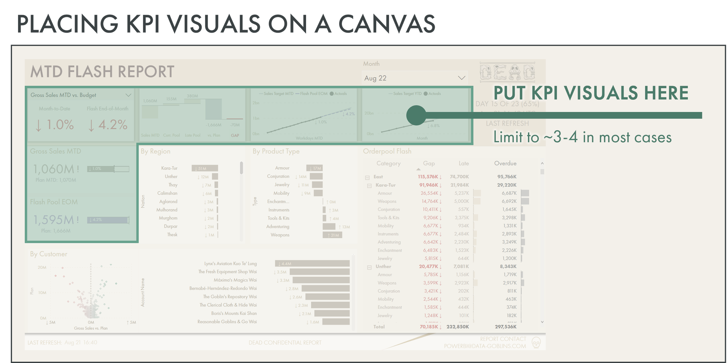
One key consideration for KPI visuals is to not have too many. Often, there’s a temptation to include many call-outs across the entire top of the report. Having too many of these callouts is counter-productive, as it dilutes their value. Users become overwhelmed with information, and don’t know where to look, first. Generally, in a typical report (not a scorecard executive overview, for example), you should avoid having more than 3-4 KPI visuals at the top of your report. Each of these visuals should be designed and tailored such that they have the right parts for users to effectively read and interpret the information they display.
Typically, an effective KPI visual can have several parts, as illustrated in the below diagram.
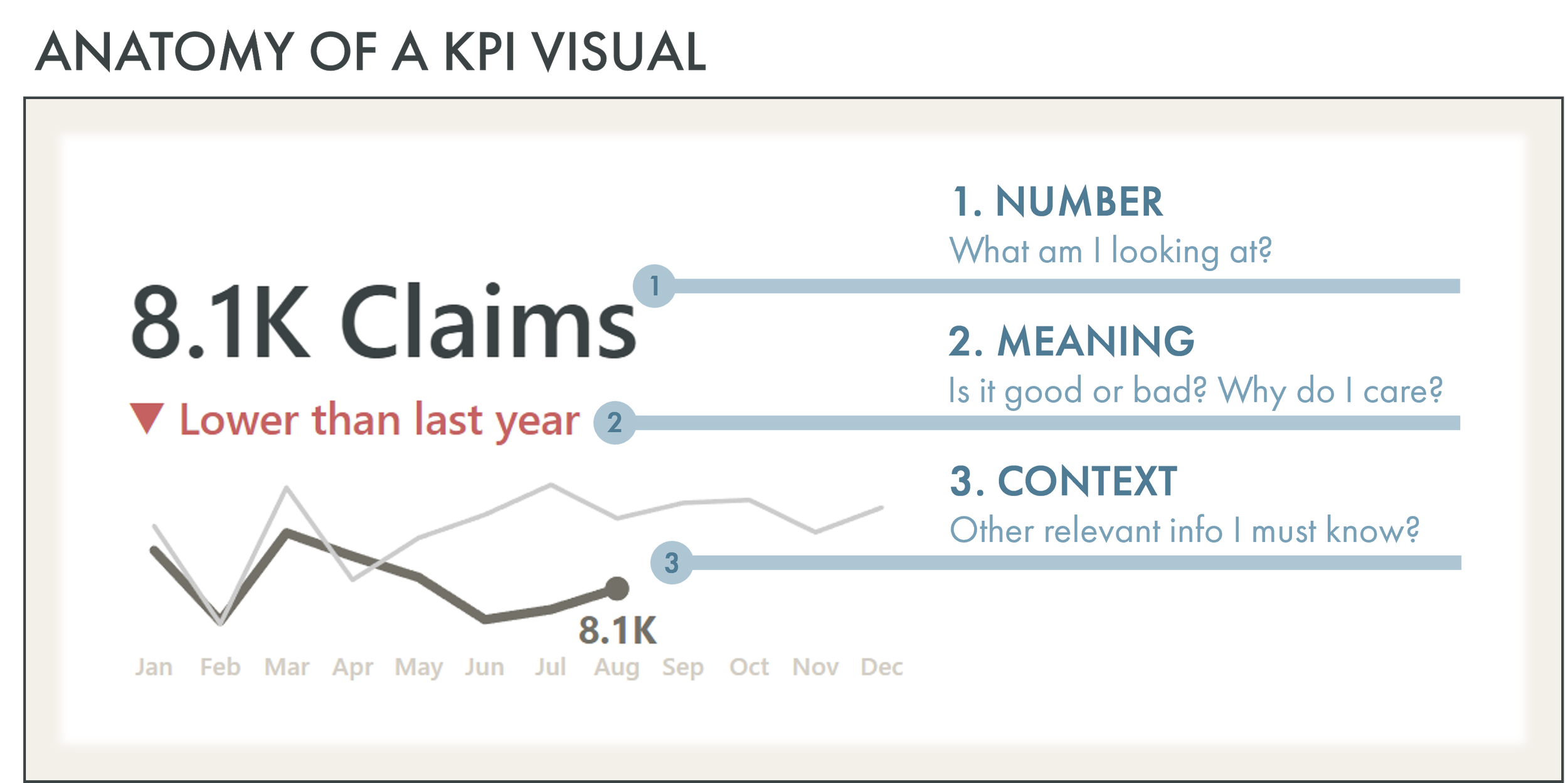
Number: What am I looking at? This is present in all KPI visuals. It clearly states the number.
Effectively set this up by:
- Formatting the number properly: Aggregate the figure and use the appropriate units and decimal precision to only show the level of detail necessary. However, ensure that when the report is filtered that this remains useful. If you lock the figure to “Thousands (K)” and “1 decimal place”, then someone filters to a single customer and product, it might just say “0.1K”, which isn’t useful or informative.
- State what the number is: Use titles, callout labels, or format strings to clearly state what the figure is. This might not be necessary if it’s evident from the report title, for example.
- Use conditional formatting and color effectively: Only use color to steer attention. You don’t want to overwhelm users with color, as it will cause cognitive overload. For example, you can use a neutral color when you’re on target, and a deep red when off-target. Red implicitly is associated with negative outcomes. Setting up the conditional formatting this way can ensure you only draw attention to elements that are off-target. For more about effectively using color in data visualization, search for articles by Lisa Charlotte Muth, who has produced in my opinion the best guides on this topic.
- Don’t just use the default font: Select a font that is consistent with your organizational branding and with other reports. Don’t default to DIN every time. Ensure that your chosen font renders on user machines / browsers, and that it’s sufficiently accessible for people with dyslexia.
- Use icons and images if it’s helpful: Having icons to the left of the figure can be a nice way to visually state what the number is. However, ensure that you have the rights to use these images, that they’re subtle, and they’re clear to the users, as well. Often, report creators include icons because they look nice and not because they’re effective or helpful.Meaning: Is this number good or bad? Why do I care? This is present only if there’s a relevant target or meaning to provide. For example, this could be the budget, forecast, or previous year, but it could also be the average across categories, or some other baseline to compare to. Sometimes, the meaning is implicit. For example, if you’re reporting on issues or defects, the meaning is clear; there shouldn’t be any, so anything greater than zero is bad.
Effectively set this up by:
- Finding a relevant and appropriate baseline: Ensure that the target is one that informs decisions and actions. Typically, this target should be something that’s explicitly linked to business objectives, like reaching an end-of-month budget target. Avoid creating a target yourself just to provide meaning, as this can confuse or mislead users. If you don’t have a target, you might want to discuss how to provide this meaning with users. For example, a good options could be comparing to the rolling average of the last 4 weeks, or a previous period.
- Use visual aids so it’s more effective to get the meaning: Codify the meaning with color and visual indicators like arrows or other shapes. This combines implicit information (red or down arrow = bad) with explicit information (such as lower than last year) so the visual is most effective. This reduces the time it takes a user to derive the meaning from the visual, and thus the time-to-action.
3. Context: What else must I know to interpret and act upon this information? Additional context can be helpful, but isn’t always necessary. This depends on the specific business objectives of the report, and what other critical information people quickly need to make decisions and take actions. Common examples are trends (such as by month) or high-level breakdowns (such as top categories like area or region; EMEA, APAC, etc.).
Effectively set this up by:
- Be subtle and simple: This context is just that — context. It should be subtle and not draw attention away from the number or meaning of the visual. It should just provide some additional information if needed.
- Don’t include it if it’s not necessary: Overwhelming users with information is one of the easiest ways to make your report ineffective. Take a disciplined approach to be as concise as possible in what you show. Ask yourself: What value is this adding? Does this help people make decisions or take actions more effectively? Is it redundant with other parts of the report? Do they need to see this in the first seconds? Why?
- Focus on interpretability: Context must be understood in mere seconds. If someone spends more than 3-6 seconds to read and interpret this part of the visual, it shouldn’t be there.
These are some high-level tips to more effectively use KPI visuals. To illustrate, we’ve provided some examples, below.
CORE VISUALS WITHOUT SVG MEASURES
The following are examples of how you can use the core visuals to call out important figures. These examples don’t use any custom SVG microvisualizations. All templates can be found in the powerbi-macguyver-toolbox GitHub repo.
CORE VISUALS WITH SVG MEASURES
SVG templates contributed by Štěpán Rešl of Data Meerkat. Check out his blog, here!
The following are additional, advanced examples of how you can use the core visuals to call out important figures. These examples use custom SVG microvisualizations together with the new card, table, or matrix visuals. This provides the ultimate flexibility, but are more difficult and time-consuming to build, test, and maintain. All templates can be found in the powerbi-macguyver-toolbox GitHub repo.
When using SVG microvisualizations (or SVG measures), please take into account the below considerations:
Report-specific objects: These objects shouldn’t be used by self-service content creators who connect to your dataset from client tools. As such, you should either hide them or mark them as private. Furthermore, these measures should be sequestered in the model, away from other objects.
Additional effort to build, test, and maintain: Ensure that you put a more robust process around testing and validating these SVG measures. Using different filter combinations and interactions may result in unexpected effects, and you can also have specific performance challenges.
Hard to read the DAX: These measures are complex. As such, you should ensure that you use variables and explicit formatting to structure these SVG measures so that they’re easier to read, understand, and change, later. Remember, you’re not the only one who will look at these; someone else will have to look at it, later.
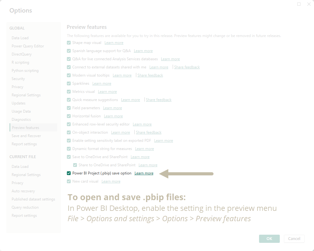
NOTE ABOUT THESE TEMPLATES: ENABLE SAVE AS .PBIP
To use these templates, you must be able to save and open Power BI Projects files (.pbip). To do this, you have to enable this preview feature from the ‘Options’ menu of Power BI Desktop.

TO CONCLUDE
KPI and card visuals are essential, popular ingredients of Power BI reports. However, they should be used effectively to ensure that users can quickly and efficiently find the information they need. This means you should ensure that you consider the number, the meaning and the context of the visual, and you place the visual in the right part of the report canvas. Furthermore, don’t overdo it with too many of these visuals, as having too many will dilute their value.

