

Dimensions of Self-Service in Power BI: Part 2 - The Dimensions of Learning

PART 2: THE DIMENSIONS OF LEARNING
Ways to think about user learning paths for successful Power BI self-service
IN THIS SERIES

It’s important to equip users with data literacy & skills if we ever want to be successful with self-service analytics
With Managed Self-Service in Power BI, there are a lot of options. How do we ensure everyone has the skills they need to use tools properly? This is an important part of our strategy; even if we make good decisions about which tools are used for which use-cases, it won’t make a difference if users don’t know how to use them.
In this article, I visualize my thoughts on the different dimensions of learning self-service tools in Power BI, and share tips to proactively manage these dimensions. When depicting the self-service learning paths in this way, it can be easier to reflect on your self-service strategy - how certain tools & users will be supported to answer business problems, and how they will be managed.
Primary Tools (Previous article)
Different base self-service tools & approaches used to address business problems with data.
A user selects a node on this axis based on the problem they try to address.
Example: Dataset creationLearning Milestones / Components for each tool
Methods, concepts & mechanisms used within a tool to be effective with it.
A user should always be progressing along this axis; a user should always be learning.
Example: Using date dimension tables in the data model instead of auto date/timeDifferent approaches
Ways to approach a specific business data problem using tool components, together.
A user selects a node on this axis based on the problem & their own knowledge.
Example: Creating date tables [and columns] with DAX calculated tables & datetime functionsChange in the tools & platforms over time
How any of the above change over time; whether a user can keep up with changes.
Happens passively; a user should recognize when change happens and have ways to keep up.
Example: New DAX function - NETWORKDAYS
DIMENSION 1: PRIMARY TOOLS

What tools are being used by whom, and why? This first dimension was covered in the previous article, which gave an overview of the self-service methods available in Power BI:
Here, users need to be aware that different methods exist, what the use-cases & barriers-to-entry are. They also need to know what is enabled in our ecosystem & what their responsibilities are as a data content creator. For example, an analyst who needs to enrich a report with a team-specific forecast shouldn’t think of “export to excel” as their de facto option. If they understand the first dimension of self-service, they know the available tools. They know they can do this with a composite model (6), but they need to link the forecast to the model’s dimensions. The goal here is to map options to use cases, and create policies & practices to enable users while ensuring they are accountable for what they do with data.
Examples of proactive actions to ensure success in managing the 1st dimension:
Deciding which tiers we want to activate for which use-cases, and creating ways for users to both request access but also remain accountable for what they create.
Creating a monitoring solution for each tier we activate.
Creating & curating shared spaces on teams to cultivate a community of practice around each level / tool.
Managing central documentation & trainings about the options available & their use-cases, with examples & templates
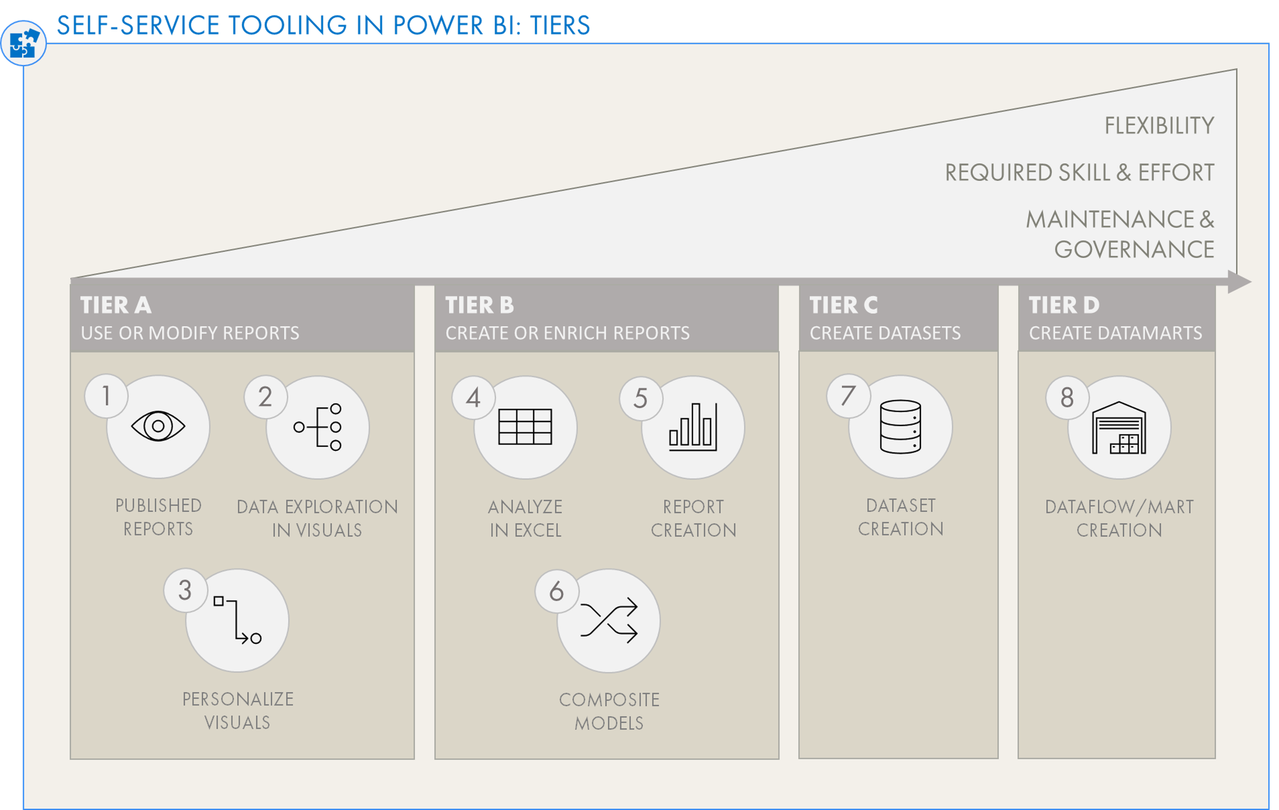
Levels of Self-Service in Power BI: Click the image, or click here to read the first article in this series.
DIMENSION 2: COMPONENTS & LEARNING MILESTONES

These are different methods, concepts & mechanisms used within a tool to be effective with it. They are positioned along an axis that rises in complexity, which users should progress along as their skills with the tools increase, and their needs mean use of more advanced features. For each tool, you can define “milestone points” from basic to complex. Users can then be mapped along this axis.
Some of these are required for a user to generate value (and not harm) from their business data. For example, a user that doesn’t know how to query responsibly from Analyze-in-Excel risks creating performance issues that impact themselves & others. They will not be able to effectively use the tool. On the other hand, more advanced features are “nice-to-have” which might not be relevant for all use-cases, like DetailRows expressions. The goal here is in some capacity to map out the learning milestones and identify actions to maintain user learning velocity along this trajectory (we should also do this for ourselves).
Examples of proactive actions to ensure success in managing the 2nd dimensions:
Mapping out the learning trajectories for our selected tools - what are the nodes & where is our minimum threshold for a user to be successful?
Conducting regular assessments to identify outlier groups that are either further behind or ahead of the average. Users further behind can be helped, users further ahead can be rewarded & given train-the-trainer opportunities.
Creating training programs for each self-service method to which we have opted in.
Not having any training material or best practices defined is setting ourselves up for failure!
Two examples of this are given below for Analyze-in-Excel and Power BI Report Creation (dataset consumption).
DIMENSION 3: APPROACHES TO ADDRESSING PROBLEMS

These are the approaches used to address business (data) problems. Unlike Dimension 2, the axis is not a literal learning path. It is instead defined by mutually exclusive approaches; there is no one “best” solution, but there might be reasons for opting for one approach over another based on the context. Multiple approaches might even be used in tandem — the overarching rule is simply “it depends”.
For example, if you need a bullet chart in Power BI, a user can find out-of-the-box examples on AppSource. This is the simplest approach, but the least flexible. On the other side of the spectrum, they could code their own entirely from scratch using the Power BI Custom Visuals SDK.
The reason why it’s valuable to identify this third dimension is to strive for simplicity and re-usability of approaches. For example if more advanced users start working in Deneb and this is identified, the Center of Excellence team can work with them to recycle & distribute their templates. They can opt for Deneb as the go-to custom visual experience, and help others get value from their learning investment through such templates in the organization. This creates further value for others and accelerates both work & innovation; it feeds into that “community of practice”. The goal here is to avoid individuals working in a vaccuum, with approaches scattered around our organization and dissolution of our community into silos & grains.
Other examples of Dimension 3 - Approaches:
Example: Different approaches to solve a problem in DAX like currency conversion
Dimension 1 Node (Tool used): Power BI Dataset Creation
Dimension 2 Node (Milestone): Intermediate DAX
Dimension 3 Node (Approach) : A specific DAX pattern
Example: Calc. Groups vs. Field Parameters for dynamic measures selection (switching)
Dimension 1 Node (Tool used): Power BI Dataset Creation
Dimension 2 Node (Milestone): Dynamic Measures & Dimensions
Dimension 3 Node (Approach) : Calculation Group TREATAS approach
Examples of proactive actions to ensure success in managing the 3rd dimensions:
Identifying approaches that work for specific problems, and deciding which are our preferred approach and why
Sessions or concise documentation, discussing pros/cons and use-cases of different approaches and listing relevant public references.
A resource catalog linking to learning resources & documentation for different approaches
Acknowledgement of users trying new approaches that have been successful by giving them the opportunity to briefly present it, or sharing it in a concise Community of Practice Newsletter
A visual example for custom visuals is also highlighted in the figure below:
Dimension 3 is all about the approach — “it depends” is the rule-of-thumb
DIMENSION 4: CHANGE OVER TIME

This is factoring in the constant change of tools, technologies, and even people. If users decide to use a certain tool or approach, chances are that it will evolve over time to something else. If they don’t update it, or keep up-to-date themselves, this creates issues and risk, or at best results in missed opportunity from newer features.
This dimension thus involves no decisions, unlike Dimension 1 (tool decisions), Dimension 2 (learning decisions) or Dimension 3 (approach decisions). It is instead an inherited responsibility; everything can change, and we need to keep up, whether we like it, or not. The fourth dimension is thus passive; for each tool, component & approach, the user steps on a treadmill that is constantly running (and arguably getting faster over time). Standing still on a treadmill can be dangerous, for many reasons. The goal here is to be self-aware of these treadmills and pace ourselves to not just avoid falling off, but capitalize on changes to keep getting value from the things we use.
Examples of proactive actions to ensure success in managing the 4th dimensions:
Monthly newsletters or Data Café sessions highlighting new features & updates in Power BI relevant to the community of practice
Quarterly talks from experts talking about new and exciting tools or methods
Scheduled, regular audits for enterprise solutions
Practices where if an approach is changed or a more optimal solution is identified, other enterprise solutions are refactored & self-service assets updated to use this approach/solution.
A visual example for Deneb custom visuals is also highlighted below:
Dimension 4 is passive, and is all about time. Are your users staying up-to-date with the tools, methods & approaches they’re using?
TO CONCLUDE
SELF-SERVICE HAS MANY DIMENSIONS
Segmenting user groups along these dimensions helps us assess where we can take action; where are our weak points, and where we should pay attention. It’s a way to visualize the learning paths and also the first step of an assessment framework for our user community.
It’s not only relevant for self-service, but also our own personal learning. If we visualize our professional learning trajectories along these dimensions, we can also try to identify where we ourselves sit, and where we want to go.

