Power BI App Checklist
A CHECKLIST FOR CREATING YOUR POWER BI APP
Best practices to ensure a good user experience for end-users when using reports in apps…
🔮 PART 1: HANDOVER OF DATASETS & REPORTS
CHECKLISTS
📝 PART 2: MODEL / DATASET
📝 PART 3: DATAFLOW
📝 PART 4: REPORT
📝 PART 5: DASHBOARD
📝 PART 6: APP CHECKLIST 👈
📝 TBD: ON-PREMISES DATA GATEWAY
📝 TBD: DEPLOYMENT PIPELINE
📝 TBD: PAGINATED REPORT
📝 TBD: ANALYZE-IN-EXCEL
📝 TBD: METRICS (FORMERLY GOALS)
📝 TBD (After GA): DATAMART
GOOD APPS HELP ADOPTION

Don’t just dump your content in the app! Set up the app right and you’ll reap the rewards.
So much focus is often on report design that we forget to spend time & care on designing apps - where reports are usually consumed. Except for embedded and collaborative scenarios, a Power BI App is the central place from which reporting content can be grouped and consumed by end-users. It is a powerful tool for packaging and delivering content in a holistic, structured experience with a defined scope.
To benefit most from this, however, we must ensure our apps themselves are designed and organized well. Creating and sharing an App might seem like a small task, but there are many nuances to consider if you want to successfully deliver your content to end-users in an easy and accessible way. Paying attention to these checklist items will result in more professional, consistent app experiences that make it easier for users to find what they need and for you to drive adoption of reports.
DOES THE APP HAVE A GOOD, CLEAR NAME & DESCRIPTION?
ARE THE THEME COLOUR & ICON WELL-CHOSEN & VISUALLY APPEALING?
This is one of the lowest-hanging fruit when setting up a good app. The name should be clear and appealing so that the content scope is clear — what can they expect to find in this app? Further, the icon is a good visual indicator to help with this. Using department logos or unique, appealing icons makes it easy for users to identify and return to the app. This is as simple as adding a circle and icon in PowerPoint, and saving the object as a picture, or using an online icon repository:
Download and install PowerTools
Open a new .pptx
Grab the colour of your app using PowerTools Colour Picker
Create a new circle with 1:1 ratio (shift-click and drag) with fill of this colour and no border
Add an icon from PowerPoint > Insert > Icons…
Copy the Icon + Circle
Right-Click —> Paste as… —> Picture
Right-Click —> Save as picture…
A short demonstration on how to make an app icon using PowerPoint and PowerTools Colour Selector.
It’s also possible to get an icon from an online repository. There are many available. My favourite is the Noun Project, which lets you select from various libraries and stylize the icon, appropriately.

An example icon “Analytics” from creator “Pro Player” stylized to my liking.
With a subscription to Noun Project, you can take and use icons with their EULA.
In addition to names & icons, every app also requires a good description. This should be a few bullet points clarifying further the content scope and who creates / maintains the app, or any other critical information.
WHO OWNS THE APP? WHO IS THE CONTACT PERSON/GROUP?
WHO CAN UPDATE THE APP? WHO IS THE BUSINESS OWNER?

The app header will show a pop-up with the contact person and a mailto link.
The contact information will - by default - show the contact information of the app publisher. It’s important that this is replaced with an explicit contact person or group. Users will be prompted to mail this contact person when selecting their name from the ‘Detailed Information’ app header. If you are creating separate teams groups for managing & discussing each workspace & app, it can be helpful to include this team group mail in this spot.
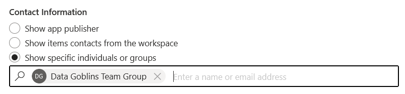
If using Teams to centralize workspace/app management, you can place the team group e-mail, here.
WHAT IS THE SUPPORT SITE FOR THE APP?

Like the contact information, the support site appears in the app header. It’s a good practice to include a link to the support desk - if you have one - or a simple Microsoft Forms, SharePoint or Power Pages site that contains more information about the app or a way to request help and report issues.
Again, this is a very simple thing that can be a convenient way to help users and facilitate support of distributed content. Just don’t forget to teach end-users about this header, and the information therein.
IS CONTENT CLEARLY & CONCISELY LABELLED IN THE APP?
The navigation experience is the bread-and-butter of a good app. If your content is not clearly labelled or organized, users will have it difficult to find what they need; so ensure that the labels are explicit and navigation menu organized. Failing to do this will create significant adoption barriers. There are some very simple steps you can take to handle this:
1. Rename content:
Renaming content in the app doesn’t break links or rename the workspace item. It can also be changed easily after publishing. So rename the reports to something short, recognizable and consistent with the app content scope.
2. Add Icons:
Since the advent of communication via social media and SMS, we are very used to seeing icons and emoji’s in regular conversation. Prefixing labels with icons can make it quicker and easier for users to visually identify specific content when done in moderation. Generally it’s recommended to do this only with the first level of navigation, although it depends on your end-user audience. To add icons, you just use the windows shortcut WIN + . (windows key + period key) 👍

3. Group app content into sections:
In the second step of app creation, you can add content, links or sections to the app navigation. Sections are folders that let you group other content types. This is an essential way to keep your app organized, especially once it reaches a certain size.
4. Order content appropriately:
This goes without saying, but arranging content from the most popular, high-level reports at the top (i.e. executive views) to the most detailed, niche views (i.e. paginated reports) at the bottom can help your users navigate. If you layout content this way, the majority of users will then need to look through less navigation items to find what they need.
ARE APP AUDIENCES USED IN AN EFFECTIVE WAY?

Click to read more about use-cases for App Audiences
Multiple audiences is a recent feature that allows a single workspace to distribute different content to different people in a single app. While chiefly meant as a tool to grant more granular control of content access through a single delivery method (a single app), audiences have a number of other use-cases. If you don’t need to restrict content across different users, audiences can be repurposed to improve and streamline the user experience in an app to a significant extent.
Click the image to read more about these use-cases and app audiences in general.
ARE YOU USING AZURE AD GROUPS TO CONFIGURE ACCESS?
If configuring access to an app audience, it’s better to give access to a group and then manage group membership. This is much easier than adding individuals to the app, and lets you re-use the group for other cases. Typically, this is done using Azure Active Directory (AD) groups, but can also be configured with distribution lists or groups in Microsoft Teams. The latter may be interesting if you have a large enterprise app distribution, where the Team serves as a central hub to discuss the content, provide feedback and serve related Power Platform solutions, like Power Apps or Power Automate flows all connected to the team. Consolidating the user experience like this can also improve adoption for users already using teams for meetings and other communication purposes.
ARE PERMISSIONS SET APPROPRIATELY?
ARE YOU SURE THERE ARE NO INCONSISTENCY BETWEEN ACCESS LAYERS?
Managing access in Power BI is not a trivial task, as can be seen in this summary diagram from Melissa Coates. For the diverse content living in an App (and the upstream content connected to it), the different layers of access and security may intersect to produce unexpected results. It’s thus important to set, document and test the access for all the content in the app to ensure no surprises upon distribution. Some of these can also be addressed by using groups for distribution, as they can be re-used across these layers to keep consistency (i.e. with Data Security and Distribution). Below are three examples of when access conflicts go awry, causing a bad experience for users or over-sharing data/functionality:
A user is given access to an audience but was not added to the dataset security role (RLS or OLS). In the relevant app report visuals, they only see “grey boxes of death” and complain that the Power BI reports are not working. The user should have been added to the dataset security role.
A user is given workspace member access and also is added to a group belonging to a particular audience that does not have build permissions. The IT team later finds out that data security is “not working” for this person; they can see “everything” and they can also connect to reports from Power BI and Excel. They should not have been given workspace member access.
A user belongs to an app audience that can see only one report and dashboard. The dashboard contains pinned tiles of reports that are not in their audience. The user (1) sees the pinned tile and (2) clicks on it, which takes them to the workspace report, prompting them to request access. Misunderstanding, the report creator approves the access from the e-mail prompt. It takes several months of the user using the “wrong” report before this mistake is discovered and corrected.
Ensure that mixed content types (i.e. dashboards with tiles from multiple reports linked to multiple datasets) have consistent access applied across them.
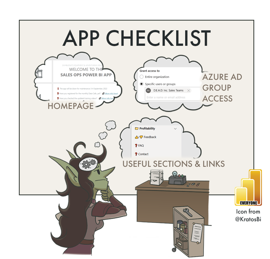
HAVE YOU CONFIGURED A HOMEPAGE FOR THE APP?
The first time a user comes to the app, they probably want to find their way around. What is this app, what’s new, and where do I find X? Creating a “homepage” dashboard is a low-effort way to give your app a professional look & feel and make a more welcoming experience. Be wary, however, that data cards will by default link to the reports in the workspace. You have to manually configure these cards to link to the reports in the app, using the app links.
DOES YOUR APP & REPORTS HAVE FAQ PAGE(S)?
When browsing app content, users often have questions about Power BI, the reports, the visuals and the data. Often, many of these questions are recurring over time. Collecting and centralizing the most frequent and important questions in a dashboard available from the app is an easy way to address them. When users ask a question covered by the FAQ, you can direct them to that dashboard to save you time and help them with any related or follow-up questions they might have.
This can also be a good place to put master data definitions (i.e. as a pinned table or multi-row cards visual) or calculations that are not widely-known or are debated across teams. This improves transparency and helps users understand how the data is used in reports.
Further, the FAQ or Homepage can be a place to show a visual roadmap of planned app content. This might be incorporation of new data (i.e. next year’s budget or exchange rates), new reports, pages, visuals or views, or even new functionality released with Power BI (for example app audiences). It can also clearly show when user ideas are planned in the roadmap so they can see their feedback was incorporated without waiting for the released feature.
Finally, the FAQ can be a good place to list training documentation and videos. Users might also be directed to a person or form they can use to request individual or team trainings in their specific language or catered to their specific needs.
IS CONTENT LOGICALLY & EFFECTIVELY GROUPED?
When a new app is released, there are often many requests for training to use the reports. Further, new employees or app users need to also have this training. To save time, it can be valuable to have short and engaging (1-2 minute) training videos for each report page. These videos can either be incorporated in a dashboard using Microsoft Stream, or linked to directly from the app to a central storage location on a SharePoint or Teams site. Making these training videos readily available makes it easy for users to find basic answers or help for the reports, without requiring them to read lengthy slide decks or documentation.
IS THERE SOMEWHERE USERS CAN GIVE FEEDBACK/REPORT ISSUES?
NOT VIA EMAIL
Being able to collect and implement feedback is a critical part of sustaining successful adoption of a Power BI solution. Too often, however, we rely on getting this feedback ad hoc via email, teams messages or in meetings. Collecting feedback in a centralized, structural way is paramount to planning and scaling your app. This can be as easy as a Microsoft Form embedded in the content area via a “Link” added to the app, but can also be integrated with your organization’s service desk or enterprise IT ticketing system. The important thing is that the feedback reaches the report creators and app owner directly, so they can act to implement it. Then, once it is implemented, the person suggesting it should be acknowledged and credited to incentivize further feedback.
It might be worthwhile to create separate links for feedback/suggestions vs. issue/bug reporting, which would likely be handled in a separate funnel.
HAVE YOU TRAINED END-USERS TO USE THE APP?

Training users before app release and during hypercare is critical to successful adoption.
Launching an app always requires a training to introduce the app to its audience. End-users should be explained what the content scope is and how to use the reports. A few basic topics can always be covered, as well as the specific questions and user stories addressed in each report page.

Good apps help users find opportunities in data.
TO CONCLUDE
Apps are a powerful and convenient way to organize and distribute content. To promote adoption and a professional look & feel of your content, it’s important to have a good app. This means taking care of not only the app aesthetics and organization, but the smaller nuances of access, training and feedback collection.
Following some simple steps will result in not only a better look & feel for the app, but a holistically better user experience for end-users.
DATA GOBLINS POWER BI APP CHECKLIST
Version 1.0 - Last update: Oct 17, 2022
Use the below interactive checklist to follow-up on your Power BI App:
Click the question mark (?) for a link to a reference document. This will be learn.microsoft.com documentation; if none are available, this may be a Data Goblins article, or another blog post reference.