KPI Tab page navigation in Power BI
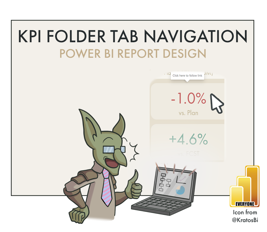
A SIMPLE DESIGN TIP FOR POWER BI REPORTS
…to improve user experience of page navigation & “click for details” user mentality
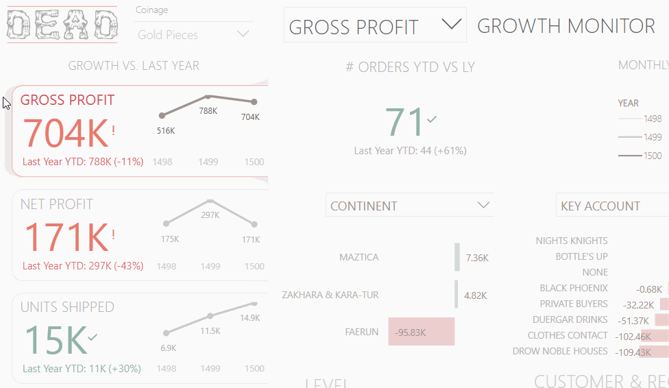
Interactive KPI cards can be a convenient way to navigate across Power BI report pages
Use-Cases:

MULTIPLE KPIs:
If you have several KPIs shown in the same style, this is a convenient way to click through to specific views for those metrics.

SMALL MULTIPLE CHARTS:
These show the same visual for different metrics or filters. It can be a way for users to click on these charts for more details after the small multiples gives them an overview.

GUIDED USER EXPERIENCE:
Since tabbed designs are common in many applications, if your design looks like a tab, users will expect interaction to do something.

NAVIGATION TO HIDDEN PAGES:
To reduce report ‘bloat’, certain hidden views or pages can be reached through navigation options like this, to keep a lean and simple user experience.
When to not use it:
REGULARLY REVISED REPORTS:
If your report design is being updated regularly, this style of navigation can be difficult to maintain. A common issue is that new views or pages are made, but the navigation is not updated. Or worse, changes to existing reports have the navigation go to the wrong page by mistake - or are forgotten, entirely.
USERS ADAPTED TO ANOTHER WAY OF NAVIGATING TO PAGES:
If your report design is being updated regularly, this style of navigation can be difficult to maintain. A common issue is that new views or pages are made, but the navigation is not updated. Or worse, changes to existing reports have the navigation go to the wrong page by mistake - or are forgotten, entirely.
How to do it - Ingredients:
DATA STORAGE:
DIRECT QUERY
IMPORT
COMPOSITE
METHOD:
VISUAL MACGUYVERING
ELIGIBLE WITH:
BUTTONS / IMAGES OVERLAID ON ANY REPORT ELEMENT
I discovered this myself when trying to fulfill a specific customer business requirement
How to do it - The Recipe:

Step 1: Create tabbed layout / design
Because KPI callout cards are so essential to a good report / dashboard, using a tabbed layout is something that often has a big impact on the design & user experience. It’s important to plan it out beforehand, so it is used effectively. Illustrate on paper where the tabs will go relative to the rest of the report, like the title or any slicers. Ensure that enough canvas real-estate is left over for your other visuals. Most of the time the tabs should be either along the top or the left, as these are the areas that contain the most critical, less detailed information, such as KPI cards. Tabs on the right or bottom are best used for selections that warrant less attention, like common filter views or links to external pages.
Next, illustrate the background in any program from Photoshop to PowerPoint. You should have one background for each ‘tab’ when it is selected.
“Tip: Aim for as much static information as you can on your background image, like labels, tabs, titles, etc. It can be a big performance booster! Each visual element in a report can slow down render time.”
Step 2: Create and format the KPI cards for the tabs
Make the visuals that will live in the tabs users will select. These can be standard KPI visuals, or can contain some extras, like slope lines. What’s key is to make the formatting of the selected ‘tab’ stand out. For example, use darker colors and thicker fonts, or conditional formatting on the selected one while the others are grey.

Step 3: Insert a ‘Blank’ button and cover the unselected tabs with it
This button is what does the actual action of the page navigation. It is an invisible ‘layer’ over top of the visuals you placed. Remember, though, if you cover the visuals, the users will not be able to see the visual header or the tooltip! This can also be a good trick if you want to selectively hide these things.
Step 4: Format the button so that the tab’s interactivity is visually obvious
You can do this using fill, border, or more. Make sure you update the tooltip to say something like ‘Click here to see more about <X>’