


Myths, Magic, and Copilot for Power BI

"WELCOME TO COPILOT [...] MISTAKES ARE POSSIBLE"
…let’s have a brief, blunt chat about Microsoft’s generative AI features for analytics and reporting
This summary is written by the author and is not AI-generated. Download this summary, here, without Goblins.
THE FIRST PART: INTRODUCTION
What is Copilot?
Copilot is a generative AI assistant from Microsoft embedded in many of their products, including Fabric and Power BI. It takes a user input (prompt) and using Azure OpenAI, generates a relevant output. The aim is to improve productivity, effectiveness, and user experience in these products. In Copilot for Power BI, users can generate code, ask questions about data, generate reports, and more. Users can only use Copilot with data or items in Power BI according to their roles and permissions. Copilot in Microsoft Fabric is GA in Power BI, but Copilot’s capabilities are still evolving over time.Copilot for Power BI is secure:
When using Copilot for Power BI, your data is secure and not sent to or accessible by Open AI’s public services or used to train foundation models. It remains in your organisation. You have control over whether its enabled and who uses Copilot for Power BI. Copilot is expensive; for the tests in this article, I used 3% of my total F64 capacity that’s available in a 24h period.Cost of Copilot for Power BI:
Copilot requires an F64 Fabric capacity, and consumes from your available compute resources. Copilot consumes significant capacity and if you use too much, this can lead to throttling your other operations, including causing slow queries and reports. It’s important to do testing and capacity planning for Copilot before you enable it, and to monitor its usage to prevent disrupting your business-critical workloads. I used approx. 3% of my available F64 capacity to do the testing in this article. I worked with a Microsoft team to obtain this estimation; this figure is difficult to obtain.
THE LOUD PART: COPILOT SCENARIOS
Scenario 1 - Using Copilot to generate code:
Copilot for Power BI can be used to generate DAX code. In my testing, Copilot could generate useful DAX with clear and descriptive prompts. It’s important that users take an “informed iteration” approach and leverage trusted online resources in addition to generative AI, in this scenario. This could be beneficial for intermediate users, but novices are likely to waste time or resources dealing with errors or falling victim to AI mistakes.Scenario 2 - Using Copilot to ask questions about data:
Copilot for Power BI can answer questions about reports and models, responding either with text or visuals. In my testing, it seems to struggle with more complex models, and there’s significant investment needed to make a solution work well with Copilot. I question the rationale of using what seems to be an inherently unreliable technology in a scenario where trustworthiness and reliability in data is so important. I do not believe that it makes sense users should ask data questions to and trust the response of a tool that says on the label “mistakes are possible”. I do not see why a user would use Copilot to answer these questions rather than alternative, non-AI methods.Scenario 3 - Using Copilot to generate reports:
Copilot for Power BI can generate visuals and report pages in response to user prompts. Report pages use a nice possibility of layouts and a theme that seem to be default properties designed and set by a human, and not part of the AI generation. In contrast, the AI-generated chart type and formatting outputs of Copilot make reports hard to read in best-case scenarios, or reports include nonsensical or misleading visuals in worst-case scenarios. I do not find the reports generated by Copilot to be either beautiful or useful. I do not see why a user would use Copilot to generate reports rather than alternative, non-AI methods. I expect to see improvement here, but remain sceptical of this use-case and the overall value proposition.
THE QUIET PART: CONCLUSION
A solution looking for a problem:
In certain scenarios with deliberate preparation, Copilot for Power BI likely helps to produce useful outcomes. However, in general, it feels like a solution looking for a problem. Some use-cases make sense, but for others, it’s hard to see the value proposition, or understand why someone would use this.


The past year has seen widespread enthusiasm for generative AI, as tools like ChatGPT using Large Language Models (LLMs) have captured the imagination of the public and data professionals, worldwide. Microsoft’s own answer to the AI enthusiasm is Copilot, a suite of generative AI assistants embedded in the various Microsoft products, from Microsoft 365 to Copilot in Fabric. Copilot promises to “use AI to help you maximize your business potential and achieve more than ever before” (Quote from Copilot for Microsoft 365). Essentially, the idea is to help you to do more and improve efficiency, which should reduce costs. Microsoft Fabric is tied to this promise, too, being marketed as “the data platform for the age of AI”. This refers not only to Copilot, but also how Fabric can be a data foundation for other AI applications.
However, recent months reveal rising skepticism, concern and possibly even disillusionment with generative AI tools, both from investors (especially from investors) and from the public. Despite the massive investment, enthusiasm, and promotion, these tools seem to be seeing limited adoption and aren’t yet showing the measurable value that fulfills their promises. And yet, paradoxically, many professionals will agree anecdotally that they use generative AI tools regularly, and that these tools seem to help them be more productive in certain tasks. Furthermore, there are concrete success stories where generative AI is bringing value, such as the models like the latest versions of Alphafold (from Google) and ESMfold (from Meta) that aid in protein folding for pharmaceutical companies more effectively find potential new drug candidates. So, who are these tools for, what problems do they solve, and how can we use them effectively? This is too big of a topic for even Bink and Bonk the Data Goblins to solve, so let’s narrow the focus, a bit.

Click here to download a PDF of the summary that contains no goblin drawings.
In this article, we’ll examine the Copilots in Microsoft Fabric; specifically, Copilot for Power BI. To do this, we first need to look together at some basics of what Copilot is and what it aims to do. Here, we’ll also dispel some myths of Copilot, mainly misconceptions about what it does and how it works. Then, we need to go into the hard part, evaluating what we use Copilot for in Power BI, whether it’s effective for these tasks, and why we would do this at all over other “non-AI” approaches. Finally, we’ll try to draw some conclusions about the state of Copilot in Power BI, so far, and where this might be headed.
This article isn’t a technical deep dive. Nor is it intended to endorse or drum up enthusiasm for this feature. The intent of this article is to explain Copilot so anyone can understand it, then to critically examine how and why you might use it specifically in Power BI. This is a long and bumpy ride, folks… so, buckle up.
 The purpose of this article is threefold:
1. To provide an overview of Copilot in Fabric and Power BI; what it is, what it aims to do, what it costs.
2. To walk through 3 Copilot senarios: generating code, answering data questions, and generating reports.
3. To draw some preliminary conclusions about Copilot in its current state, and whether the attention and enthusiasm that it’s getting right now makes sense.
This purpose of this article is not to convince you to use or not use generative AI technology, Copilot, or Fabric, but to inform you about these things and discuss topics that I find interesting and important.
The opinions expressed here are my own and represent no other individuals, group, or organization.
 A clarification Kobold appears. Clearing its throat, it speaks in a squeaky voice:
Copilot in Microsoft Fabric is generally available for the Power BI experience, but Copilot continues to evolve over time.
- The capabilities, cost, and features of Copilot discussed in this article might change over time.
- The focus here is on the “hows” and “whys” of Copilot, which are less likely to change than features or details.
- One can’t discuss “hows” and “whys” without first mentioning some features/details; keep this in mind.
- The quality of the outputs you get from Copilot will always depend on the quality of your prompts, data, and models, as well as the readiness of your people and processes to adopt this technology, and the maturity level of your Fabric / Power BI implementation.
I realize that as of writing this article (Sept 5) FabCon Europe is around the corner, and I can guess there will be new announcements about Copilot. I will publish follow-up articles in the future discussing whether any hypothetical new features or improvements to Copilot address the concerns I put forward in the article.
These bookmarks are provided for convenience. If you have time, I do recommend reading the whole article.
THE FIRST PART: WHAT IS COPILOT AND WHAT DOES IT DO?
The aim of Copilot seems to be providing an AI assistant with which you can interact in the various Microsoft products to improve your productivity and make these products more convenient to use. The notion is that Copilot can simplify or automate certain tasks, which ideally should save you time to enable you to do more and reduce costs for your organization.
Most will be familiar with Copilot as the public service that’s been implemented in the Bing search engine or the Edge browser. Here, you interact with a chatbot in a separate pane or window. Generally, this Copilot experience is similar across the different Microsoft products; you interact with Copilot by providing it with statements and questions in a chat:

The Copilot pane in the Bing browser (in Dark mode). This is an example of the publicly accessible Copilot that everyone has access to.
The Copilot experiences in Fabric and Power BI can have a similar Copilot pane, which is embedded in either the Fabric portal or Power BI Desktop. However, some Copilot features in Fabric or Power BI don’t use the Copilot pane, opting instead for other user interfaces and experiences. For instance, generating text or visuals might occur in response to controls that a user can click, rather than explicitly writing a prompt.
Some example screenshots of Copilot in Power BI are in the drop-down menus, below:
As you can already see, Copilot in Bing and Copilot in Fabric work and look a bit differently. That’s because these are different Copilots. This is the first clarification to make; there are many different Copilots across the different Microsoft products.
Copilot is a generative AI tool, and generative AI is a form of “narrow” or “weak” artificial intelligence. A simple explanation is that tools like Copilot provide a chatbot interface to interact with pre-trained foundation models like GPT-4, which might have additional tuning on-top. Inputs to these large-language models (LLMs) might use additional pre-processing with contextual data (which is called grounding) or post-processing by applying filtering or constraints (i.e. for responsible AI, or AI safety). These foundational models are trained on large amounts of data to learn patterns and can then generate new data that should resemble the inputs while also being coherent and context appropriate.
Strictly speaking, Copilot and the LLMs that it uses are generally considered to not “be intelligent”, nor are they capable of tasks that require true human intelligence. There’s more complexity and nuance than this, of course, but the purpose of this article isn’t to explain the technical details of Copilot, generative AI, or LLMs, but rather to focus on how they’re used.
If you’re interested in an article that explains the details of how the GPT models work, I suggest this post by Bea Stollnitz. If you’re interested in a more creative and existential exploration of generative AI, consider reading the article “Is my toddler a stochastic parrot?” by Angie Wang. Another good article is “Why A.I. Isn’t Going to Make Art” by Ted Chiang.
Most people are familiar with Chat-GPT, and some can be confused about how Chat-GPT differs from Copilot. In short, the tools are similar in their user experience, where a user can submit a prompt to request an output
Chat-GPT and Copilot differ in several ways, as shown in this overview article:
Copilot is in a separate, secure service, where you don’t access the Open AI service or models, but rather a distinct Azure Open AI instance managed by Microsoft, which the organization Open AI doesn’t have access to. Copilot might use the same “foundation models” as ChatGPT, like GPT-4, but do not train those foundational models with your prompts or data.
Copilot can use data from your Microsoft environment, applications, or chat history with Copilot to provide additional context to the model. This grounding should ideally help the model to produce more useful results and less hallucinations.
Copilot is embedded in the Microsoft products, meaning you can use it as you work with these applications, and Copilot can leverage use their functionality in its inputs or outputs. Ideally, this would support you as you use these applications, helping you to be more efficient and get a more convenient user experience.
Copilot is governed by settings and oversight that you control, like Compliance and Purview.
COPILOT IS NOT A SINGLE PRODUCT
While it’s often marketed and spoken about like it’s a single thing, “Microsoft Copilot” isn’t one product. Copilot is the catch-all name given to these AI assistants and similar generative AI features across many Microsoft product families. There are many Copilots, depending on which product they’ve been integrated with. While these different Copilots might have similarities in their user interface and experience, they may differ greatly in what they do, how they work, and what you must pay to use them.
THERE ARE DIFFERENT COPILOTS ACROSS THE MICROSOFT PRODUCT ECOSYSTEM
There are already many different Copilots which do different things across the Microsoft product families. These include everything from GitHub Copilot to Copilot in Microsoft 365 or Microsoft Fabric. You can see an overview of some of the different Copilots in the following diagram:
It’s important to know that these various Copilots are different from one another for several reasons:
They do different things: Copilot in Fabric (like in the Power BI workload) only accepts text (unimodal) and doesn’t accomplish the same tasks as Copilot in Bing Chat, which can accept text, images, or audio (multimodal).
They work in different ways: The different Copilots might have subtly different architectures, use different foundational models (like Chat-GPT4 or DALL-E3), and return different results.
They have different pricing models and cost: You don’t pay for one Copilot. Rather, you pay for the different Copilots with different licenses. These Copilots use different pricing models, depending on the product in which they’re integrated.
This applies not only across products (like Fabric, Microsoft 365, and Bing) but also within a single product.
THERE ARE DIFFERENT COPILOTS IN MICROSOFT FABRIC
Even if we look only at Fabric, Copilot does different things depending on the workload or item you’re using it with. Additionally, while Copilot in Fabric is billed as part of your Fabric capacity compute utilization (more on that later) but the different Copilots in Fabric consume this compute in different ways.
The following diagram shows an overview of each workload (like Data Factory), the items within that workload that support Copilot (like Data Pipelines), and what Copilot typically aims to do in that context, from a technical standpoint:
So, even within Fabric, “Copilot” doesn’t refer to one thing, in particular. Generally, it refers to these AI assistant or generative AI features that aim to improve productivity in different parts of the platform. This can be especially confusing, since Fabric also has various AI features that aren’t explicitly marketed as Copilot but have similar use-cases or experiences.
An example of this are AI skills, which is a data science item type in Fabric (like reports or semantic models). Since the name of this feature doesn’t clarify what it does, AI skills let you set up a way for users to interrogate your lakehouse and warehouse tables by using generative AI. AI skill items are different from Copilot, as explained in this blog post, since they let you provide examples (called few shot learning) or additional context. They do still require Copilot to be enabled in your tenant.
There are also some features where it’s not yet clear whether they’re Copilot or not. For instance, the Microsoft documentation specifies that you can create your own Copilots, but this documentation then redirects to Azure AI Search.

It’s important to know what is part of Copilot in Fabric and what is not, and the differences between them. This is due to the same reasons as previously mentioned: these Copilots do different things, they work in different ways, and they have different cost. The cost is particularly important, since Copilot is billed differently than other workloads (which we’ll talk about later). For instance, it’s functionally relevant to know if the “AI skill” item is billed like Copilot, or in another way.
HOW DOES COPILOT WORK?
Like other Copilots and generative AI tools, the purpose is to take a user input phrased in a standard question or statement (provided in natural language) to produce a response containing a useful output. To generate the output, Copilot uses a large language model, with grounding from your data.
To paraphrase what Copilot does in steps, it:
Accepts a prompt or user interaction as input.
Preprocesses the prompt with additional contextual information (called grounding).
Submits the prompt (possibly with modifications) and grounding data to Azure Open AI.
Waits for the LLM in Azure Open AI to produce and provide an output.
Receives and postprocesses the LLM output, applying content filters, responsible AI checks, or business-specific constraints.
Returns the output to the user.
The following diagram depicts this process visually, without illustrating capacities, workloads, or items:
To reiterate, the purpose of this article isn’t to deep dive into how Copilot works, but there’s some important points to address before we can move on to talk about the “hows” and “whys” of different scenarios. I also want to try to explain Copilot in simple terms, because I feel that there’s an over-abundance of technical jargon. This jargon makes it hard for a lay audience to understand Copilot, due to both to some obtuse feature names and terminology of generative AI and certain concepts in Fabric.
WHAT’S REQUIRED TO USE COPILOT IN FABRIC OR COPILOT FOR POWER BI?
To use Copilot, you need to consider both hard and soft requirements. Hard requirements are what you need to enable and access the feature, while soft requirements are what you need for it to produce a usable result.
Hard requirements for Copilot which you must always have include:
Reside in a supported cloud.
i.e. Copilot isn’t available on sovereign clouds.Have a workspace with license mode set to a paid Fabric Capacity, with F64 or higher SKU size. Henceforth, I’ll call this an F64 workspace for conciseness.
i.e. Copilot isn’t available on F2 SKUs or Fabric trial capacities, even though a trial is an F64 SKU.Enable Copilot in the administrator settings for Fabric.
i.e. This involves both enabling the feature and whether data can be processed outside of your geographic region, compliance boundary, or national cloud instance.
For Power BI Desktop, you need:
A version of Power BI Desktop installed that supports Copilot (April 2024 or later). If you use the version from the Microsoft Store, you should have the latest version.
Admin, member, or contributor access to a workspace with license mode set to a paid Fabric Capacity, with F64 or higher SKU size. Copilot must be enabled on that capacity. Note that you can use Copilot from Power BI Desktop when connected to semantic models that are in other Fabric capacities, like F2 or trial capacities. The Copilot compute will go to the F64, while as I understand it, the queries to the model will go to the F2 or trial.
Soft requirements for Copilot that improve the results you get with Copilot include:
You create and submit prompts that are explicit, descriptive, and detailed to get the output you want.
You submit prompts in English. Unfortunately, the corpus of information upon which LLMs were trained is predominantly English, meaning that English-language results are generally going to be better than when prompts are submitted in other languages.
Validate results before you use them by referencing quality and reliable sources of trustworthy information online.
The semantic model follows good data modeling practices, like using a star schema, only including the relevant fields, avoiding redundancy, and so forth.
Hiding fields that shouldn’t be used for user reporting, like report-specific objects, key columns, etc.
Using good naming conventions for tables, columns, and measures in your semantic model. These model objects also need to be named in English without acronyms (like AGS for adjusted gross sales), abbreviations (like Adj. Gross Sales for adjusted gross sales) or grammar, i.e. there should be spaces between words instead of underscores or hyphens.
Editing the linguistic schema of your semantic model by using the Q&A setup. Linguistic modelling helps form meaningful associations between certain words and objects in your model. This context improves the results that Copilot returns when answering questions about the model. It’s unclear whether adding descriptions helps to improve results, but descriptions are also a good practice in general to help users who consume the model for their own reports and analyses.
Setting the row label and key column properties for tables in your semantic model. These properties help determine how to aggregate data when there are duplicate values identified by another column. The example from Chris Webb’s blog is avoiding grouping customers only by name, since some customers have the same name, but are identified uniquely by their customer ID.
For additional information about how to set up a semantic model to use with Copilot, see this article from the Microsoft documentation.
WHAT OUTPUTS DOES COPILOT GENERATE?

Throughout Microsoft Fabric, the outputs that Copilot generates are text. Even when generating reports or visuals, these are simply a rendering of visual metadata in the Power BI service, where these visuals query your model. This is important to understand because – for instance – Copilot will only generate visuals based on how it understands that visual metadata. It’s constrained to basic formatting options (as opposed to flexible visual MacGuyvering a human might do…).
Furthermore, when you ask Copilot a question about your data and it returns a result in a visual or text, it is not outputting your data. Rather, Copilot outputs and evaluates a query, which is run against a Fabric data item that contains your data, like a semantic model, lakehouse, or warehouse.
Some additional clarifications about the outputs of Copilot are listed below:
Copilot doesn’t generate facts and might be incorrect: The natural language, metadata, or code generated by Copilot can never be taken at face value, since there’s always a possibility that it might be incorrect. As disclaimed lightheartedly in the Copilot panes, themselves, “Mistakes are possible” or “AI can make mistakes”. Furthermore, there’s no measure or indicator of certainty, or an estimation from the tool of how reliable the output actually is. Because of this, you always must validate even simple outputs from Copilot or a similar LLM tool, like Chat-GPT. If you don’t validate the output, then you are literally operating on gut feeling or blind faith that it’s correct. Vice-versa, you also can’t use Copilot or Chat-GPT to validate your own ideas, since it might simply agree with you, even when you’re wrong.
The quality of the output depends on the quality of the inputs: When you use Copilot, the results you get depend on how well you’ve constructed your prompt (prompt engineering), and the quality of the data used to ground the model response. In the latter case, considering an example where you use Copilot to summarize a semantic model, “the quality of the data” refers to three things: first, the literal data quality; second, the quality of the semantic model; and third, how well that semantic model has been set up to support use with Copilot in Power BI. I will go into more details about these points later in this article, but it’s a tale as old as time: if you put shit in, then you get shit out.
Copilot doesn’t generate data: Copilot doesn’t connect to external data sources to add or use new data in its outputs. However, Copilot can generate code that–when run–will generate new data. An example might be if you use Copilot in a dataflow gen2 or a notebook to generate a date table, which you can load to a lakehouse or warehouse. The date table isn’t what’s generated; Copilot generates code using available functions and setting variables to obtain that date table result in a query or dataframe.
HOW DOES COPILOT GENERATE THESE OUTPUTS?

To get this output, Copilot will take your prompt and grounding data to use with the LLM. This grounding data is perhaps a misnomer, because it’s not necessarily the data from your data items. Rather, it refers to the metadata that defines i.e. your semantic model and how you’ve set it up to work. For instance, Copilot looks at the names of the tables, columns, and measures in your model, as well as their properties, including the linguistic schema (i.e. synonyms), among others.
Again, the details of the “black box” technical process of how the model generates its result once it tokenizes the input is complex and beyond the purpose or scope of this article.
However, there are some important clarifications to make regarding how Copilot arrives at this output, and what it does along the way.
Copilot doesn’t send your data to Microsoft, Open AI, or anywhere else: A common concern from companies when using generative AI is ensuring compliance and avoiding data exfiltration (which is a fun term for your when data leaves your company). Copilot doesn’t use or interact with any of the public Open AI services, including its APIs, and Open AI doesn’t have access to the Azure OpenAI instance.
Copilot doesn’t use your prompts or data to train foundational models: In addition to the previous remark, since your data isn’t accessible to Open AI, it can’t be used to train their GPT models. Other foundation models are also not trained with your prompts or data.
Users can only see data that they have access to: Copilot will only use grounding data and return query results for items that someone has permissions to use, and data which that person has access to. For instance, Copilot should respect workspace roles and item-level permissions, as well as row-level security configured appropriately in a semantic model. Again, it’s up to you to ensure that these things are configured correctly before users start using Copilot in Power BI.
The rest of this article focuses on the Copilot features in the Power BI workload of Fabric.
SO WHAT IS THE COST OF COPILOT IN MICROSOFT FABRIC, OR THE COST OF COPILOT FOR POWER BI?

A frequent question about Copilot is how much it costs. This is a difficult question to answer, because of how complex it is to understand the pricing model for Copilot in Fabric. Furthermore, this isn’t necessarily a helpful question to ask, as Chris Webb points out in his blog post. There’s no price tag, per-user license, or subscription for Copilot in Fabric. Rather, the cost is paid from the available compute you’ve purchased as part of your Fabric capacity license. I’ve tried to make it as simple and concise as possible, below.
To use Copilot, you’re required to have either Power BI Premium Capacity (P SKU; no longer purchasable) or a Fabric Capacity (F SKU) of F64 size or higher. The cost of a Fabric Capacity is visible on this Fabric pricing table.
Copilot is not available for Trial capacities, so you can’t test it for free. Instead, you can enable an Azure pay-as-you-go subscription with an F64 capacity that you keep paused, and only un-pause when you test it. Note that you don’t pay for what you use, rather you pay a constant rate so long as the capacity is running; if the capacity is unpaused for 1 hour, you pay for 1 hour, if you use it or not. That is how I test Copilot and the other F64 functionality, for instance. Of course, remember to pause it when you’re done testing or else it will get very expensive…
This article cost me approximately ±200 EUR to make in F64 costs, because I repeated the tests over two separate capacities that I purchased (I did not use credits). That’s a lot of Waterdhavian gold pieces!
If you have an F64 and Copilot is enabled, you can use it from any of the workloads and items described earlier in this article. When you use Copilot, it costs Capacity Units (CU), depending on the size of the input and output (in tokens). You can see the up-to-date cost for Copilot in Fabric here in the Microsoft documentation. There’s also an end-to-end example, here.

This is absurd to try and understand, since it involves two separate layers of abstraction between your wallet and the action: input/output tokenization (how many tokens) and CU consumption rate.
Tokens: A token is the smallest unit of information that an AI model uses. For LLMs like the OpenAI LLMs that Copilot uses, tokens refer to “common sequences of characters found in a set of text”. A model breaks down text into tokens using a process called tokenization, which you can test yourself here for Open AI. Note that each token has a unique identifier, or Token ID. For Copilot costs, this essentially means that longer prompts and longer outputs will cost you more. Notably, output length is 3x more expensive than input length.
Capacity Unit consumption rate: A Capacity Unit seconds or CUs is the unit of measure for how much compute power you have available to do things in Fabric. You have a finite number of CUs depending on the size of your capacity, where an F2 SKU has significantly less than an F64 SKU. You pay either for a pay-as-you-go (billed per second; min. 1 minute) or reserved instance (billed at a fixed amount, monthly with an annual commitment).

The things in Fabric that cost CUs like using Copilot are called operations. These can be either interactive or background operations, which differ in terms of how their CU spend is handled by Fabric, and when throttling occurs. Copilot is a background operation, which means that if there are moments of high usage you can leverage smoothing. Smoothing spreads out the CUs you use over a moving 24-hour window, to make it easier to manage peak usage and plan for the mean, rather than the max concurrency.
Once you consume your available CUs, you can start to experience slow-down and even errors with most new operations in Fabric. When this happens, you’re experiencing throttling. Throttling occurs when you use too much CUs, which results in a CU debt of how much you’re overspending, called carryforward.
If you produce a high utilization with many concurrent background operations, smoothing could mean that you might encounter throttling over a longer period.
Taken together, your usage of Copilot—like usage of other Fabric workloads—doesn’t result in a proportional increase in literal cost. Rather, using Copilot takes from your Fabric capacity’s available compute resources—CUs—that you pay for in your Azure subscription. As such, the cost of your Copilot is paid in whether it results in over-utilization of CUs, causing performance decay or errors in other parts of Fabric, upon which critical business decisions might be made.
As Chris explains in his blog post, the best way to understand Copilot pricing is to examine it as a percentage relative to your total base capacity. Chris explains how to find this in “the ‘Background operations for timerange’ table on the TimePoint Detail page of the [Fabric] Capacity Metrics app.”.

Ultimately this complexity is one of the challenges for using Copilot in Fabric. Because of the various layers of abstraction combined with features like smoothing, how throttling works, and understanding the capacity metrics app, it’s hard for the average administrator to understand how Copilot usage is affecting the capacity once it’s enabled. Furthermore, it’s hard to extrapolate tests to real-world scenarios.
If you’re evaluating Fabric and conducting capacity planning to figure out what F SKU you need, then this complexity makes it difficult to evaluate, and you might over- or under-estimate your needs.
Copilot usage can have a significant impact on your capacity usage, so it’s important to still do this capacity planning, then monitor usage of Copilot using the Capacity Metrics App.
 How much Capacity did I use while writing this article:
For the tests in this article, I used approximately ~3% of my F64 capacity available in a 24h period.
- ~0.2% of 24h capacity for scenario 1: generating DAX code
- ~1.0% of 24h capacity for scenario 2: asking data questions
- ~1.8% of 24h capacity for scenario 3: visual and report generation (generating 2 full reports, ~2 visuals, and ~6 cards)
I worked with a team from Microsoft to get these estimations. Normally, calculating this is significant effort and not easy to do. Refer to the Fabric Capacity metrics app if you want to monitor your own usage, as described earlier in this article.
Goblin tip:
If you need help or additional resources for costs of Fabric and Power BI, see the following articles:
THE LOUD PART: SHOW ME THE MAGIC

Generative AI – including Copilot – has been touted by tech companies, consultants, and influencers as being a groundbreaking technology that will revolutionize productivity and change the way we work. This is no different for Power BI, which has seen a surge in the interest in and marketing of Copilot and other generative AI integrations.
Undoubtedly, generative AI has and will continue to have an impact on our work. But…
Is Copilot in Power BI really revolutionising productivity?
Is it something that you should use, or that you should give a strategic focus in Power BI?
Is it a driving factor to consider purchasing a Fabric capacity F64 SKU, or not?
To look functionally at Copilot in Power BI, let’s examine three of its biggest use cases: helping you write code (DAX), asking questions about a model (generating queries), and generating visuals or reports. Note that there are other specific use-cases of Copilot which I don’t go into for the sake of conciseness, like generating measure descriptions.
Generative AI has seen an explosion in many different areas and sectors. Among these are creative areas, such as fictional writing, visual artwork, and music. Part of the reason that generative AI does so well with these creative areas is because they have soft accuracy. By soft accuracy, I refer to the fact that these outputs don’t typically have a precise definition of a correct output. When you request a paragraph of fiction, a painting of a landscape, or a snippet of a rock song, there is a wide margin of interpretation; you can tolerate many possible outputs as usable. Note that this doesn’t mean that it’s a good or even an interesting output (see “Why A.I. Isn’t Going to Make Art” by Ted Chiang), but for the prompt writer, it might be usable.
In contrast, by hard accuracy I refer to outputs that must meet a very precise—possibly even unitary—definition of correct. When you request a piece of code or a very specific, detailed image, there is a slim margin of acceptable outputs. Notably, soft or hard accuracy is not specific to a particular type of output or use-case, although, generally, creative areas more typically have these soft accuracy requirements. However, when it comes to outputs about data, there is typically only a single correct answer… the truth.
Generative AI is good at use-cases with soft accuracy. Unfortunately, in business intelligence, almost nothing fits in that box. When it comes to a BI solution, the business expects only one answer – the correct one. An incorrect or even a misleading output can lead to wrong business decisions and disastrous results.
EXAMPLE 1: USING COPILOT TO HELP WRITE DAX CODE

A common area where many people struggle is getting the right DAX formula for a particular business metric or reporting requirement. Already, it is very common for people to turn to Chat-GPT to help them write or understand DAX. In this case, Copilot might be a preferred option, since Chat-GPT could be disabled in your organization, or your DAX code or prompt could contain sensitive information that you don’t want to use with the public Open AI services.
Generating code with Copilot is an obvious use-case not limited to DAX in Power BI, but also applies to the Copilots in other Fabric workloads, such as using it in Notebooks for Pyspark or Real-Time Analytics for KQL queries.
Beyond code, this is one of the more common use-cases for LLMs, in general, where a user is searching for an answer to a question or a solution to a problem. Importantly, there are some features of LLM outputs that are important to understand in this context:
They aren’t generally deterministic: When you submit a prompt multiple times to Copilot or Chat-GPT, you aren’t guaranteed to get the same answer back. However, in other tools that allow more tuning of LLM responses, you can set the temperature property lower (or colder) which makes results more deterministic.
They can produce incorrect results, or “hallucinate”: When Copilot or ChatGPT produces an output, there’s no guarantee that this output contains factual, correct, or trustworthy information. To reiterate from earlier in this article, these tools might produce text (arrangements of tokens) that make sense to its complex pattern-matching, but which do not correspond to any real-world element that actually exists. There’s also no indication of how certain or trustworthy the output is. As it says in every single Copilot window, “AI can make mistakes”.
Outputs can be improved but not perfected: Both developers and users can invest time to produce a better output. Developers (in this case of semantic models and reports) can take steps to make the semantic model work better with Copilot. Users can take steps to engineer a better, more descriptive prompt that aligns to the terminology used in the model. However, since the output of an LLM is not deterministic, there is always a non-human, probabilistic element to consider.
THE EXAMPLE: DIFFERENCE BETWEEN TWO DATES IN HOURS
Consider an example where a user wants to write a DAX measure that computes the difference between two Datetime fields in hours. They want to use this DAX measure to analyze the typical short-term delivery times for certain products that customers order using express shipments.
In the DAX Query view of Power BI Desktop, they might use Copilot for this, trying a few different prompts to “test drive” the functionality before proceeding with the following:
In a real-world scenario, people are lazy and not trained to be “prompt engineers”. While we often say that tools like Copilot or Chat-GPT accept “natural language” prompts, typically, good prompts don’t come to users very naturally. The initial prompt in the previous example describes what the user wants in more “normal” language. While this prompt comes more naturally to the user, it is less likely to return correct results because of the following reasons:
The user doesn’t specify where the order date and billing date columns are, which might be necessary since this model is imperfect (like in real-life) and these columns exist redundantly in both an ‘Orders’ and an ‘Invoices’ table.
The user doesn’t specify how to get express orders, which according to business logic should be done via the Order Document Type, or Order Doc. Type.
The user doesn’t specify how to aggregate the hourly difference between the order date and billing date.
If we execute this prompt, after waiting for Copilot to “work on it…”, we get the following result.
The user can’t run this query, because there are errors.
There’s a lot to process here, but let’s start with these errors:
Line 8 - A measure can’t use a column reference:
Line 11 – The ‘Invoices’ table has no relationship to the ‘Orders’ table. As such, RELATED(‘Invoices’[Billing Date]) is an invalid reference in this context.
But there are other problems, too, such as:
Line 7 – The measure begins with an IF statement to apply the filtering logic for the calculation to consider only express orders. This is incorrect, the measure should instead use CALCULATE to modify the filter context, or FILTER the inner Orders table being iterated by AVERAGEX. This IF approach would only theoretically work in a visual that contained the Order Doc. Type Text column.
Line 8 – Copilot tried to filter to orders with “Express”, which isn’t a value that exists in that column. The correct value is “Express Order”. Even if this filtering logic was applied correctly, it would return blank, because there are no orders where Order Doc. Type Text = “Express”.
Line 9 – DATEDIFF refers to the Order Date and Billing Date in different tables, even though AVERAGEX is iterating over the Orders table, which contains a Billing Date.
However, to Copilot’s credit, it was able to identify correctly that the measure requires an aggregation, and it “guessed” that an average over the Orders table would make sense. It does. However, it would be up to the user to understand why Copilot added this, and how it works. Ideally, the user would look at this result and try to understand it. Then, they could modify the expression themselves to get a result that works.
In this case, the user is annoyed that they got errors from Copilot, so they open a new query window to re-submit the same prompt and hope for better results. Remember that Copilot is not deterministic. If we run this exact same prompt again in another query, we may get a completely different result with different issues. This might depend on other grounding data that Copilot is taking from that different session, i.e. if you submitted other prompts before.
This query has no errors. “Great!” The user thinks, so they run the query. However, it returns a blank result:

Evaluating the previous query in the Power BI Desktop DAX query view returns blank results.
So, the user tells Copilot that it didn’t work, and asks it to try again. Copilot makes some minor modifications to the measure and the user gets the following result:
But, alas, the result is still blank.

The result is still blank when evaluating the revised measure after the second prompt.
The reason that this result is blank is of course because of the issues highlighted earlier. However, additionally, Copilot is introducing new problems because of a flawed prompt; it’s computing the difference between Order Date and the Date from the Date table, which has a relationship… to Order Date. So even if we correct the filter to “Express Order”, the result will be incorrect; it will be 0.

When keeping the query from the previous prompt, then manually changing line 19 to filter to “Express Order” instead of “Express”, the query no longer returns blank, but returns 0. Click to enlarge the image in a lightbox.
“What the heckin’ heck!” The user thinks. “Why is it 0?! That’s not possible!”
From here, the user might understand that there’s a problem with the DAX and try to modify it and get a better result. Or they might think that there’s a problem with their data, or their model, and start troubleshooting there. Either way, they start a journey that might not have been necessary in the first place.
Now, one issue here is that the user’s prompt wasn’t sufficiently descriptive, so let’s address that, first. The user writes a rather explicit prompt that states what they want, using the exact column and table names as they appear in the model, and the exact value that should be filtered to so that the measure looks at only express shipments.
With this improved prompt, Copilot suggests a different measure that filters the Orders table to only express orders, and then computes the difference between the Order Date and Billing Date in hours.
This is already an improved result from Copilot compared to the previous attempts. When running this query, it produces the expected result.

The result of the measure evaluation for the previous query, which returns the expected result.
So, you can see how important the prompt is even in this very specific and simple example. However, it relies on the user knowing and referring to the exact field and table names (or their synonyms), as well as explicit verbs (like filter) and the exact values for filter criteria (like “Express Order” instead of “Express”).
In real life, however, the story might not stop here. What if:
…the user needs to optimize this DAX, because the measure is slow in a visual?
…the business wants to add exceptions, like using the Ship Date for a region that recognizes revenue at using the Ship Date, since they only invoice at the end of each month?
…the data isn’t suitable for an average, because there are a few order lines that are outliers with extremely high values, which make the average higher than it seems?
…the Datetime fields need to account for changes in daylight savings time, or if the user is really unlucky, timezones which differ between the delivery plant and the customer address?
In each of these scenarios, the user would either have to spend time and compute resources with Copilot to adjust the measure, or they would have to apply their own critical thinking and knowledge to get there, themselves. So, Copilot can certainly help the user write DAX when the model, data, and prompt are suitable. However, it doesn’t remove the need to think or know DAX, yourself.
USER EXPECTATIONS AND BRUTE FORCE:
USING GENERATIVE AI TOOLS EFFECTIVELY
When using Copilot or Chat-GPT to generate DAX, users aim to get working code that returns a correct result in queries or reports. This is demonstrated in the previous example. Here, the user is expecting Copilot to produce a functional result, trying again and again with variations of their prompt until they see a number that seems correct, which they can then validate. This is a very inefficient way to use Copilot and similar tools, like Chat-GPT, where the user might copy-and-paste the code between the Chat-GPT window and the tool they’re using.
This brute-force iteration wastes time and resources, and it can be an obstacle to you actually learning as you work. Instead, you should consider a more informed approach, where you leverage both generative AI tools like Copilot or Chat-GPT together with reliable and trustworthy resources, like documentation or expert instructions that you would find online.
Generating code and iteratively working toward solutions to intellectual problems is one of the most valuable use-cases for generative AI. Anyone who writes code can tell you, anecdotally, that these tools can have a real, meaningful impact. However, these people will also caution you that there are some very real risks and dangers here, too.
So, how can you maximize your benefit; who benefits most from these tools?
APPROXIMATE KNOWLEDGE OF MANY THINGS: WHEN AND WHO BENEFITS MOST FROM USING GENERATIVE AI TO SOLVE PROBLEMS AND ANSWER QUESTIONS?

When you use generative AI to solve problems, it can present information and propose solutions that cover a variety of topics spanning things you know and things you don’t know. This is a challenge, because answers and code might contain logic, patterns, or functions that have special considerations you aren’t aware of. It might work in one context where you’re applying it today but return incorrect results in another context where you’d apply it, tomorrow. This is further complicated by the fact that generative AI can “hallucinate” information, returning results that are inaccurate, illogical, or simply made-up.
Put another way, the more you know about a topic, the better you can tell what’s right and what’s wrong. When you know more, you’re also more aware of what you don’t know, what’s possible, and what makes sense. When using generative AI, this is extremely helpful, because you can have a more productive sparring session and less frequently fall victim to their errors or hallucinations.
I like to think about this visually, applying terms from a quote by Donald Rumsfeld in 2002. When you use generative AI, you’re engaging with information that falls into one of four categories:
· Known knowns, or what you know that you know.
· Known unknowns, or what you know that you don’t know.
· Unknown unknowns, or what you don’t know that you don’t know.
· Bullshit, or what generative AI is fabricating because it’s a text pattern that makes sense to it.
However, the solution you’re seeking typically falls in the first 2-3 categories (and never the 4th). This is visualized in the following diagram:
The problem here, is twofold:
The less you know about a topic (blue), the less you know that you don’t know (yellow). This means that you’re more likely to be “flying blind” in the “unknown-unknown” (pink) area.
You can’t distinguish between real information that you don’t know (“unknown-unknown”; pink) and bullshit that’s hallucinated (white). The less you know about a topic and related topics, the less likely you are to be able to critically appraise something and identify it as flawed or incorrect.
As you learn more about a topic, you grow your knowledge. You know more, but you also learn more about what is possible, and what you don’t know. Usually, as you become an expert in something, you accept this, because to become an expert typically also means that you specialize in a few narrow topics, although you have shallow knowledge across a wide breadth of areas (T-skilling).
What this means is that novices and beginners are more susceptible to wasting time and resources using AI. That’s because they are more likely to encounter “unknown-unknowns” that are harder to understand and apply, but they’ll also struggle more to identify bullshit like errors, hallucinations, or logical flaws.
You can see this visually depicted, below:
Note that I’m not saying that you need to be an expert to get value from generative AI. On the contrary, I think that generative AI lowers the technical barrier and knowledge curve for many people, particularly when combined with reliable, trustworthy sources of information. However, I do think that the less experienced you are in a given area, the more likely you are to encounter challenges with the errors and hallucinations that AI returns. You’ll still get value from using generative AI, but you need to mitigate the risk that this creates.
In this scenario, a novice user might be content with Copilot's result and seek to use it in other contexts. Here, for example, the user wants to compare how much faster "Express Orders" are vs "Standard Orders" (and eventually other order types) for customers, because customers get a rebate if it's not meeting a target. However, when re-using the code in the matrix they want to create, the user sees "-100%" for all rows except the total. 'What the heckin' heck!' The user thinks, 'Why did it work before, but not now?'. If the user doesn't understand how the code works, they won't understand what's happening, and how to change the code to work in their new scenario.
This is one of the reasons why it's so silly to just show a single example of generating code to demonstrate "it works!" or "it doesn't work!". Real life is more nuanced and whether it works or not depends on how its used...

Intermediate or expert users might use generative AI to produce measures that they themselves author independently, and compare the results. This can be a good way to learn alternative approaches and challenge your existing habits and understanding of how something works. It's always important to understand that what's "best" depends on the scenario.
To illustrate, in this case, the user wants to examine the results by area, key account, and product type, and does performance testing (cold cache; n=20 benchmarks) on a DAX query in DAX studio to see which measure is more performant. The user's approach is faster (by 12%), but the difference realistically is negligible (-40ms) in this specific query and not noticeable by an average user.
WHY WOULD I USE THIS?
So, down to brass tacks. When you need to generate code to use in Fabric or Power BI, Copilot can be helpful. For it to be helpful, you need to invest time in creating a good prompt, and providing good grounding data, which might include optimizing your semantic model for use with Copilot, for instance. Ideally, you also have a certain level of knowledge which can make you less susceptible to errors, fallacies, or hallucinations.
Is it worth it to use Copilot rather than research online? In general, the effort you need to invest to make a good prompt seems too high. I’m skeptical about whether there’s truly a productivity benefit when you compared to researching using a search engine or asking a nearby expert. That said, as described earlier, an “informed iteration” approach combining both Copilot with trustworthy online sources seems the best path forward. I question whether it’s reasonable to expect that a developer covers all these various terms and language in the linguistic model of their semantic model. I doubly question whether a user will ever put in the effort to engineer or iterate with a good prompt. It’s up to you whether this is worth the time investment.
Why should I use this over Chat-GPT? For me, I’m more likely to trust Copilot compared to Chat-GPT, because I’m making a (possibly naïve) assumption that Microsoft has invested in making Copilot more reliable for languages used in its own products. Also, when I use Copilot, I’m not using the public services of Open AI, so there’s less risk of proprietary information ending somewhere that I don’t want it to be.
However, I pay a flat monthly fee for Chat-GPT, and I can’t negatively impact the compute of other people. So, if I’m i.e. developing on a personal project or for an article, I’d never use Copilot over Chat-GPT, because the latter is simply cheaper.

Is this helpful or dangerous for a novice? This is a very grey area, but in general, I’d expect intermediate and expert users to benefit more from Copilot to generate code than beginners. Intermediate users in particular might realize value using Copilot responsibly, in this context. Experts on the other hand I’d expect could use it situationally, but may likely find it quicker and easier to leverage their expertise and use tools that better support their existing workflow.
Beginners would do better to first invest time in understanding basic theoretical concepts and establishing a good foundational knowledge. Then, once the “known-knowns” and “known-unknown” circles are a bit bigger, they’re probably going to see more productivity gains, and feel less frustration from Copilot results that “don’t work”… or worse, mistakes that they cause because of results they thought worked because their code ran in one context, but the users ran it in another.
In general, I’d say that generating code is perhaps the most interesting use-case for Copilot in Power BI, albeit in a situation-specific manner, mitigating certain risks and caveats.
EXAMPLE 2: USING COPILOT TO ANSWER DATA QUESTIONS
A popular request and application for generative AI tools are to be able to ask natural language questions about your data. In Power BI, you can do this from reports or from your semantic model.
Some features related to this use-case include:
Asking questions about a semantic model in the Copilot pane.
Add a narrative visual that summarizes a Power BI report or write prompts for an existing narrative.
Using Copilot with the Q&A visual in Power BI reports. (to suggest synonyms)
Etc…
Here, the input is the user prompt requesting information from the model, but the output to the user is an evaluated query, possibly with a visual, or supplemental text that provides context. It’s important to clarify again that Copilot is not outputting your data, but rather generating code to query your data, then generating additional text or metadata to display it.
While Copilot is generating code in this example, it’s different from the previous use-case, where we use Copilot to generate code that we will use or run, ourselves. In this case, there is only one definition of correct. When I ask Copilot to give me the Sales MTD for August 2021, I expect one, correct number… nothing else.
In contrast, when Copilot generates DAX for a measure, there can be different possibilities to get a correct result. Furthermore, I have an opportunity to modify that result before it’s evaluated for a user in a query or a report. In this scenario, there’s no interception of Copilot by the developer; the user submits a prompt and they’re going to get a number back.
THE EXAMPLE: ASKING QUESTIONS ABOUT DATA USING COPILOT IN POWER BI
In the example below, a user in Power BI Desktop has a report open and is asking Copilot questions about the underlying semantic model. Notably, this semantic model is not published to a workspace on an F64 capacity; the user has just specified from Power BI Desktop to use that workspace for the compute.
A clarification Kobold appears. Clearing its throat, it speaks in a squeaky voice:
I created this demo without much expectations. I didn’t try to pre-engineer a specific result or provide overly simplistic data. My goal was to start simple with a question about the total MTD Sales for a specific year and month in a typical model that I work with, which is a star schema containing multiple fact tables, 100s of measures, and business logic like dynamic currency conversion.
The intent of this section is not to demonstrate that Copilot does or does not work, but simply to share as-is the results from this specific scenario to drive later discussion. To reiterate, results you get from Copilot depend on your prompt, your data, and your model.
The scenario is outlined in the following diagram:
In this scenario, the user asks Copilot for the MTD Sales for August 2021. This initially returns an error; MTD Sales is a synonym for Turnover MTD, so the user repeats the question using the actual measure name in the model. Copilot proceeds to return the Turnover MTD, but for August 2022 instead of August 2021. The current report page is showing MTD Sales, where the month is August (from a slicer selection) and the year is 2022 (from the filter pane). For its answer, Copilot refers to a matrix visual that shows this number.
Obviously, this answer is incorrect. The user can easily see that the Turnover MTD (or MTD Sales) is 1.57bn when changing the Year filter in the report to 2021 for the selected month of August. Does Copilot need the report page to be filtered to the year 2021, then? In that case, the visuals already display Turnover MTD for August 2021, so why would the user ask this question if it’s on the page? Regardless, let’s try.
When submitting another prompt after changing the report page, Copilot then creates a card stating that Turnover MTD is 5bn for August 2021, which is not only incorrect, but I have no idea how it came up with this number, because when clicking “Show reasoning”, Copilot simply re-phrases the prompt.
Alright, so this isn’t off to a good start. After only a few prompts, the user has probably lost faith by now that Copilot can reliably return an accurate, quality result.
There’s a lot to digest here, but, like with the previous example, let’s work through it step-by-step.
SO WHAT’S GOING ON; IS THE PROMPT THE PROBLEM?
In the previous example where we generated code, the user could get a better result. Here, the prompt already seems quite specific and descriptive for such a simple question. However, even if the user gets extremely specific, referencing the exact column names and values, Copilot still returns an incorrect result.
When asked for the Turnover MTD for August 2021, Copilot returns 5bn. The correct result is 1.57bn. That’s a big difference, but we’ll explain why in a moment.
So, what’s going wrong, here? Why is the result incorrect? Well, upon investigation, Copilot isn’t applying the currency conversion and is computing the result in local currency.
Is this a problem with the model or the prompt? Debatably, the problem is with both:
The measure shouldn’t return a result when a currency isn’t selected.
The user could specify in their prompt which currency they want the result to show as.
Let’s make these changes and see if we get the correct result. Note that in the Data Goblin world, the standard currency until 2023 was “WAT”, short for the currency of Waterdhavian Gold Pieces.
After making these changes and submitting the prompts, the user gets the following results:
In the first attempt, Copilot is uncertain and asks for clarification. This is quite nice; I like that this is part of the user experience. The user understand they are trying to select (or filter) to a specific currency, so they select that option.
This leads to a second prompt, followed by a question from Copilot: “Which specific currency would you like to filter by?” Again, this is nice.
The user responds with the currency, “WAT”, but Copilot returns an error.
The user slightly adjusts the prompt, removing possible ambiguities from the column names, which include examples. But again, the result is wrong; Copilot incorrectly returns the turnover for August 2022 instead of 2021.
Obviously at this point any normal user would give up. The damage has been done. But for the sake of argument, let’s press forward. The problem might not be the prompt. Could it be the model? The data?
In general, it seems like two issues:
When Copilot tries to use the report, it returns the incorrect result of August 2022 Turnover MTD in WAT.
When Copilot uses the model only, it returns the incorrect result of August 2021 Turnover MTD in Local Currency, and it can’t seem to “find” the currency column to apply the filter.
Additionally, Copilot seems to be referencing the report page and grabbing a result from a visual, when I actually want it to query the model.
TUNING AND BRICK WALLS: SETTING UP THE MODEL WITH COPILOT IN MIND
There are many things that a semantic model developer can do with their semantic model so that it works better with Copilot. In this case, the model seems to be using the correct measure (Turnover MTD) but is unable to apply the right filter (Calendar Year). As we saw before, Copilot either can’t apply the currency or is applying the year 2022 instead of 2021, we’ll focus on making some changes to these columns and tables:
Using clearer names: The developer might improve the names of the columns in the model.
Calendar Year: One possible problem is that the column Calendar Year (ie 2021) has a bad name, because it includes 2021. This name exists at the request of self-service users, who connect to the model so that they can see the column format without querying it, since there are columns like Calendar Year Number which is a number, or Calendar Year Short which is ’21. We can rename all these columns remove the suffix, to start.
Currency: Additionally, there are multiple columns called Currency. The developer can instead rename them so that the invoice table uses “Local Currency” and so forth.
Modifying the linguistic schema: The developer can modify the linguistic schema either in the config files or the Q&A setup (the latter being much easier). Chris Webb has a good blog post about this.
Adding synonyms: In this case, synonyms have already been added which the user has in the prompts. Regardless, let’s start going through the very laborious task of addressing this. Thankfully, Copilot does make this easier by suggesting generated synonyms. However, in practice, the synonyms the developer sees here don’t seem to be particularly helpful or related to the prompts we were trying to use and having issues with.
Will disabling Q&A in columns we don’t need help?: In this case, the best thing we can do might be re-naming the columns, or disabling the ones that shouldn’t be used in Q&A. The following is an example of a Currency column from another table, once it’s disabled in Q&A. We can also rename this column, as was mentioned in the previous point.
What about adding linguistic relationships?: When adding relationships, we run into a problem… it only works with physical relationships. In this case, there is no physical relationship in the currency conversion. We’ll explain more about this in a minute.
When making some model adjustments and continuing to refine the prompt, the user comes to the following result:
The model in this example is one that contains a lot of business logic, complexity, and business-specific exceptions. This isn’t AdventureWorks or an Excel table engineered for a demo screenshot. This model is built to reflect a real-world scenario for sales and orders data. One of the business logics here is that there are two different exchange rates, a budget rate that applies to all data, and a monthly exchange rate. Furthermore, this is dynamic currency conversion, where there are multiple source currencies, and multiple target currencies.
There is no direct relationship between the target currency the user selects and the Invoices table, because that’s how the pattern works.
We can try to explain this to Copilot, but it replies that it’s not possible.

The result when attempting to get Copilot to proceed without a physical relationship.
Copilot implies that a physical relationship is required for filtering, here… but this doesn’t seem to be listed as a limitation in the documentation. Regardless, it seems like unless we make significant model changes, we’ve reached a dead-end here, and we won’t be able to find out the Turnover MTD from Copilot.
Copilot gave a different result 1-week later, which was likely correct, but was difficult to validate. The number is one digit, I couldn't see the applied filters or grab the resulting query (since they don't carry through if I add the card to the report page).
Notably, I did repeat this entire set of prompts a week later and on a second, newly created F64 capacity, and Copilot eventually was able to return the correct result, although it was difficult to validate since it just said “2bn” in a card. Furthermore, during this replicate set of tests, I observed other, strange results like Copilot returning the result for August 2024, or trying to convince me to ask it for the data in ‘USD’, ‘EUR’, or ‘GBP’, which would make sense if those values were in my model… but they aren’t. It’s worthwhile here to reiterate that we’re getting different results with the same prompt. It’s impossible to conclude whether this is due to changes Microsoft are making to Copilot in the last week, or due to the non-deterministic nature of the technology.
To reiterate, I didn’t pre-architect this demo; I didn’t anticipate this result. With simpler models, this might be more straightforward; improving the prompt and preparing your model for use with Copilot can improve results. In other words, you might experience better results in your scenario. However, it would seem from these examples that when your model has certain logic or complexity that it does not work well with Copilot.
BAD DATA ISN’T USEFUL AND WON’T PRODUCE USEFUL COPILOT OUTPUTS
One possible explanation for poor results could have also been due to the data quality. In this instance, that’s not the case, since we could easily compute the Turnover MTD for August 2021 using the report. However, issues with the quality of your model (like bi-directional relationships or mistakes in DAX) or your data (like missing values or bad master data) will obviously lead to bad results.
There’s not much more to say here about data quality and generative AI, really; it’s been said many times. Like any BI tool or solution, quality is important to get value. Shit in, shit out. The onus is up to the organization to ensure that the data is fit for use in the tool, Copilot or not.
WHY WOULD I USE THIS?
Alright, so… I’m afraid that this is the part of the article where things don’t just get bumpy. They get ugly.
What would've happened if a user tried to answer the question "What is the Turnover MTD?" using a report, querying the model, or asking Copilot. In this case, Turnover MTD is such a standard, basic metric that it makes sense that the most efficient way to view it is from a central report. However, users might connect to the model if they want to use that data for something else, like comparing to a forecast or making their own report. But why would they do this in Copilot?
Note that when testing these same prompts a week later I got different results, and the user is eventually able to get the Turnover MTD in the last step (without considering a model design change).
A decision tree thinking exercise to try and answer the question: "When would a user user Copilot to answer a data question?". This is just an reflection of my own thinking process; it's a simplification and not a representation that there's one best way for any of these approaches. That said, I am struggling to find scenarios where it is either more convenient, efficient, or reliable for a user to ask Copilot rather than answer the questions in one of the many other ways.
I realize it's small. Click the image to enlarge it in a lightbox. Right-click and "view in new window" to view full-screen.
A question that I’m having a hard time answering is… why would I use this? Why would I use Copilot to ask questions about my model, rather than simply answer those questions myself in the visual canvas or a DAX query? What is the unique selling point or the advantage of this feature over the other ways of doing it?

This is true both if I consider myself as a developer of semantic models and reports, and when I try to think from the perspective of a business user. Why would or should a user do this instead of use a report or connect to the model from Power BI or Excel?
Thinking through this… If I opt for this approach, then I must pay the additional costs:
Investing additional time in making the model suitable for use with Copilot, like setting up the linguistic model, tuning properties, and so forth.
Investing additional time in validating the outputs, since there’s no deterministic cause-effect relationship between subtler nuances of my model’s design or complexity, and how reliable it is with Copilot. Also, AI can make mistakes, which lead to skepticism among developers and users and therefore more testing.
Investing time in designing a good prompt that’s sufficiently clear and descriptive.
Paying the compute (CUs) for each prompt that I submit, and each output that I receive.
Additionally, I might have to make certain concessions:
Since Copilot and LLMs currently work best with English, I should use prompts in English, which might not be my first language. This makes it harder and more time consuming to construct a sufficiently good prompt.
I should switch my model to use an English-language schema, or implement translations.
Certain model features, designs, or complexity seem to not work well with Copilot, but there’s no clear guidance or documentation about what this is.
If I think far into the future, I can imagine that it would be interesting for a user to engage with Copilot from Microsoft Teams or a mobile app to ask questions about the data. They might get a few effective visuals, and then a lineage of where that data comes from, including whether its endorsed (i.e. promoted or certified) or not. I can see that being convenient, but it comes with the assumption that the user trusts the data, has realistic expectations, and the technology is consistently reliable.
I’ve discussed with a Microsoft team briefly my concerns; they understand the challenges and agree that it’s important to get Copilot returning accurate results from semantic models.
“AI CAN MAKE MISTAKES”

In BI and analytics, trustworthiness, reliability, and quality are paramount to what we do. It takes a long time to build trust, but it only takes a few mistakes for it all to slip away. People base important decisions on this data. A single mistake in a report or model can lead to dire consequences in the worst-case scenario that can affect people’s lives or livelihood, and in the best-case scenario make a user annoyed. These mistakes can get you fired.
And yet, this technology seems to be inherently unreliable, with nearly every implementation containing some version of the red-tape warning that’s become invisible white noise… “AI can make mistakes”. The Microsoft documentation states, verbatim, that “Copilot responses can include inaccurate or low-quality content, so make sure to review outputs before you use them in your work.” Not only that, but again, there’s no indicator or measure of how trustworthy or or likely the answer is to be correct. Even if you take all the necessary human precautions to validate your data, your model, and its setup for Copilot, there is a chance that you’ll still get inaccurate or low-quality results due a non-human factor that you might never control.
The reality of this is surreal – that you might expect a business user to base important decisions on a tool that literally says on the front of the tin “FYI, I can’t be trusted”. What exactly is the expectation, here… that the business user should tolerate this? That they’ll risk making a bad decision; that they’ll just wing it?

Are we seriously expecting business users to roll those dice, rather than viewing a report or model made by a colleague that they trust, or simply getting the data themselves in Excel?
Or is the implication that a user should do the work twice, the first time with Copilot and the second time to validate that it’s correct? Since the model is not deterministic and the same input can yield a different output, then we can’t simply test it once and call it a day. I’m sorry… but how exactly does this revolutionize productivity?
How is trusting Copilot any different from trusting a report or a data model the user queries?
A fair rebuttal to the previous section could be that a business user has as much transparency into a report visual or model measure as they do into a response from Copilot. Human error happens all the time, so what’s the difference?
The difference is the human factor. In an organization, the people who deliver data build a bond of trust with the people who use that data. This bond is essential to drive adoption of a BI tool and to help organizations build better data solutions.
Another difference is that the transparency can be created if the business user needs it. Underlying data can be visible in a drillthrough, calculations and business logic can be explained, and justifications can be given for how something was set up. With Copilot, this is simply not possible. A business user can’t pull the curtains back on a prompt and see how it arose to a particular result, and there’s little to nothing that a developer can do to enable that. The business user can only rely on the results of a user acceptance testing, then note for the future… AI can make mistakes.
Why are we so eager to smash this square tool into a circular hole?
EXAMPLE 3: GENERATING REPORTS WITH COPILOT

Saving the best for last, using Copilot for visualization is the area where I simultaneously have the strongest opinions, but I have the least to say. This is partly because I expect that this is where we will see the most changes and advancement with Copilot for Power BI. Furthermore, Microsoft will likely continue improving the default, human-made Copilot layouts and themes. However, to be honest, this is also because this is the part of Copilot where I’m so far the most disappointed.
In this case, I’m going to be less anecdotal and more to-the-point, because this feels more personal. I want to emphasize that I believe generative AI does have a place in data visualization and can deliver value. I also want to emphasize that it is impressive that Copilot can return visuals containing the correct fields in response to a natural language prompt. However, the question I’d like to ask – is this really useful? More importantly… is this really more useful or efficient than simply making the visual yourself?
EXAMPLE: GENERATING A REPORT
Starting off, let’s generate a report page using the same model that we used for all of the previous demonstrations. We didn’t have much success with Copilot using sales data, so let’s instead defer to analyzing on-time delivery (OTD) data for orders in the same semantic model. In this case, I put a lot of effort into making the prompt as descriptive, explicit, and clear as possible to start off on a good foot.
You can see the prompt and response from Copilot as follows:

The prompt to generate an on-time delivery report by customer key account.
The resulting generated report looks like this:
In truth, the output was better than I expected! The report is simple, but functional. There are mistakes; for instance, it added a table instead of a matrix, included the wrong measures in the table, and decided to include a card for late delivery penalties. It also is missing the typical gradient background of most Copilot reports (and seems to use DIN instead of Segoe font in most places). This is because Copilot will only apply the “Copilot theme” in empty reports; if you already have a chosen theme applied on other pages (in this case, the default one) then it uses that theme.
At this point, however, I realized that I actually intended for Copilot to use the on-time delivery percentage and not the values. I should have specified this explicitly in the prompt, but at this point, I wonder “Do I generate a new report page, or replace these visuals myself?” But I wasn’t interested in using more of my available capacity.
So, I decided to re-make the report myself, like how I originally intended:
Creating this report took about five minutes, only a few minutes longer than it took Copilot to generate the original one. To reiterate, it’s impressive that Copilot can do this. However, there are some things that I noticed in successive tests that I’d like to address.
IF THE REPORTS LOOK NICE, IT’S BECAUSE OF A HUMAN AND NOT COPILOT
The example reports from Copilot demonstrations look nice at first glance, especially before scrutiny. However, it’s important to emphasize that the initial aesthetic appeal of these reports is not an AI output, but due to some simple design controls put in by a human.
Consider the following example, which is another report generated in the Power BI service:
Neglecting the issues with the line charts and column charts which are too busy and not readable (more on that later), the layout and general theming of the report looks quite decent, right? Well, that is not because of Copilot.
I do think it’s great that Copilot reports are adopting some good design principles from the get-go. That makes me happy. However, I do find this misleading and potentially dishonest, because these “default Copilot layouts” could easily be made into a template or theme file and shared with the community, or even be incorporated into Power BI Desktop as a default option. Currently, these reports give the impression that Copilot is creating these designs, layouts, and backgrounds… making those decisions. For people who don’t know any better, that’s impressive… it helps convince them to purchase and using it.
However, you can get reports that look as nice as this just by spending a little time applying some basic design principles or using a template that does it for you. This isn’t something that requires AI; creating these templates and themes is simple. For instance, you can do this quickly and easily using the PowerBI.tips theme generator (which I have no affiliation with, but think is a helpful tool for theme generation). You can see a video of them demonstrating it on Reid Haven’s YouTube channel, here.
In the meantime, here’s a .pbit file that contains similar layout options to the one shared above:
If you use that template, you benefit from the backgrounds, spacing, layout, etc. of the Copilot outputs, no AI required.
THERE’S NUMBERS AND THERE’S COLORS…
DOES A PROMPT MAKE A USEFUL REPORT?
Continuing with the example from the previous image, we see that there are some issues. Specifically, while the reports are following some good general layouts and using a well-designed theme from a human, the chart type and formatting choices often make charts unreadable or unusable.
In this case, the report decided to neglect the measure OTD % (Lines) although it included value and quantity. It correctly arranged the visuals vertically, but constructed bar charts and trends that were completely illegible:
Charts are a mess: There are too many series on the trends. Instead, there should be only the trend without series, and the user should be instructed to use filtering (from the filter pane or a slicer) or cross-filtering (by selecting the bar charts) to view a Key Account’s trend. An alternative might be small multiples, but there’s not enough space for that. Sparklines would also be a good option, but that’s potentially too far from the prompt.
Axes are illegible: The column charts don’t have legible axes, choosing to show all bars rather than show horizontal bars with legible axes. In this case, a scroll bar would be better than not being able to read the key account names.
There are other examples of this, as well. Consider the following example of generating a visual. In this case, the user explicitly specifies that they want to have the OTD in value, quantity, and lines, by key account in a matrix. Copilot returns the following:
Copilot successfully did exactly as the user requested. However, using the default theme, it added—unprompted—conditional formatting, which made the numbers illegible. Copilot added no other formatting changes. I find it disappointing that the elegance of the overall layout and background haven’t been applied in the theme to individual chart styling and conditional formatting, here. However, I do anticipate that this could be an improvement added in the future… again, not by AI, but by a human who improves the Copilot JSON theme…
I had also found reports with poor formatting choices or confusing information in Microsoft’s documentation, but to their credit, they fixed these issues after I provided feedback on these points. I’ve selected two of these examples, which you can see, below, and explain why they’re misleading or inappropriate for consumption (and why they were replaced in the docs):
This report was taken from the page Create reports in the Power BI service. The issues are obvious…
What is the purpose of this report?
What questions is this meant to address?
How would this be useful to a business user?
Several of the visuals (outlined in red) contain useless information, like Count of CurrencyName or Count of Product Line. How exactly is that relevant to “Internet Sales Trends”?
This example was taken from the page Create reports in Power BI Desktop. It also has nonsensical visuals, like a card with “Count of Trip Purpose” (red). However, it also is misleading. The color blue is used to indicate three different things: Sum of Visits (arrow), first time visitors (arrowhead), and Pleasure/Vacation (circle). Furthermore, the visuals don’t follow good visual practices; the doughnut chart has too many categories (why is it a doughnut and not a horizontal bar?) and the charts at the bottom are difficult to compare because of similar colors and the choice of visuals.
You can find dozens of examples of generated reports like these on social media sites, like LinkedIn, Twitter, or YouTube, where people call the reports “amazing” and “beautiful” without levying a single critique about the content. Come on… these aren’t AI-generated blog banners, here, and they deserve more scrutiny than simply admiring the colors and spacing between shapes.
It’s essential that these generated reports follow some basic visual best practices in the charts. These include things like avoiding part-of-whole (i.e. pie and doughnut charts) with too many categories, using color effectively, and so on…
I’ve discussed with Microsoft briefly my concerns and they’ve agreed that it’s important that generated reports are meeting quality standards and are useful.
VISUALIZATION: A HARD TARGET OR A SOFT TARGET?

Visualization is interesting because it’s a blend between something analytical and precise, while also being something creative and subjective. Everybody has different opinions about what types of visualizations look nice, and there’s a certain level of self-expression that goes into creating a report, which is pretty neat. However, reports also need to be accurate and trustworthy. Your visuals can convey misleading or incorrect information not only because of mistakes in your data, your model or your DAX, but also because of inappropriate formatting of visuals, conflicts between slicers or interactions, and your choice of visuals or colors.
It's important to acknowledge that generating a visual or chart isn’t anywhere close to the same area as generating fictional images or text. Despite the creativity and interpretation, visualizations represent facts. As such, the generative AI capabilities might be better restricted to the creative part of visualization, like generating interesting color palettes, formatting options, layouts, or themes. I’m not sure that it makes sense for generative AI – which again comes with a label “AI can make mistakes” – to be generating entire reports.
WHY WOULD I USE THIS?
As I understand it, the use-cases here should be the following:
The business will use and get insights from the generated outputs.
You use the outputs to improve your workflow and productivity when making reports.
You use the outputs for “a starting point”, ideation, and design when making reports.
The outputs will help you make better reports.
In the future, I can see myself potentially using it for the third case. For self-service users, in the future, I can see these use-cases potentially approaching realization. However, in my subjective opinion, Copilot in Power BI in its current state accomplishes none of these things.
In fact, I’d say that in its current state, using Copilot to generate reports is not only not useful, but also dangerous. It has a higher risk of generating misleading visuals or wasting time and resources generating reports, rather than investing in a proper design system and user engagement. The cost on your computational resources in Fabric seem hard to justify.

The time it takes to create these functional visuals and reports is trivial because Power BI is already quite a good and elegant tool. When you use good .pbit or Power BI theme files, this difference is even negligible. Where I’d like to see generative AI helping is the massive time and effort that it takes to create great visuals and reports, because right now the time tax of setting up and formatting great visuals in Power BI is just too high. Honestly, I just wish that the resources that went into developing this Copilot functionality would have instead gone into creating a visual template functionality and visual template libraries for your organization. Not only could that have been easier, but I honestly believe that this could have delivered more value across the board in a shorter time for all users.
My modus operandi is that I want to help people create useful reports. I also firmly believe that a report does not need to be beautiful to be useful (but elegance often helps). However, the reports generated by Copilot don’t yet seem beautiful or useful, to me.
THE QUIET PART: SOLUTIONS LOOKING FOR A PROBLEM
Some of the best products and features I’ve used came about in direct response to a problem. Developers saw and understood a need, then built a solution to address that problem the way that they thought would be most effective.
With Copilot, it seems to be the other way around. Innovative technology exploded in popularity and captured the imaginations of both consumers and companies. A call was made to “use generative AI” or “put generative AI” in products, without considering the real-world problems that it should address. Now, we have generative AI features where it really feels like we’re looking for a way to apply them. Honestly, I’m tired of using products that have features feeling like hammers looking for nails to hit.
Copilot provides some interesting use-cases where it will be helpful to people. Currently, I’m most convinced by using it to help you write code, yourself. However, I’m skeptical about its use for tasks that require more reliability and precision, like answering data questions or generating visuals and reports. I look forward to testing the new future releases of Copilot for Power BI and sharing whether I think that this improves, or not.
COPILOT PROBABLY ISN’T A DECIDING FACTOR FOR YOU TO GET AN F64
Copilot in Fabric and Copilot for Power BI are evolving over time. Undoubtedly, eventually, it will grow to encompass much more functionality and scope, and it will improve. However, in its current state, I don’t really consider it to be a deciding factor for purchasing Fabric or an F64 SKU. Of course, this might change, and I’ll re-evaluate this as its capabilities evolve.
I also don’t think that Copilot is a feature that currently makes Power BI better than its competitor’s products, like Tableau (whose generative AI feature, Einstein GPT, suffers from much of the same criticisms here as Copilot in Power BI).
However, if you already have Fabric capacity with an available F64 SKU, you should evaluate whether certain teams or individuals might benefit from using Copilot in Power BI. This is especially true if your organization is very restrictive with other generative AI tools, so people don’t have alternative options. Just remember to do capacity planning and monitoring, first.
THE EXPECTATIONS FOR GENERATIVE AI ARE STUPID
In general, it seems like people are expecting generative AI tools like Copilot to do everything and solve every problem. This is unrealistic. We really need to pump the brakes and define more clearly the problem space where these tools can provide valuable solutions, and stop demanding generative AI for every scenario.

We shouldn't expect to use AI in every scenario, particularly when it comes to making reliable data solutions.
One final remark is not about Copilot specifically, but generative AI technology, as a whole.
This technology was based on the questionable exploitation of massive amounts of intellectual property without regard for the original I.P. authors or repercussions for the ones who trained their models on it.
Investment is pouring in and energy being used at stupendous rates; there’s an alarming environmental impact of this technology. It feels like we’ve abandoned goals to pursue green energy and net-zero in favor of this AI enthusiasm.
Generative AI is threatening creative industries and satisfying, creative work with a mere shrug and “oh well”.
We’re hurdling forward with only cursory regard for AI safety, enough to avoid a short-term crisis and market as “safe”.
Now, I’m not trying to be cynical, but I do genuinely feel like there’s an ethical problem with using these tools. I find it difficult to use Copilot and not have these things make it all feel… dirty. Uncomfortable. Not right.
It would feel inappropriate if I don’t mention that, here…

TO CONCLUDE
Copilot in Power BI is one of the many Copilots available from Microsoft, and there’s a lot of enthusiasm for it. With disciplined usage and validation, Copilot can undoubtedly lead to useful outcomes. However, in general, Copilot hasn’t yet delivered on the promises of revolutionizing productivity or empowering people. Some use-cases—like generating code or ideating for reports—seem like they fit the tool. Others—like answering data questions or generating reports—seem like we’re trying to hammer a square object through a circular hole.
I’m interested to follow-up with Copilot for Power BI as its capabilities evolve. Stay tuned for more articles and assessments as Microsoft releases updates to this feature.


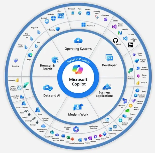