All in Data Visualization
In this article, I explain several use-cases for semantic-link-labs with reports, which involves programmatic modifications to report metadata to streamline certain report management tasks. This article explains how to do this with standard reports; future articles will elaborate about using the methods available for PBIR.
In this article, I introduce semantic-link-labs, a library based upon semantic-link that you can use in Microsoft Fabric notebooks to help you build, use, manage, and audit not only semantic models, but also reports and other items or parts of Fabric.
In this article, we look at a 5-step process to replace fields in a report when you’ve re-named, moved, or deleted them in the model. You can also use this method to “hot swap” different fields in and out of a visual without losing formatting. This isn’t officially supported, but it’s easy and it’s a huge time-saver.
In this article, I discuss why quality is a often problem for data and analytics, and how DataOps can help.
In this collaboration with Štěpán Rešl, I share some tips and templates to design effective KPI visuals.
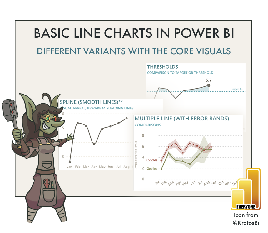
In this article, I share the different variants of line charts you can create with Power BI, and provide free templates to try them yourself. I also discuss the impact of chart type selection and formatting in Power BI visuals, in the context of line charts.
In this article, I share the different variants of bar charts you can create with Power BI, and provide free templates to try them yourself. I also discuss the impact of “Macguyvering” Power BI visuals too far.
In this short article, I share a visual overview of the MS Build announcements for Microsoft Fabric that are relevant for Power BI. Hopefully this makes it less overwhelming.
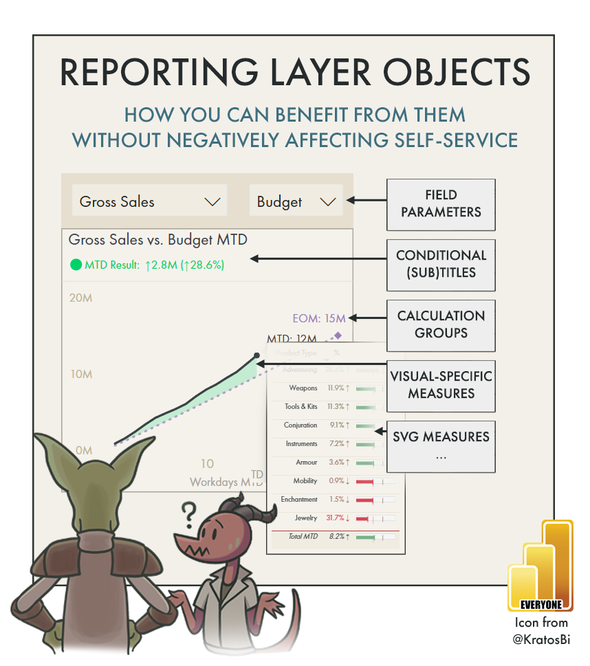
In this article, we tackle the growing issue of ‘report-specific objects’, dataset measures and tables created to fill specific report visual requirements, why they negatively impact self-service users, and best practices to mitigate this impact.
In this article, we look at the difference between best practices and optimizations. We also define a four-step method to tackle complex issues with dataset/report performance and design.
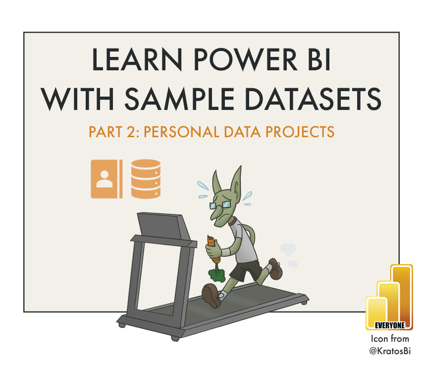
In this post, we examine how personal data can be used in personal projects to help us learn Power BI.
In this post, we look at how to create our own SQL Database and fill it with data from the Contoso Data Generator, so we can get some hands-on Power BI experience.
In this article, we compare different methods to let users to dynamically select measures in reports & pivot tables.
In this article, we look at what we need to make a good dashboard, and some important considerations with access & permissions
Power BI is a powerful tool that has also enabled millions of people worldwide to easily visualize & explore their data. Despite that, inflexibility to the visualization configuration and formatting can make it difficult to fulfill visual requirements. What are some of the biggest feature gaps with data visualization in Power BI, and why is this important?
In this post I list some tips for checking to make sure your report is ready for handover to someone else.
In this article, I discuss 3 common approaches to collecting reporting requirements, arguing in favor of the third approach - working iteratively & collaboratively with business users to make the report.
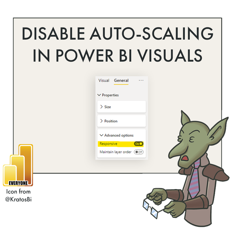
‘Responsive Visuals’ is a lesser-known feature that in general helps users make better graphs without fawning over visual settings & parameters. However, disabling it might be necessary at times when you are trying to achieve a specific result that Power BI default visuals won’t seem to permit.
I share a method in Tabular Editor to generate mermaid flowchart syntax to visualize model object dependencies. This code can be directly copied into an Azure DevOps wiki to automate documentation, or into mermaid.live to get an image of the resulting flowchart.
It’s frustrating that in Power BI re-naming measures or moving them to another table will break any visuals using them in reports. Likewise, Power BI does not have a feature to hot-swap measures in visuals, to retain formatting or save time. Here I will show you an easy way to replace multiple measures in a Power BI report, including those used in “broken” visuals. Fix all broken visuals in Power BI reports using this method!