Visualize Power BI Dependencies with Tabular Editor and Mermaid

GENERATE A DEPENDENCY FLOWCHART
A method with Tabular Editor to make mermaid flowchart syntax for model object dependencies

A measure dependency flowchart generated from Mermaid syntax created by a Tabular Editor 3 macro.
 A Goblin warning:
I do not maintain this script. You will have to adapt it for your model and scenario. If you aren't familiar with C# or comfortable with scripting, I do encourage you to try to use LLMs to make this easier.
WHAT IS MERMAID & WHY IS IT USEFUL?
Visuals help us better interpret information and understand concepts. This isn’t true only for complex information, either. Even simple concepts are better understood a good diagram, flowchart or graph. This is why data visualization is so powerful; as humans, we are wired to more effectively process visual information. It takes a mere 13 ms to process visual information vs. 200 ms for words, and we learn more effectively when diagrams are presented together with text. The problem is that making diagrams and charts takes a lot of time - particularly for technical documentation. Often we need to either manually create such diagrams in programs like PowerPoint or Figma, or know complex methods to generate them. There must be an easier way, right? Well, there is.
Mermaid.js makes this trivial. Mermaid is a javascript tool for generating diagrams with a simple, markdown-like syntax. It’s trivial to learn and use, albeit limited in customisation. If you’re familiar with Azure DevOps Wikis, chances are you’ve come across the ‘Mermaid Diagrams’ button. These diagrams can be created with the mermaid plugins - like the one in DevOps or the mermaid.ink service in Jupyter notebooks - but also using a javascript API, CLI and a web-authoring interface, mermaid.live. Basically, you can make mermaid diagrams in many ways, to integrate them with whatever you’re doing.
mermaid.live in action — making flowcharts, gantt charts & sequence diagrams was never easier
USING MERMAID FOR POWER BI
There are a lot of reasons why we might want to use mermaid for Power BI. Below are 3 examples:
-
Diagrams & visuals in documentation greatly improve their readability. Someone is much more likely to understand your docs if you use good visual aids:
Visualizing Dependencies
With an enterprise model, it’s not uncommon to have a lot of upstream & downstream dependencies for a given object. Getting these dependencies is possible with DMVs and C# scripting in Tabular Editor.Illustrating Development Processes - Git branching, Data Lineage, etc.
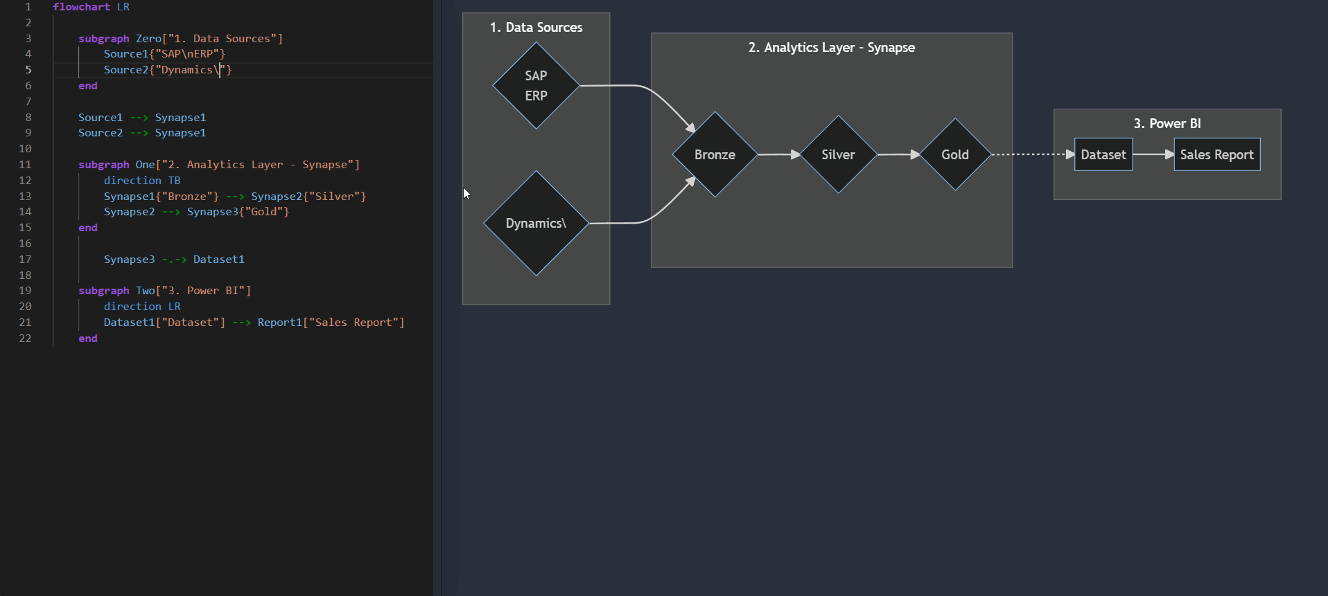
Flowcharts can easily show how data passes from a source system through an analytical layer to Power BI. With many integrations this easily gets complex. A good diagram cuts through that complexity to paint a clear picture of your data lineage. This is already visible in the workspace or other tools like Purview, but making your own is simple with mermaid, too.Other chart types also make it easy to visualize things from models to Git branching strategies. -
Documenting design is about more than just creating excel sheets of requirements & wireframe mock-ups. It’s important to document processes, relationships, and more nuanced, interconnected elements. Here, diagrams can make a big difference in clarifying the design’s intent to fulfill particular user requirements & needs, both to developers & stakeholders. They help ensure that the design is understood and followed without a full prototype being built.
Report User Experience (UX) Flow
A flowchart, sequence or user journey diagram showing how a typical user persona is expected to engage with reports in an app, pages in a report & visuals in a page. This makes clear the developers intent for how report contents might be used, to identify misalignments with how they are actually used or to simply understand interactions & actions like crossfiltering and drillthrough experiences. -
Diagrams make things not only more understandable but also more concrete. A few good Gantt charts can elucidate an entire project plan that consists of dozens of pages. Other diagrams showing the relationships between project stakeholders, escalation paths, support models, etc. can make the difference between a good plan and a great plan for a project - as it helps everyone understand their role & path.
Gantt Charts
In my experience, Mermaid is the quickest & cleanest way to make a Gantt chart that I’ve seen. The only downside is that it isn’t very customizable or flexible.
EXAMPLE 1: MODEL MEASURE DEPENDENCY DIAGRAM

Click here for more about Tabular Editor
To make your own mermaid diagram, you can manually write out the syntax, or - better yet - industrialize your diagram creation with scripting & macros in Tabular Editor. This is doable in both Tabular Editor 2 and Tabular Editor 3, and even easier with the new helpful documentation for the scripting API. These scripts let you grab specific model objects, where you can handle the results and insert the Mermaid syntax. You can save them as macros for easy re-use later. Easy!
Below is a simple example that shows the direct dependencies of all the measures in the model. It’s possible to further customize this to include calculated columns, calculated tables, and calculation groups/items — even specifying them as separately formatted objects.
Use Tabular Editor to generate a mermaid measure dependency flowchart syntax with a click of a button
EXAMPLE 1 CODE: MODEL MEASURE DEPENDENCY DIAGRAM
Below is the code used to generate the above demonstration, created based on this sample from the Tabular Editor docs site. I’m no C# expert so excuse any code verboseness / formatting.
Edit June 29 - Fixed a mistake I made when formatting the code in pygments, sorry about that.
string dependancies = "flowchart LR\n%% Measure dependancy mermaid flowchart";

foreach(var _measures in Model.AllMeasures )
    {

    var _upstream           = _measures.DependsOn;
    var _upstream_measures  = _upstream.Measures.OfType<Measure>().Select(c => c).Distinct();

    dependancies += string.Format("\r\n\n%% [] Dependancies:\n\t\"]",

        // 0 - Lineage tag of the measure in scope
        _measures.LineageTag,

        // 1 - Name of the measure in scope
        _measures.Name);

    foreach( var measure_dependencies in _upstream_measures )
        {
        dependancies += string.Format("\r\n\t\"] --> \"]",

            // 0 - Lineage tag of the measure in scope
            _measures.LineageTag,

            // 1 - Name of the measure in scope
            _measures.Name,

            // 2 - Lineage tag of the dependant measure
            measure_dependencies.LineageTag,

            // 3 - Name of the dependant measure
            measure_dependencies.Name);
        }
    }

dependancies.Output();


   A draft of a Tabular Editor C# script to generate mermaid syntax for measure dependencies, for all model measures
This is made possible in a number of ways:
Each object in the model has a Lineage Tag, which is a GUID that can be used in the syntax
Measure names or DAX Object Names can be used to label objects
Object types can be identified and filtered to have type-specific syntax, like having different object shapes or formatting for measures vs. columns vs. calculation groups / items
EXAMPLE 2: CONTEXT-DEPENDANT DEPENDENCY DIAGRAMS
However, most (enterprise) models can have dozens - or even hundreds - of measures, making a full-model dependency diagram unreadable. Thankfully, however, the Tabular Editor scripting API lets you interact with objects in a context-dependent manner, for example using Selected.Measure. We can generate a filtered syntax with a lineage only containing the selected measure, then separately format and highlight that selected measure for visibility.
Below is an example when highlighting the measure [Delivered Revenue PY] in the model. Dotted-line arrows illustrate what is downstream, straight-line arrows illustrate what is upstream of the selected object, from a dependency point-of-view.
Use Tabular Editor to make a context-dependent flowchart of measure dependencies
EXAMPLE 3: SYNTAX FOR DEVOPS WIKIS
With just some basic syntax adjustment, we can have a diagram which can be directly copied into Azure DevOps wikis. I’d imagine this can be further automated with the Tabular Editor command-line interface, but truthfully, this is not something I’ve had time to test.
Tabular Editor automates generation of Mermaid Flowcharts for DevOps Wikis.
TO CONCLUDE
MERMAID + TABULAR EDITOR SCRIPTING IS HANDY
Diagrams & visuals help us more efficiently process information
Creating diagrams in mermaid.js is easy - use plugins, the API, CLI or mermaid.live
These diagrams are helpful for Power BI documentation, design, planning, etc.
We can automate the creation of mermaid diagram syntax with Tabular Editor C# scripting
RELATED READING
Discovering diagram of dependencies in Synapse Analytics and ADF pipelines
Kamil Nowinski
Similarly generating mermaid flowcharts from Synapse and Azure Data Factory, but using PowerShell instead of C#. Combined with the above covering Power BI, you can build your own lineage flowchart for docs & other reasons.Mermaid JS: Finally There's A Great UML & Diagram Drawing Tool
ArjanCodes
A nice YouTube walkthrough of the mermaid.js tool
Disable Auto-scaling in Power BI Visuals