


Does it feel like too much?

HOW TO GET ORIENTED
…with the new features, tools, and information so you know what’s important for you and why.
THE HIGH FREQUENCY AND VOLUME OF “NEW STUFF”

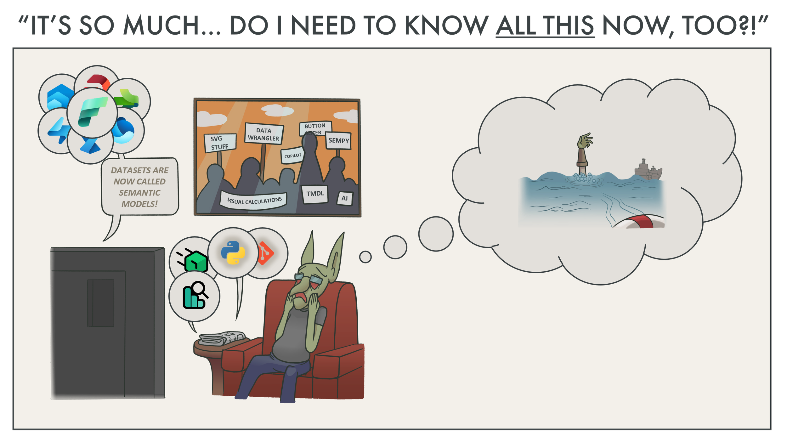
It’s fair to say that it’s been an eventful year in the Power BI world. Announcements like ChatGPT, the various Copilots, and Microsoft Fabric are poised to revolutionize many aspects of what we do, today. Furthermore, within and around these big announcements, there’s also hundreds of new features, tools, and resources related to Power BI that’ve also been announced - both big and small. All of this is very exciting; many of these features have the potential to bring a lot of positive change and value. However, it can also feel like… a bit much. Overwhelming, even.
If you’re feeling overwhelmed by the pace and volume of these announcements, or the amount of information you feel you need to consume to remain “up to date”, you’re not alone. In a recent poll I ran, 86% of respondents said they felt overwhelmed.
This is a small sample size (204) for an informal poll, but it aligns with what I’m seeing and hearing in the last 6 months:
It’s just too much; I don’t have time for all this stuff.
I think this is a big problem. It’s a problem not just because people shouldn’t feel overwhelmed, but also because it says something about how effectively these new features, tools, and resources are being communicated, understood, and used. But what is the problem, exactly? And if you’re in the minority of people not feeling overwhelmed, why should you care?
Perhaps most importantly, how can we approach these new features, tools, and resources to ensure we understand them and can find value without feeling overwhelmed?
 The purpose of this article is twofold:
1. To try and describe why people are feeling overwhelmed, and why this is a problem.
2. To consider how we can approach these new tools, features, and resources without feeling overwhelmed.
Disclaimer: In this article, I'm not criticizing these new tools, features, or resources, or how they're communicated. Nor am I promoting them.
WHAT’S THE PROBLEM?
POWER BI HAS ALWAYS BEEN A BIT OVERWHELMING
Power BI is not just a tool for making self-service reports. A common metaphor to describe this is the iceberg analogy. Here the visualizations of reports, dashboards, and pivot tables sit on top as the floating ice. But lurking beneath the surface are the many additional aspects of the Power BI ecosystem, like the data model, DAX, external tools, custom visuals, dataflows, metrics, data gateways, and much, much more… see this great summary from Melissa Coates (March 2023) for a full picture of The Power BI End-to-End.

The Power BI ecosystem can be daunting. But let’s be clear — this is more than just feeling overwhelmed. There’s a real cost and consequence to this for those who work with Power BI.
Because so many things fall under the umbrella of Power BI, it’s not uncommon to hear about circumstances where 1-3 data heroes [1] in a team, department, or organization are given the immense task of managing it all. The Power BI person™ placed in these positions because of assumptions; under-estimating what’s needed to adopt and implement Power BI.
The result is that these people are often stretched thin, over-capacity and treadmilling to meet business needs. While being hailed as heroes by their users when they bend time and space to help the business, these heroes occupy a fractured, unsustainable keystone of their organization’s data estate. They can often struggle to just stitch things together, nevermind keeping up with name and UI changes of the month. These people often are constantly trying to secure more resources and help, calling attention to the ice beneath the water as they work to establish a solid foundation with what they’ve got.
For self-service users, a similar story exists. While not data heroes, they get tossed Power BI by their IT department — usually without training — and are expected to “use the data”. Overwhelmed with the tool and its plethora of features, this leads to the infamous export express of Excel files. Eventually, technical debt settles in, as bad practices risk thriving like weeds among the user community.
[1] Data hero is a concept originally from the DataOps Cookbook.
Goblin tip:
Being a data hero isn't a good thing! Don't let yourself become a data hero!
If you find yourself in a position where you're:
- Usually running over capacity to deliver
- Under consisten high pressure and tense deadlines
- Feeling like it would all fall apart without me
- Hailed as a hero by your users once you deliver
Resist the urge to accept that mantle of data hero! It's unsustaintable, and it's a trap! Instead, try to raise this unsustainability with your manager or sponsor. Put forward a case for more resources. It's important that your organization feels the pains of the short capacity, so that they can allocate more resources to achieving their desired objectives.
🚀 Refer to the Power BI Adoption Roadmap and Power BI Implementation Planning if you need guidance.
Even though an immensely diverse set of skills are needed to successfully adopt and implement Power BI, few organizations and consultancies (in my experience) create a segmentation of Power BI professionals. Most roles will request a Power BI Developer who has experience in… well… everything. From data modeling, SQL, and DAX to visualization, governance, and administration. It’s rare to see formally acknowledged, specialist roles, like those that exist in other technical and business domains.
This makes it difficult for organizations to find the right people for their teams and projects, and for people to find the right role for their skillset and interests. Unfortunately, the result is often that someone (usually the person and not the organization, of course) has to compromise. People working in Power BI need to spend significant time and effort to upskill; to learn and do things outside of their domain-of-interest or expertise. Unless they get the time for it by their organization, this is particularly difficult for people with limited time, because of family or other obligations.
Goblin tip:
Note that this is particularly difficult for junior and medior consultants.
These consultants can often end up in Power BI Project Russian Roulette… where they’re being asked to develop reports, but need a set of completely different skills once they get their boots on the ground. The only way to circumnavigate this turbulence is with skilled sales or account managers running effective pre-sales meetings to knock out the assumptions.
Even then, these consultants need to be able to learn fast and be flexible, torch-juggling the many components of Power BI. If you're at a later stage in your career, you might think "Good, they need to learn those skills". But this can be immensely stressful for these early career practitioners, who can feel sometimes like they need to know everything.
At a certain point, the barrier-of-entry in these careers will rise to the point of being too intimidating for many people. Worse, others who underestimate it will quickly get in over their heads, and burn out.
The scope and scale of the Power BI ecosystem makes it challenging for someone who wants to learn Power BI. Sometimes, the most difficult question is simply where do I start? It’s easy for people to pick up Power BI Desktop and start playing around… but there’s a tremendous gap between those first reports and, well… everything else. Unfortunately, many people are directed to a tidal wave of information, seeing sprawling diagrams like the ones above and being assaulted by a hurricane of technical jargon.
There’s a lack of clear skill roadmaps for people who want to learn more about Power BI after their first steps. What do I need to learn to accomplish my goals? What should I learn first; what should I prioritize?
Goblin tip:
Learning paths from Microsoft Learn are a good place to get started. The quality of these learning materials is only improving; the people leading these initiatives are doing an incredible job.
WEAVING THE NEW TOOLS, FEATURES, AND CHANGES IN
Since early this year, Power BI newsfeeds have been running hot. Not just for tools and features specific to Power BI, but also Fabric. Mainly related to Fabric, in fact. In May at Microsoft Build - when Fabric was announced - the waterfall of updates began. Since then, LinkedIn and social media feeds normally occupied with Power BI information now overflow with… What is Fabric? What is a Lakehouse? What is Direct Lake? In addition to announcements about new external tools, .pbip and Git integration, and more.
Just last week, another conference occurred where a second tidal wave of new features hit.
What are visual calculations? What is semantic link? What is … a semantic model (a dataset)?
These updates may exacerbate the challenges and concerns that people face with Power BI, alone…
Will organizations now seek “Fabric Developers” who will be expected to know the entire platform?
Will this make the analytics roles around Power BI even more ambiguous?
If someone starts to learn Power BI (or Fabric), where do they start? What paths can they take?
Should a Power BI professional be expected to know the other Fabric workloads?
Goblin note:
Personally, I think it's unreasonable to expect a single person to know both Power BI and the various Fabric workloads in depth. It's just not possible; it's too much material. If you're a specialist in Power BI today, it does not mean that you need to be a specialist in Fabric, tomorrow. Your career will not suffer because you choose to keep focused on mainly Power BI.
Instead, it's more likely that if you work with Power BI today, you might cherry-pick parts of Fabric that will help you solve specific problems. I discuss this further later in this article.
Additionally, there will hopefully arise clearer canonical roles and responsibilities of a team who use Fabric effectively.
In addition to the above, there’s other reasons why these updates in particular have been overwhelming.
The pace and volume of updates seem to be - and likely are - much higher than they’ve ever been, before. The Fabric updates were even so large that they’re being moved to weekly announcements, instead of monthly, reducing the volume but increasing the frequency in which they’re delivered.
While impressive, the machine gun pace makes it difficult for people to digest and understand the content.
Fabric is composed of many different workloads, and they each come with their own names, and names for their various components (or items). Within each of these items are also new features and tools which also have their own nomenclature.
The result is that people have to adopt an entirely new lexicon just to read and understand the basics of what’s new. Alongside that are dozens of new logos or icons, making this not just a vocabulary issue, but one of visual recognition and cognitive overload, too.
Why are changes to names and the UI frustrating?
Power BI's various features and components have seen many re-namings and facelifts over the years. Goals become metrics become scorecards, or now Datasets become Semantic Models. But why does this matter?
- It has a real, measurable cost. Training material, documentation, and articles all have to be re-named to avoid confusion and ensure consistency. This can cost a lot of time, particularly if videos have to be recorded. For companies, this means choosing between having outdated material, or eating the cost to update it.
- It makes it harder for users. Re-naming creates confusion. Users don't get notified of these name-changes; they just see it in the user interface. This results in more questions and sometimes issues as people search for something that's been moved or re-named.
- Some names are just inaccesible. Changing Dataset to Semantic Model is a good example. For self-service users (or 'citizen developers'), the term Dataset is obvious; it requires no explanation. However, the term Semantic Model means nothing. It requires explicit information to understand what that means, and what it does.
Does this mean that improvements to the UI shouldn't happen? No, of course not. But they shouldn't be disruptive, or result in a more difficult user experience.
A lot of Fabric-related content focus too much on the What and not the Why. In the words of a friend at my gym that have stuck in my head:
Stop telling me marketing about what is Fabric. Start telling me why I should care and when I would use it.
OK, so Direct Lake has the performance of import but the latency of DirectQuery. Should all my datasets be Direct Lake datasets, then? What are the use-cases? When would I choose Direct Lake over Import or DirectQuery?
This is particularly true surrounding new announcements, as there can often be a gold rush-like feeling from people posting about new features. Take the below examples:
Semantic Link is now available in Private Preview! This is awesome!
DAX is going to be easy now thanks to visual calculations, coming soon!
Okay, but…
What is Semantic Link? What does it do? When do I use it? Why should I care? Why is it awesome?
What are visual calculations? What do they do? Why should I care? Why do they make DAX “easy”?
Goblin tip:
If you make Fabric content, please do explain the What and How, but don't forget about the Why. Use examples, use-cases and scenarios to illustrate the point or feature. Keep it simple; keep it concise.
Examples of good Fabric content (there's many more, I'm just pulling the last 3 I viewed myself, so please don't be offended if you make Fabric stuff and don't see it here):
To read these updates and learn these tools, people need time. However, people also have to continue their current tasks and meet existing deadlines. It’s rare that people have dedicated, paid time to learn and explore what’s new.
Yet, people are being asked to test features and provide feedback, start trials, read documentation, and follow tutorials. They’re also being encouraged to attend conferences, usergroups, and livestreams on evenings and weekends. With work, family, and personal health obligations, most people are lucky to get a few hours a week for extracurricular activities. Do you need to spend that time upskilling to stay up to date? With the sheer volume and aggressive pace of updates, do you even have a choice?
While you are responsible and accountable for your own learning, it doesn’t mean that you have to spend your spare time on this stuff for a successful career with Power BI. To reiterate — it’s perfectly acceptable if you don’t spend your spare time consuming content and advancing your data skills. Don’t feel pressured by others who do; just do what you want and need to do.
Goblin tip:
Attending conferences is worth your time investment.
They're also fun, and a good way to meet people and grow your network. In a conference, you have dedicated time to learn, discuss, and debate these topics in a supportive environment. If you work with Power BI, I'd strongly encourage you to attend one conference a year. The conference organizers and experts there respect you and your time.
Examples quality, fun conferences I've been to (EU):
If we want these new features, tools, and resources to be effectively used and understood, then we should address this problem. In reality, this problem has to be tackled from multiple angles — the people communicating these new tools, features, and resources, as well as the audience who consumes it.
WHAT CAN WE DO?
To some extent, unfortunately, this problem is largely beyond our control. We can’t control the rate of change and the volume of information around us. But we certainly can control how we respond to it.
STEP 1: REFRAME THE CONTEXT
To approach “what’s new” in an effective way, we should take a step back and reframe the context of these updates.
First, it’s important to be aware that the people blogging and posting about Fabric right now are in the very small minority of early adopters. Typically, these are experts or Microsoft MVPs. These are people with extrinsic incentives to learn and make content about Fabric. They invest early in the hopes of getting more benefits sooner. However, the vast majority of Power BI users are not learning or using Fabric yet. You’re not “behind”.
Second — to be abundantly clear — you don’t need to use or learn Fabric, today. You don’t need to use or learn any of these new tools, features, or resources, right now. You use these tools when and if you need them. In this regard, these new tools, features, and updates are no more than additional options available to you. Of course, to do that, you need to be at least peripherally aware that they exist, and what they do.
In Power BI, we already have a suite of options to solve various problems. With Fabric and new external tools like PBI Explorer, we now have additional, different choices and options that help us address new scenarios. We don’t yet need to learn these new things, but rather know they exist and when we might use them.
Then, we can learn them when we need them.
Designing a data model: Previously, we had to choose between an Import and DirectQuery storage modes. With Fabric, we have an additional option with Direct Lake .
Connecting to and transforming data: Previously, we had to choose between transforming data in Power Query of datasets or dataflows. With Fabric, we have additional options like Notebooks for transforming data with Spark (or python).
Optimizing DAX: Previously we could use DAX Studio or Tabular Editor 3 to optimize DAX code. Now, we also have the option of using DAX Optimizer to automatically identify DAX issues.
Exploring reports we didn’t make: Previously we could explore reports in Power BI Desktop or the Power BI Service. Now, we also have the option of using PBI Explorer to get more details.

This section and image are inspired by a discussion with Matthew Roche, Melissa Coates, and Peter Myers about this topic.
STEP 2: MAKE IT SMALL AND PRIORITIZE
You can’t give equal attention to everything and effectively comprehend it. So don’t waste time doing that. Instead, focus on your objectives, and pinpoint what’s relevant to you. Start from what you do today, and look toward the tools, features, and resources that could improve what you do, tomorrow. This helps you identify your priorities, reducing the time and effort required to absorb “what’s new”.
For example, here’s some things you might prioritize if you…
Power Query Diagram View: UI update for Power Query providing a more elegant, visual way to do and show your transformations. It’s already visible in Dataflows (Power Query Online).
OneLake: Store data in a data lake where it can be used across all the Fabric workloads. Use the OneLake Explorer like OneDrive to sync local files from the desktop to a Fabric workspace.
Dataflows Gen2: The second generation of Power BI Dataflows. With this second generation of Dataflows, you have a no-code approach to get data to a Lakehouse table, where you can benefit from Direct Lake. If you’re not planning to use Lakehouses or Direct Lake yet, you might not prioritize investigating Dataflows Gen2.
Fabric Notebooks: Code notebooks where you can leverage Spark and use languages like Python or R to transform data and output it to OneLake for use in downstream semantic models (formerly datasets). Notebooks are a great alternative for use-cases like when you need to get data from APIs or want to transform data in Python or R without a personal gateway. They’re also an excellent way to transform and clean data from a Lakehouse to make it ready for Power BI.
Lakehouse and Data Warehouse: Transform and serve your data in a more scaleable way so it can be leveraged by other downstream workloads. This can be useful if you want to re-use that data across multiple semantic models (i.e. instead of Dataflows or Composite Models).
Direct Lake: Connect to and read Lakehouse tables without importing the data. Direct Lake promises enhanced performance while maintaining a high degree of data freshness. However, Direct Lake has a wide range of limitations, like the inability to make calculated tables and columns. Choosing between Import, DirectQuery and Direct Lake is a tactical decision; not every model should be a Direct Lake model.
Model Explorer and Calculation Groups: Get a tree structure view of the model organized by object type (objects being Measures, Tables, etc.) so you have a more organized model and an easier time to browse and use it. Calculation Groups are an advanced DAX feature that let you apply calculations on top of existing model measures. For more information, see these articles from sqlbi.
Semantic Link in Fabric Notebooks: With Semantic Link, you can connect to a semantic model (formerly Power BI dataset) and explore it in Python or Spark. If you’re more comfortable in these languages, you might find this useful to help you understand, analyze, and document your model. Furthermore, Semantic Link implies a new audience of model consumers — data scientists and analysts who will run queries on the model from within their Notebooks. This is important for model design, governance, and adoption.
DAX Optimizer: A paid third-party tool from the people behind sqlbi and Tabular Editor, DAX optimizer is an automated way to find issues with your DAX. Following the best practices by the global DAX experts of sqlbi, DAX Optimizer highlights parts of the code that is problematic. It shares instructional material and examples to explain why that code is problematic, so you can either fix the issue or ignore it, if it’s by design.
New button slicer (and the general visual overhaul): The team of Miguel Myers are working toward their vision of an improved data visualization experience in Power BI. The first efforts of this were the new card visual, extended SVG support (for microvisualizations), and additional options like subtitles. Soon, the new button slicer will also be available.
Visual calculations: Create calculations inside of Power BI visuals (instead of the model) with a grid-like interface similar to Excel. If you struggle with DAX, this might help you write more complex calculations in a different way. Furthermore, it’s also an alternative to report-specific measures living in the model or thin reports; these measures will live in the visual metadata. It’s not yet clear whether these calculations can be managed at scale, i.e. by connecting to the thin report from a tool that shows them all and lets you manage them.
PBI Explorer: A free third-party tool from the people behind sqlbi and Tabular Editor, PBI Explorer helps you analyze and manage your Power BI reports. This tool helps you get a quick overview of the report contents and find “gotchas” like visual-level filters, hidden visuals, and bookmarks. This is particularly helpful when you’ve inherited a report from someone else, or are auditing reports in a new environment. You can also compare reports to identify changes in a Git-like user interface (with Git integration, too).
PowerBI.Tips theme generator: Generate .json theme files and report wireframes with an elegant user interface. This very feature-complete theme editor is the best way to create your custom JSON theme, and includes a wide range of options like custom icons you can leverage in Power BI visuals. Some of these features are only available to subscribers of their Tips+ themes subscription.
STEP 3: TRY TO GET DEDICATED TIME FROM YOUR ORGANIZATION
It’s worthwhile to discuss with your sponsor or manager whether you can secure dedicated time to investigate these new tools, features, and resources. A good example of this is the “20% Rule” of Google: Spend 20% of your time doing things that would benefit Google. This might be side projects, upskilling, or investingating new innovations. The 20% rule has led to significant successes within Google, including Gmail and Adsense.
Having dedicated time to dig into “what’s new” can provide benefits to your whole team and organization:
Find tools, features, and resources that can fit existing needs and scenarios you face, today.
Help distill “what’s new” to only highlight what’s relevant for your organization.
Give your organization a head-start to ensure you get the most from what’s coming soon.
Avoid wasting time on old methods when new ones could save effort or be more effective.
Develop side projects which can spin out into prototypes and full solutions that solve problems and bring business value.
STEP 4: ATTEND CONFERENCES, IF YOU CAN
While attending conferences is a time investment outside work hours, it’s worthwhile for many reasons. Conferences are about more than work, they’re also about connecting with like-minded people in your industry. These people face similar problems and challenges as you, and likely also have similar reasons for attending the conference in the first place. By meeting and discussing with these people, you can benefit in different ways:
Grow your professional network and make new friends.
Learn new ways to approach old problems from other people.
Hear about “what’s new” from professional speakers specialized in effectively communicating about it.
Ask questions and get advice from experts or Microsoft employees.
Have fun in nice locations and venues accessible to colleagues, family, and friends.
STEP 5: RELAX — IT’S THERE FOR YOU WHEN YOU’RE READY
These new tools, features, and resources aren’t going anywhere. Despite the frenzied hype and the sputtering nozzle of endless content, you’re under no obligation to pay attention to any of it. It’s perfectly fine if you want to remain in your comfort zone with the tools and features that you use, today. It’s perfectly fine if you want to ignore all this new stuff.
It’ll be there when you’re ready, and when you need it.

TO CONCLUDE
The frequency and pace of updates in the last year have been higher than usual, and it can feel overwhelming. There’s many complex reasons why this is overwhelming, from how these updates are communicated (and how frequently) to how they’re perceived.
However, this is ultimately a problem. For one, it creates confusion in organizations and the wider market about roles, responsibilities, and career paths. It also makes it difficult for people to effectively understand and use these new tools, features, and resources. However, it’s important to keep in mind that there’s no rush to learn all of this right now. Instead, we can try to work outward from what we do today, identifying priorities and focusing on what’s most relevant. By simply being peripherally aware of “what’s new”, we extend our toolbelts so that we might benefit from these tools when the right use-cases and scenarios arise.

