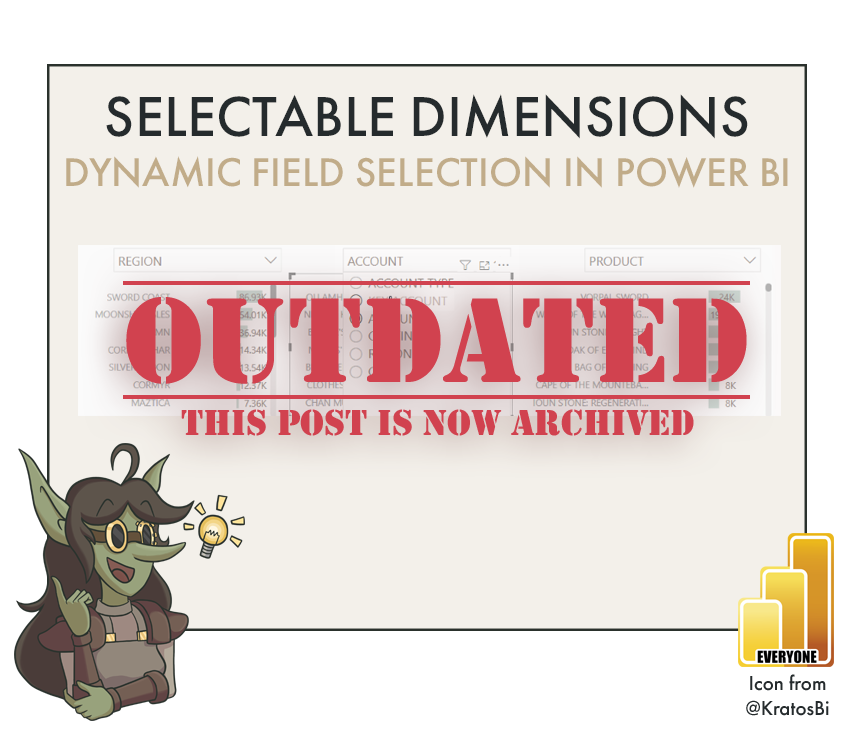
Selectable dimensions in Power BI
Note: This article is archived.
This approach should be taken with Power BI Field Parameters, instead, which work with both measures and dimensions, and are much more optimal than the approach described, below!
DYNAMIC AXES & USER-SELECTED DIMENSIONS IN POWER BI
…for report flexibility and exploration with parameters
Dimension selection can be a simple alternative to traditional drilldown for users to get more details.

Time to Implement
![Difficulty [1]](https://images.squarespace-cdn.com/content/v1/5c3a30e0f7939271ddaa7e4f/1602271356169-5I7RU6CEC8S0LPSTDUHU/Difficulty-3-of-4.png)
Difficulty [1]

Usefulness
[1] The difficulty is mainly because of knowing when to use it.
Use-Cases:

HIERARCHY DRILLDOWN:
Drilldown can sometimes feel un-intuitive to users whom are not familiar with it. They might want to go straight from the top layer to the bottom in one click, or select the hierarchy name in a more simple way. This approach makes that possible.

SELF-SERVICE-SAVVY USERS:
Users that have experience engaging with Power BI reports and all the interactivity therein can extract a lot of value from having more flexible reports. Arranging their own way of drilling down into the data supports them to do this.

DETAIL-ON-DEMAND MATRIXES:
By combining multiple layers of selectable dimensions in a custom hierarchy, users get complete control over how they split their data.
Such ‘Details-on-Demand’ views are extremely valuable for insight gathering.
When to not use it:
LARGE OR UNDER-PERFORMING MODELS:
This method requires the creation of a bi-directional relationship between two dimension tables - the dynamic dimension selection table and your ‘normal’ dimension table. These relationships can be problematic because they are slow and because they can cause unexpected cross-filtering of data. If you are not familiar with bi-directional relationships, it’s recommended that you read up about them, here before continuing.
Because of their performance impact, large datasets or poorly-optimized models can experience a performance impact with this method.
For very large datasets, or those which are well-optimized, this method may not be advised.
DIMENSIONS WITH HIGH CARDINALITY
This method involves pivoting the Dimension table to create an ‘Attribute’ for each column and a ‘Value’ for each Dimension member. I.e. ‘Customer Account’ and ‘Key Account’ are the attributes, while the actual (key) account names are the values. So, the more unique dimension members and columns, the bigger this table can be. When going down to the level of i.e. individual product codes, or - for instance - by minute for a date dimension, this can exponentially blow up the storage bloat of the model.
It is thus not advised to do this method for dimensions with a very high cardinality.
How to do it - Ingredients:
DATA STORAGE:
IMPORT
COMPOSITE
DIRECT QUERY (IF TABLES ARE CREATED IN BACK-END)
METHOD:
POWER QUERY
VISUAL MACGUYVERING
ELIGIBLE WITH:
ANY DEFAULT VISUAL
I first learned and adapted this from this blogpost by LeanX
How to do it - The Recipe:
To begin with, you need to have the initial model already established. You should have your fact and dimension tables, with relationships already set up between them. Decide already which dimension table will be subject to this data alchemy, and proceed with Step 1.
Step 1: Open Power Query Editor and select the query for your Dimension table. Create a new index column starting from 1 after the last step.
This index column will be used to be able to form the relationship between your existing Dimension table and the pivot table that will allow the dimension selection. In effect, it is the key between the two tables. Thus, it is important that no other data transformations are performed after this indexation, particularly in the pivot table, otherwise the relationship will result in the dimension selection returning wrong data!


Step 2: Right-click the query and select ‘Reference’ to make a copy (reference the original query) without opening a new query.

Step 3: In this new query, re-name it to ‘Dimension_Pivot’ and select the index column, then right-click and select ‘Unpivot other columns’

Step 4: In the “Unpivot Other Columns” step in Power Query, Re-name ‘Attribute’ to ‘DimensionName’ and ‘Value’ to ‘DimensionValue’. Click ‘Close & Apply’ to load the new table.
The ‘DimensionName’ field will be used in the slicers, while ‘DimensionValue’ will be used in the axes of your visualizations. You can also add a conditional column to give an order to the ‘DimensionName’ column values using integers, thus controlling the order in which they appear in slicer drop-downs or lists. This can be important to users, who expect to see the dimensions in a certain hierarchical or logical order.
Click the below image to see an example of this ordering with a conditional column.
Step 5: Create a relationship between the two index columns - the one from the original Dimension table and the index column from the new Dimension_Pivot.
When you first create the relationship, it will form as a many-to-one from the Pivot (Many) table to the Dimension table (one). This is, of course, logical, because the Dimension table has 1 index number for each row, whereas the unpivoted table (which we oddly called “Pivot” ), has many; one for each column.

Step 6: Edit the relationship and enable bi-directional cross-filtering.
This is necessary so that your Pivot table can be used to select the dimensions. Single direction filtering from a many-to-one relationship will not work; thus, you need a bidirectional relationship.

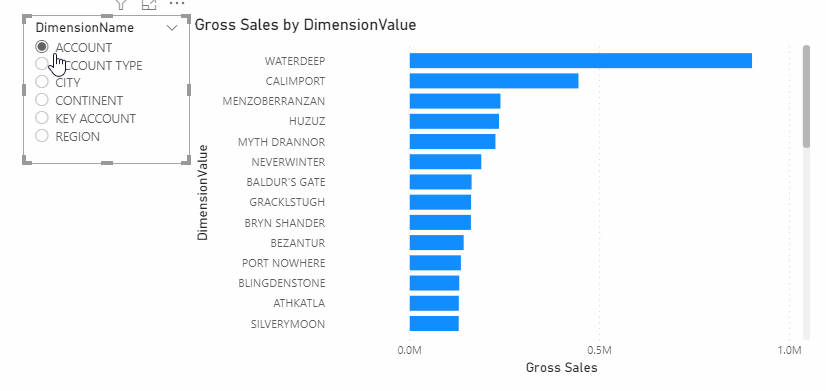
Step 7: From the ‘Dimension_Pivot’ table, add the field ‘DimensionName’ to a slicer or the filter pane. Enable ‘single-select’.
You should enable single-select because otherwise users may accidentally select multiple dimensions and receive unexpected results they won’t understand. They might perceive the numbers as ‘duplicated’. To avoid this, you should restrict them to selecting only a single category at a time.

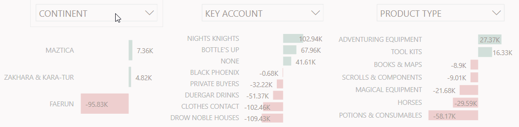
Step 8: Add the field ‘DimensionValue’ to a new visual as the axis / category, and add a value to see the graph.
Without selecting anything with the slicer, all dimension values will be shown. This is normal, of course, until you can do the filtering from the slicer.