

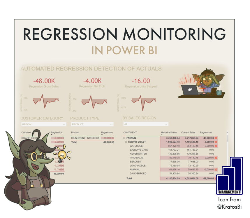
Automated Regression Monitoring in Power BI

AUTOMATICALLY DETECT DATA MISMATCHES IN POWER BI
…to deal with data quality issues before they arise in business reports

Automatically detect changes in historical data with a composite model over AAS.
Data quality is always a threat to a good dashboard. It is difficult - sometimes impossible - to predict when data quality issues will arise. But there are things we can do to prevent it.
Thanks to the a new Power BI feature allowing DirectQuery & composite models over Power BI datasets, we can create a hybrid model of historic and production datasets to automatically identify regression.

Time to Implement

Difficulty

Usefulness
Note: The time to implement and difficulty come from the fact that if you want to do this successfully, you need to incorporate the regression detection in your workflow. You also have to ensure you are detecting regression in the right places. It may be that this is very easy to set up, but if you do so focusing on the wrong area or not creating a support process around it, then it will bring you little added value.
Use-Cases:

USER TRANSPARENCY
Sometimes users do not have much oversight on the data handling or data delivery process. They might only see the output which they consume for their own self-service analytics or decision-making purposes. How can we help them trust the data?
One way is by showing them that it is consistent. Historical data should not change over time. So if we can show this in an easy way to users - or at least give them the opportunity to validate - it will improve transparency and also trust in the data processes.

AUTOMATED QA/QC
Data quality is paramount to ensuring your report is up to snuff. However, data issues are often not evident, particularly if they are small or subtle in nature. On top of that, we don’t have time to manually explore the data to identify discrepancies; this is time-consuming and not a good use of resources.
Instead, we should automate the process. The easiest way to do so is to identify a fixed “point of truth” to which the data should match. Any deviations will trigger an alert, that can cascade to downstream events.

ROOT CAUSE ANALYSIS
If there is visibility on the data problem at a granular level, it is easy to then go into back-end or source systems and try to identify in which steps the issue arises. Further, it may help identify patterns in the missing data. Perhaps one specific customer is missing, or a new document type caused a duplication… etc.
A quicker root cause analysis means quicker resolution. So not only do you automate the detection, but you improve the resolution time, as well.

Data quality is important!
When to not use it:
IF HISTORICAL DATA CAN CHANGE:
In most cases, historical data is not expected to change. The average temperature of March in 2020 should be the same when we look at it in 2021. However, there are cases when this is not necessarily true. For example, if we are looking at net orders data, we could be seeing orders from 2020. Since we are looking at net, however, we deduct cancellations. An order placed in 2020 could be cancelled in 2021, which would thus change the 2020 data by creation date. If we look at the gross order volumes this is not the case (or it should not be). Nonetheless, changing historical data means a changing baseline in this case, so we shouldn’t use i.e. net orders in this approach.
IF DATA DEFINITIONS HAVE CHANGED:
Changing historical data might not be due to data processes, but rather business processes. If new exclusion criteria are enacted, or new exchange rates are used, it could change the baseline and thus render any fixed historical baseline irrelevant.
However, this could also be something you might want to detect, so as to avoid any surprises - or, more importantly, to avoid surprising users.
How to do it - Ingredients:
EXTRA TOOLS:
MICROSOFT POWER AUTOMATE
DATA STORAGE MODE:
ALL
COMPOSITE (REQUIRES XMLA READ/WRITE)
METHOD:
DAX
ELIGIBLE WITH:
CARDS
BRING YOUR OWN DESIGN (BYOD)

A handy, simple tool for monitoring regression
How to do it - The Recipe:
Step 1: Save the model as two, differently-named versions and publish both to the workspace.

Step 2: Connect to both Power BI datasets in a Power BI Desktop local model.
To do this you need to be able to use the new preview feature: DirectQuery for Power BI datasets and Azure Analysis Services.
Your tenant administrator also has to have XMLA read/write enabled, as well as the appropriate features to enable Analyze in Excel. If those are not enabled, you will receive an “Unauthorized” error.

Composite hybrid over Power BI datasets!
You can also connect to a flat file instead of or in addition to the historical model that contains “fixed-truth” values you are aware of. For example, this file might be one exposed to a few of your most active users, and lets them input things like:
Total # Customer Groups
Total # Product Types
Total # Sales Regions
etc.

Add a flat file with some fixed-truths from Business!
By combining this with the historical data regression detection, you are tracking multiple facetsof your model and covering a wider scope of quality assurance!
Step 3: Set up relationships from the Dimension tables of the historical model to the Fact tables of the production model.

We need to link up the models with relationships
Step 4: Build measures that will compare identical, existing measures in the two models.
You should subtract from the fixed point-in-time historical model the value of the production model.
Step 5: Build measures that will compare identical, existing measures in the two models. Create some cards of those measures.

What you would want to see…

When there’s a regression…
Step 6: Publish the report and pin the cards to a new dashboard. Set up some data alerts for the dashboard.
Step 7: Use the data alerts to trigger flows with Microsoft Power Automate.
A flow to notify your team when there is a regression data alert. This could also be achieved with the native data alert functionality, alone.
A flow to stop users from seeing the incorrect data. There’s a number of ways to do this, the easiest is using the Power BI REST API to block the migration of the refreshed dataset from the TEST to the PRODUCTION workspace. In this scenario, the regression analysis happens automatically after each refresh, and if no data alert is sent within a given time window, the refreshed dataset is pushed to production. If a data alert is sent, it will trigger a change in the deployment pipeline via a PowerShell script initiated with i.e. Azure Functions, such that the migration is blocked.
Step 8: Plug everything into Teams as tabs

Save time, make value!

