


This article is a fun one-off sharing a Tabular Editor C# script to play a Snake game.


Plenty to read!
All tagged Power BI
This article is a fun one-off sharing a Tabular Editor C# script to play a Snake game.
In this article, we look at the difference between best practices and optimizations. We also define a four-step method to tackle complex issues with dataset/report performance and design.
In this article we look at four different ways to query data from within Tabular Editor. I also share a C# script to query or test selected columns and/or measures.
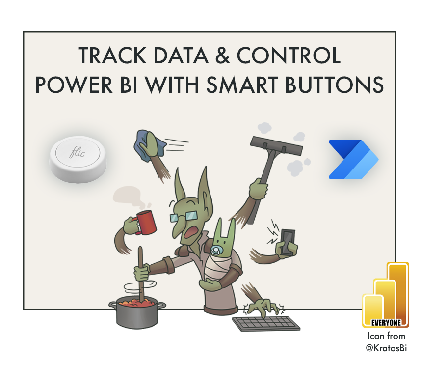
In this post we look at how to use Smart Buttons (flic) with Power Automate and Power BI to create and control types of event-driven reporting solutions.
We look at how Tabular Editor shortcuts can revolutionize your productivity, linking them to macros, common actions and more.
This short article explains how to quickly count measures (or any model object) in Tabular Editor. A C# script is provided to count all model objects as a quick pop-up.
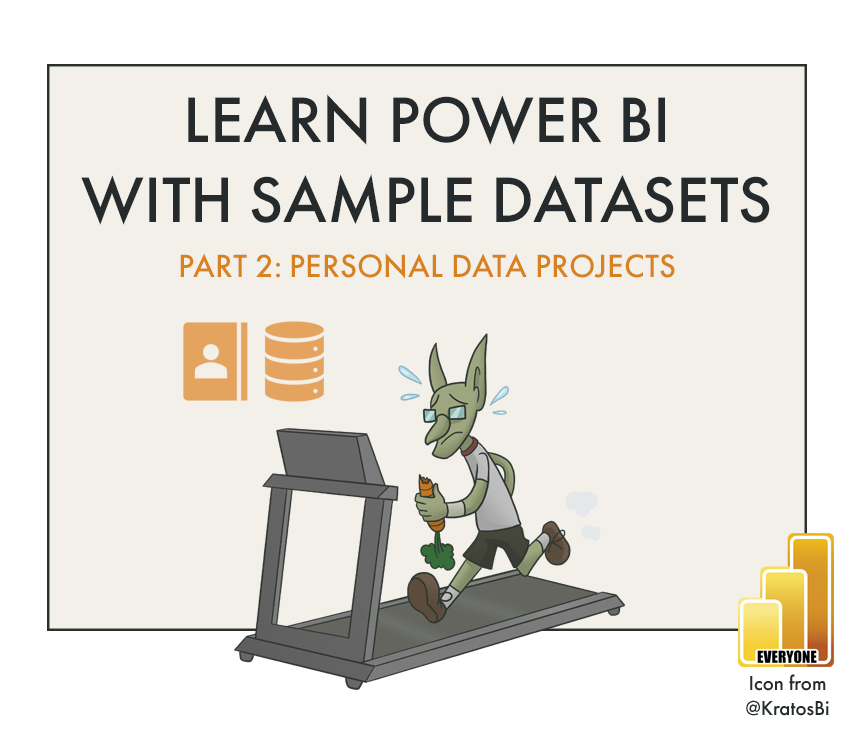
In this post, we examine how personal data can be used in personal projects to help us learn Power BI.
In this post, we look at how to create our own SQL Database and fill it with data from the Contoso Data Generator, so we can get some hands-on Power BI experience.
In this article, we explore Power BI App Audiences and why they are such a powerful feature for managing and using content in Power BI Apps.
Training users is important in every Power BI project. It’s particularly important when implementing Power BI, or if users are not familiar with Power BI reports. However, creating good training material is time-consuming, and difficult. In this article, I introduce reporTee, a licensed, out-of-the-box training tool to get users oriented in Power BI reports.
In this article, I discuss 3 common approaches to collecting reporting requirements, arguing in favor of the third approach - working iteratively & collaboratively with business users to make the report.
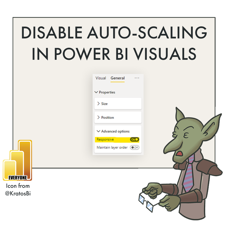
‘Responsive Visuals’ is a lesser-known feature that in general helps users make better graphs without fawning over visual settings & parameters. However, disabling it might be necessary at times when you are trying to achieve a specific result that Power BI default visuals won’t seem to permit.
I share a method in Tabular Editor to generate mermaid flowchart syntax to visualize model object dependencies. This code can be directly copied into an Azure DevOps wiki to automate documentation, or into mermaid.live to get an image of the resulting flowchart.
In this post, I write about the learning paths users take when using self-service solutions in Power BI. Specifically, I illustrate a way to conceptualize these learning paths, making it easier to segment users and create meaningful training programs.
In this post, I write about the options for self-service tooling in Power BI. Which tools to use for which cases, by whom & why? I've found it's helpful to visualize the different dimensions of this, to know the options & understand user skill/solution paths.
I believe that Power BI - if successfully adopted & supported in a research department - has the potential to deliver tremendous value. In this article, I try to explain how, and why this benefits researchers & society as a whole.
In this post, I write about the similarities between scientific research & business intelligence.
This article was originally written in 2019; I re-published it to support an article I’m working on about Power BI in Academic Research.
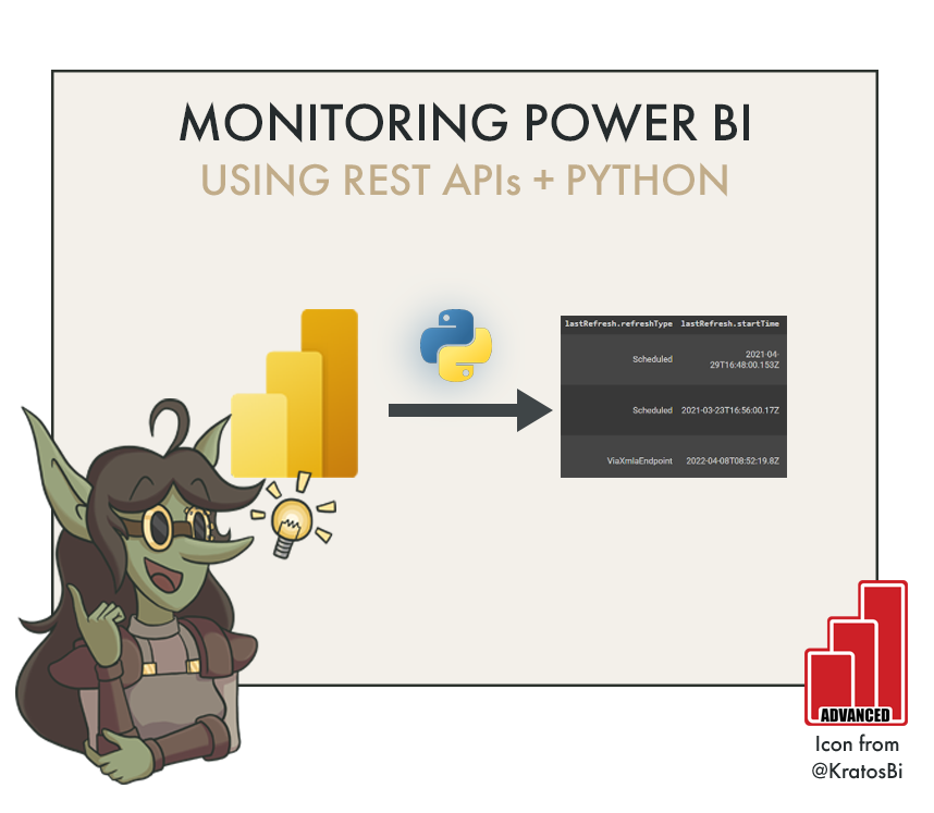
In this post I explain how to call the Power BI REST APIs from Python. You can do this either with a dedicated user or a Service Principal registered from the Azure Portal. I’ll walk through the necessary steps to get this working.
It’s frustrating that in Power BI re-naming measures or moving them to another table will break any visuals using them in reports. Likewise, Power BI does not have a feature to hot-swap measures in visuals, to retain formatting or save time. Here I will show you an easy way to replace multiple measures in a Power BI report, including those used in “broken” visuals. Fix all broken visuals in Power BI reports using this method!
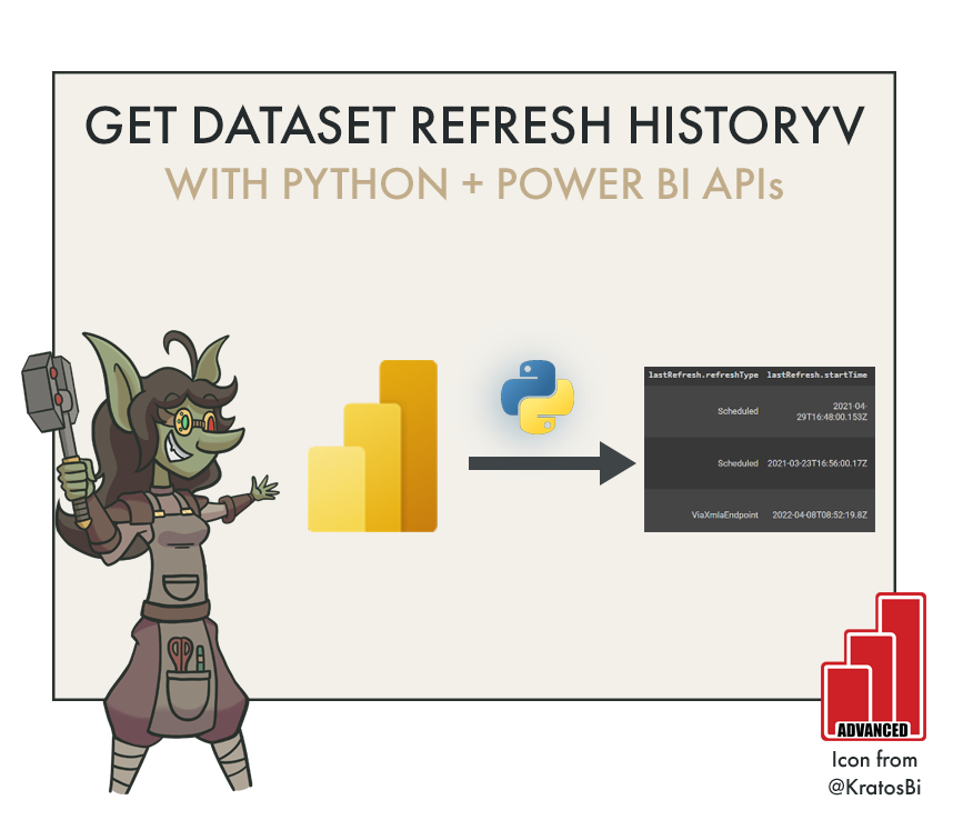
In this post I explain how to get dataset refresh history from Power BI using Python. For this method, you need to be a tenant Admin, and it is limited to only 7 days or 60 refreshes, per dataset. For more history, you need another API or method.