


Power BI Dataset Checklist
IS YOUR DATASET READY FOR HANDOVER?
Some tips to prepare your dataset for handover & support.
🔮 PART 1: HANDOVER OF DATASETS & REPORTS
CHECKLISTS
📝 PART 2: MODEL / DATASET CHECKLIST 👈
📝 PART 3: DATAFLOW
📝 PART 4: REPORT
📝 PART 5: DASHBOARD
📝 PART 6: POWER BI APP
📝 TBD: ON-PREMISES DATA GATEWAY
📝 TBD: DEPLOYMENT PIPELINE
📝 TBD: PAGINATED REPORT
📝 TBD: ANALYZE-IN-EXCEL
📝 TBD: METRICS (FORMERLY GOALS)
📝 TBD (After GA): DATAMART
CREATING SUSTAINABLE DATA MODELS

In the race to production, handover & documentation are sometimes forgotten. What steps can we take to improve handover & support of datasets?
Chances are that you will not be working on the same dataset, forever. The datasets you make today will be passed on to someone else, tomorrow. Without the right hygienic and documentation steps, a lot of time is wasted trying to understand what was made. What are some simple steps we can take to make life easier for ourselves & our data descendants - future colleagues who will take over the things we make?
In this article we look at some tips for improving dataset handover. To do this, we go through a checklist to ensure that:
We have done some basic documentation
The model is hygienic: consistent and organized
Some basic best practices are applied

DOCUMENTING THE MODEL
When you’re documenting a model, you need more information than a list of the fields & measures. Contextual and descriptive information is required for someone to understand and change it. Much of this basic information might seem self-evident, yet too often it is neglected from documentation in favor of a dump of fields or code that no one will look at.
Documentation differs depending on the model and the norms of the team / organization. Below are examples of more contextual information that you might want to include in basic documentation:
-
Every dataset will have the same set of basic information around it:
Who owns the dataset / Who is the SPOC / Who makes decisions about it?
In which workspace(s) is the dataset published?
Is it used in more than one workspace?
Is it in deployment pipeline(s)?
A governance solution might automatically collect this information (i.e. using the REST APIs)What is the GUID of the dataset(s) and their workspace in Power BI Service?
This is particularly important for using the API to get further informationWhat is the XMLA endpoint connection string (if enabled)?
This lets you easily connect with third party external toolsWhat tools are used to manage the dataset?I.e. Power BI Desktop? Tabular Editor? Is CI/CD with DevOps used?
… etc — More information can be added
-
This involves some information about the business questions the model aims to solve. Generally, a model should and can not try to answer every question. It is good to define explicitly the scope from both a data and a business point-of-view.
A good way to document this is using the output of the design; the user stories & business questions that resulted from requirements gathering / co-creation workshops, for example.
-
Ideally, everything in the model is automated and manual intervention is not necessary. In reality, however, this might not always be true. Maybe because of capacity constraints, limited access to technology or resources or other reasons, part of the model requires the intervention of a developer. For example, a Forecast Excel data source provided quarterly by the Finance team that often changes its structure or has spelling mistakes, requiring some additional data cleaning steps. Other examples might be data sources excluded from scheduled refresh to be refreshed asynchronously, a part of the model expected to change when expected new data or logic is introduced, or manual changes required to update the schema when a new field is introduced (particularly if incremental refresh is used).
If manual steps exist, it’s essential to identify them and justify their existence. Just doing this is a critical thinking exercise that might help you see more sustainable solutions missed. But if the manual step is absolutely necessary, you can at least make it clear. At minimum, clarify what it is and provide step-by-step instructions on how and when to perform the task. This is best done with visual aids, either in a separate section for each item, or even annotated videos.
-
Knowing what data is in which models is essential in governing a Power BI ecosystem. There are many solutions that address this at scale, from sophisticated all-in governance solutions such as Microsoft Purview lineage analysis, the Power BI REST APIs, or third party tools. Within the workspace itself, the lineage view provides a simple overview of which sources are linked to what data items.
What should you document about the data sources? Below are some examples of basic info:
Connection string / Name.
SPOC of the data source.
Whomever is supporting the model needs to know who to talk to if there are issues.
When the data source is updated.
This is particularly important if you use batch loads and risk asychronicity with your import modelIf staging is used
i.e. the development model connects to the development data source.If native queries are used, and where they are stored
i.e. Self-authored SQL queries passed through to a SQL database, instead of relying on the query generated by Power Query.
-
Any atypical features of the model that warrant special attention or care, for example:
Incremental Refresh
Hybrid Tables
Calculation Groups
Bi-Directional Relationships
Role-Playing Dimensions / Inactive Relationships
Many-to-Many Relationships
Composite Modelling
.svg Measures
Colour / Transparency measures
(conditional return of colour hex codes)etc.
Many of these things can be automatically detected from the model metadata using third-party tools.

A good place to get started with data model documentation is the Model Documenter tool from Marc Lelijveld & Ton Swart. This tool will automatically extract documentation from the model, so anything you can get from the metadata can be done a lot easier. Afterwards, you can add your own contextual information.
MODEL HYGIENE - A CHECKLIST
When designing data models, there are many things you can do to make handover & support easier. Below is an overview of a few points to check during development to ensure a model is ready for handover:
Additional context is provided in the rest of the article; this is an abbreviated, visual version:
WHAT IS THE CONTEXT - WHO WILL SUPPORT THIS?
It’s important to define up-front who will support a data solution & how. Too often, models and reports are made with a “fire and forget” mindset thinking support is not necessary. This is not true. As a solution and an ecosystem, Power BI is robust, but only as robust as the data consumed and the instructions received. All it takes is a change in headers of a connected Excel file with some inflexible Power Query, then the model’s not refreshing and no one can find the latest .pbix file.
Defining the support is important to do early in development. Who will support this data model? You? Who will support it when you’re gone? These are important questions to answer. This makes clear the context, so the right steps are taken to facilitate a successful future handover. Depending on who will support the solution, different things might be needed for them to take it over.
Generally, one of the most helpful things to do is to involve the support contact in the development itself. This prevents the infamous ‘data dump’ at the end of a project, or when someone leaves. In those situations, a model is explained in a one-hour meeting when someone shares their screen. Obviously this is neither efficient or helpful; how can we expect someone to handle that volume of information? Instead, we can break it up into sizable chunks during development, or stretched out over a 1 or 2-week period. This will make it easier to digest and understand what was made, giving the opportunity for questions.
Below are some questions to reflect on to help you understand the context of your solution’s support:
-
If the person / team supporting the solution were not involved in its development, they’ll need more hands-on knowledge transfer (KT) to understand it. Ignoring this or sending them to a mountain of documentation will inevitably lead to issues. A good way to prevent this is to include this person in 15-minute, daily reviews of the development, so they can see it made brick-by-brick. These meetings can be recorded and tagged in case of changes or for simple review, later.
-
A discrepancy in skill between a current & future solution steward will inevitably cause issues. For example - a center-of-excellence (CoE) developer is tasked with making a model for a business team knows & uses calculation groups to fulfill some requirements. The business analyst will support the model, later. This analyst has never used Tabular Editor or Calculation Groups, which are quite complex. So either the CoE developer has to include some very clear instructional KT material and explanations, or they should use a different approach that this analyst can actually support. If neither of these options are taken, inevitably, if the analyst needs to fix or change something they will be blocked. It won’t be sustainable. Simply stating “well, they should learn Calculation Groups” is both unhelpful and unempathetic; building the bridge between the development & support will help everyone, in the long-run.
-
More sophisticated or enterprise teams might be using tools like Azure DevOps to structure their development & deployment process. Integrating your development into their existing process will make it easier for others to see what has been done. Further, this is important to define a method of source / version control. If no process exists, then you’ll need to define how the model or report is versioned and stored, for example saving the model metadata using Tabular Editor 3’s folder structure.
-
Some changes might already be anticipated when the solution is complete. These ‘additional phases’ may be as simple as including additional data sources, or adjusting and adding logic to fulfill additional requests.
Documenting these expected changes are important, and also building the data model with that future in mind. A good example of this are models made on data snapshots. In the beginning there are few snapshots, but eventually, data volumes and cardinality will increase. So it’s important to optimize performance early on, otherwise it will need to be done in the future.
IS THERE SOME KIND OF VERSION CONTROL?
Likely the most important thing, version control is essential. In the simplest form, this is ensuring that your model is saved in a central repository that is tracking changes (versions). The person supporting always needs to know where they can find the latest version (metadata or .pbix).
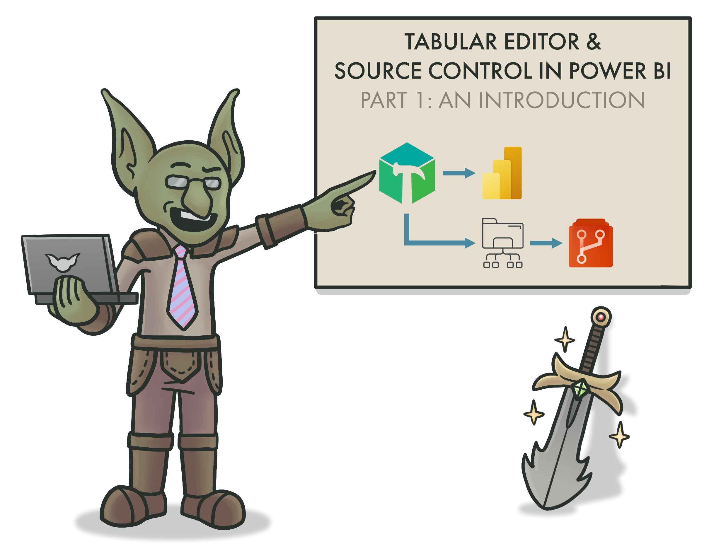
Click for an overview of version / source control methods
The simplest way to do this is via SharePoint or other file cloud storage location that is tracking the changes. This gives limited tracking of just the files. You will have no visibility on changes to individual model objects, like measures or tables. This source control requires management of the model data, for example using Tabular Editor in combination with a Source Control Management tool. For more information about Source Control & Version Control with Power BI datasets, click the image to read an article on this topic.
IS ONLY NECESSARY DATA INCLUDED?
One of the easiest ways to optimize a model is to limit the data inside it. Columns and rows not used in reporting shouldn’t be included, particularly columns that have many unique values (high cardinality). Part of this should already be done during the design, when discussing with business users. It’s important to challenge them and ask the value of including certain fields, particularly if they are redundant. If we have the vendor name, do we still need the vendor number? Maybe we do, so that it can be used for follow-up actions. If not, then it should be removed.
A good step as you finish a model is to scrutinize the largest fields and ask yourself whether they should be there. This not only will improve the performance of your model, but it reduces the number of fields both developers and users need to be familiar with. Analyzing your model is simple using VertiPaq Analyzer in DAX Studio or Tabular Editor 3. Further, you can identify fields & measures not used in reports, relationships or DAX code, then remove them. PBI Cleaner V2 from the BI Accountant helps you do this.
ARE DATA TYPES AND DECIMAL PRECISION APPROPRIATELY SET?
Another reason to scrutinize columns with VertiPaq Analyzer is that it will show unexpectedly large columns. These are fields that have too high decimal precision. For example, a currency field with a precision of 8 decimal places will have a much higher cardinality / size than when the fixed decimal data type is used to limit precision to 2 decimal places. This is a simple hygienic check which can have a significant performance impact by reducing the size of your model.
ARE REPEATED VALUES PARAMETERIZED IN POWER QUERY?
Redundant information used in Power Query can be parameterized to simplify changes and avoid discrepancies. The simplest example of this is connection strings for data sources. With parameters in queries, you can easily switch from i.e. one data source to another by only changing that one parameter, instead of changing it in many places. Without parameters this is less efficient and more susceptible to mistakes; the last thing you need is the ‘Sales’ table connected to ‘PROD’ while ‘Orders’ is connected to ‘TEST’. Parameter changes can be controlled from within the service or programmatically. Other examples of parameterized information might include filter values, reference dates or environments.
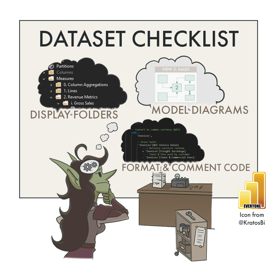
IS THE CODE FORMATTED?
-
Provided by SQLBI, this tool makes formatting DAX extremely simple. You can format either using long- or short-form rules. Further, you can also automate this in Tabular Editor 2 or Tabular Editor 3 leveraging the C# scripting & macro features, which is easy to do.
-
Provided by mogular GmbH, this tool similarly formats M code used in Power Query. If you’re only using the GUI, you can access the code through the ‘Advanced Editor’ and paste it in here.
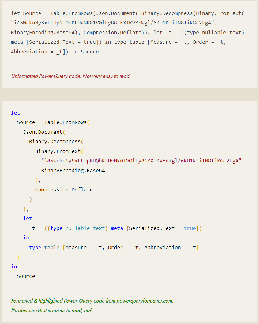
Formatting code improves both readability and understanding. It’s not just more efficient, but also a courtesy to do. This is also true for code in documentation. In Power BI this is easy: tools exist to format both DAX and M code, and embed the HTML for your documentation (or your blog!).
Below is an example of unformatted vs. formatted M Code from Power Query:
DOES COMPLEX CODE CONTAIN COMMENTS?
While this can largely come down to developer preference, adding comments in DAX & M code can generally help a reader understand the original intent of the code. It’s important, however, to not provide excessive information or comment obvious things. Instead, it can be an opportunity to translate the code into common tongue; to illustrate explicitly both the business requirement and the intent of the developer. This can be particularly useful if fulfilling a complex business requirement or when exceptions need to be justified.
For Power Query it can be particularly useful, since comments will show up in tooltips on top of the applied step.

Adding comments in Power Query will automatically put a tooltip on an info icon next to the step.
ARE OBJECT NAMES LOGICAL, CONCISE & CONSISTENT?
For a user, finding their way around a new model can be a pain. If field names are not clear and the model isn’t organized, this hurts model usage & adoption. Worse, it can lead to confusion of a user taking an incorrect field and making mistakes in their analysis. This doesn’t just apply to users, either, but also future developers looking to make changes or additions to the model. Thankfully, avoiding this can be simple if some preventative, organizational steps are taken.
One low-effort way to do this is to have good naming conventions. Clear naming of fields is important so that users find what they are looking for, and understand what a field means. Which naming conventions are used depends on your organization and the expectations of users, but below are some general tips:
-
Consistent across data artifacts
If the primary revenue metric is called [Gross Sales] in one dataset and [Revenue] in another, that is a problem. It’s not clear to a user that it’s the same thing.Consistent within data artifacts
The same is true when having versions of a field in the same dataset. [Gross] vs. [Total Gross Sales, YTD], for example, is unnecessarily confusing.Consistent with Attributes
Similarly, it’s important to be consistent in the label attributes. [Sales (Gross)] and [Net Sales] isn’t as consistent as [Sales (Gross)] and [Sales (Net)]. Similarly, how will you describe aggregations like MTD or YTD?This isn’t true only for the naming of measures, but any object in the model - including display folders.
-
Look to the users - what is done, today?
When considering how to set up your naming conventions, look to what terms are pervasive in the business, today. Try to avoid users having to learn new terminology or be confused. If there is inconsistency in the terminology they use, reach out to key users to ask their feedback on the naming conventions you’re thinking of using.Get early feedback from the business on naming conventions
Getting this feedback early is a very low-effort step that can make a big positive impact once the users see the model for the first time. -
Abbreviations & acronyms are dangerous because there is an assumption that people know what it means. For example [AGS] might be clear as [Adjusted Gross Sales] to you, but maybe not to 90% of users.
The general rule for abbreviations and acronyms is to avoid over-use, particularly in cases where they are lesser-known. Part of this is common sense, but to check for sure, reach out to the targeted userbase to see what they do, today.
-
Avoiding abbreviations is a general rule, but at the same time, you don’t want objects to have massive names that bleed off the fields pane. It’s annoying to have to read a measure name like:
[Total Adjusted Gross Sales, Year-to-Date until the End of Previous Month]
Instead try to balance clarity with conciseness, for example:
[Adj. Gross Sales, YTD; Last Month]
There’s no “perfect” way to do it, just what works for everyone and is reproduced consistently.
-
Already mentioned above, this feedback will be a small effort that can be very valuable for users. It clears up assumptions about how fields should be called, and is a small step forward for including users in the development.
ARE EXPRESSIONS & FIELDS ORGANIZED IN DISPLAY FOLDERS?
Using Tabular Editor, sorting fields into nested display folders is easy. It’s such a low-effort step to make your model more accessible and easy-to-use.
Display folders can be used both in Power Query and in the data model to organize objects. Using a nested folder structure with consistent naming / grouping rules will make navigating the model a lot easier, both for developers and users.
In the Data Model (Power BI Desktop)
In Power BI Desktop, columns and measures can be added to columns from the model diagram view in the “Properties” pane, under “General”. Other properties that can be adjusted here are field names, descriptions (mentioned above) and synonyms (for Q&A).
Nested folders can be created with a backslash, and multiple fields can be selected and grouped by selecting them with Shift + Click or Ctrl + Click.

Query group example
In Power Query (Power BI Desktop)
Display folders in Power Query are called ‘query groups’. In Power BI Desktop, they can be created by right-clicking a query and selecting “new group…”. Queries and groups can be dragged & dropped into other groups, making organizing queries easy.
Tabular Editor
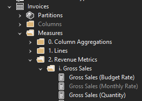
Organizing fields into display folders is simple if managing the model metadata with Tabular Editor. Simply right-clicking multiple fields and selecting ‘Create > Display Folder’ will make one, and both folders and fields can be dragged into other folders.
An important thing to note is that fields and tables will be sorted alphanumerically in the Power BI Dataset. You can exploit this in your folder names, for example in the above image:
Columns / Measures
Arabic numerals (Example: 1.) - ordered by priority / importance
Roman numerals (Example: i.) - ordered by priority / importance
Alphabetical (Example: a.) - ordered by priority / importance
ARE TECHNICAL FIELDS MADE "INVISIBLE"?
It’s not just important to name and organize fields, but to also choose to display them at all. Technical fields that should or could not be used by business users or report designers can be hidden. This makes the model simpler, as only useful objects will be shown. Examples of technical fields to hide:
Relationship keys
Example: Customer key, Date fields in fact table(s)Technical fields used for specific DAX or visual functionalities
Example: A measure which dynamically provides a colour hex code for a Power BI reportComplex fields (i.e. that use measure selection)*
Example: Complex calculation groups
Example: Measures that use measure selection
* Obviously depends on the skill level of people using the model
IS A FIELD DICTIONARY AVAILABLE? IF NOT, CAN YOU CREATE ONE?
Once the naming conventions are used, they need to be documented. This is not only so users can check what is in the model, but also so other people creating other models can re-use these naming conventions for consistency. More importantly, it’s essential that not only names are consistent and clear, but also definitions. What do we mean when we say “Adjusted Gross Sales”? What is included in that definition; how is it calculated? For users and future developers, answering these questions is essential.
Some solutions like Microsoft Purview provide data dictionary tools, but if those aren’t available you can always start one. Extracting from the model fields and their properties is very easy, thanks to the Dynamic Model Views (DMVs). Third party tools like Model Documenter, VertiPaq Analyzer and Tabular Editor make this an effortless task.
An easy way you can do this in the model is to also put these field definitions in their descriptions:
DO NON-OBVIOUS FIELDS HAVE DESCRIPTIONS?
An obvious field like [Gross Sales] might not require much explanation. However, [Pareto; Variance Outliers] will. It’s important that these non-obvious fields have descriptions entered in the model. This can be done in Power BI Desktop from the model view, or from within Tabular Editor. Identifying what is ‘non-obvious’ is obviously something subjective, but as you develop you should have a feeling for what a colleague or Future You will need explained; six months from now, will you still remember what the boolean field [RNAse-Free] means?
This is one of those exercises which could cost a lot of time, so it’s important to be concise. What information is needed to understand this field and its relevance in the business & this model? This can also be a valuable exercise from a design perspective, as it builds an understanding of the underlying data; if you understand the data better, it help you drive good discussions about report requirements and designs.
ARE ORGANIZED MODEL DIAGRAMS AVAILABLE?

Example of a disorganized model diagram.
If your model is complex, creating a few different tabs with different diagram views is a simple way to help someone understand it.
By default Power BI Desktop will display a single model diagram view with no logical or consistent organization. If this isn’t adjusted, the first thing someone will see when they look at your model is a swarm of model spaghetti - tables and relationships all over with no organization. This is obviously not helpful, but also easy to fix. Tables can be moved and collapsed, and key fields (those involved in relationships) can be set to appear at the top. You can create additional tabs for specific views, for example:
Separate views for each Fact table, showing all tables that filter it
A separate view for calculation groups
A separate view for disconnected tables
A separate view for the start schema (ignoring all disconnected tables)
If you use Tabular Editor 3, there is also a feature to create views there. This is honestly much faster and easier than doing it in Power BI. Here is a nice overview of the model diagram view from enterprise DNA.
HAS THE MODEL BEEN TESTED? HOW? WHERE ARE THE RESULTS?
We all know testing is important, yet too often we hear about models & reports being used without testing, at all. Having some basic questions about testing in the checklist serve as a reminder of accountability; to trigger the developer to do it. Testing is a large topic outside the scope of this article, but below are some information you’d want to document regarding testing:
What testing was done (i.e. UAT)
Who did the testing
When testing was done
How testing was done (testing methodology; i.e. using reports, DAX queries, etc.)
Test results (where are they stored)
WHAT TRAINING / ADOPTION ACTIONS MUST BE HANDED OVER?
Particularly for managed self-service usage scenarios, users with build permissions need to know how to use a model. It’s not reasonable to expect users to figure it out themselves; if they didn’t create it, there needs to be some kind of adoption or training actions. Part of the handover is ensuring that whomever supports the model can drive continuity of these adoption & training activities. This might be as simple as taking over a weekly ‘Data Café’ session, or managing a form where users can submit training requests. At the bare minimum, the handover needs to serve as a bridge between whomever will support the model and the user community, so they know who to go to for certain questions, etc.

TO CONCLUDE
If a dataset is given to someone else without proper handover or knowledge transfer, they are being set up for failure. To avoid that, it’s important to take certain steps to ensure that this handover (or dataset “inheritance”) can succeed. There are many ways to do this, and by following some simple checklists during development, we can ensure that the model is more organized and structured. This will make it easier for others to use it, understand it, and once we’re gone, support it.
Special thanks to those who contributed additional items which are listed in the interactive list:
-
🔗 Click here for Sandeep’s twitter
🔗 Click here for Sandeep’s blog (one of my favourites)
Disable Load on Intermediate Data Sources
Set Security Level of Data Sources
Check Referential Integrity
Disable Summarization
Use Explicit DAX Measures instead of Implicit Field Measures
Create Measure tables if you won’t house measures in Fact tables (i.e. Sales measures in Sales table)
Check that native queries and Power Queries in general are folding to foldable data sources
Check the Refresh Time & CPU use during refresh
-
What about 'addressed BPA messages and documented any ignored rules/objects'?
-
Something that helps with the process is maintaining and using BPA on dataset. Helps sort a lot of standard issues.
DATA GOBLINS DATASET CHECKLIST
Version 1.11 - Last update: Feb 15, 2023 (Link updates)
Use the below interactive checklist to follow-up on your tabular model or Power BI dataset:
Click the question mark (?) for a link to a reference document. This will be learn.microsoft.com documentation; if none are available, this may be a Data Goblins article, or another blog post reference.
Dataset Design
Dataset Building
Power Query - Data Sources & Refresh
Model Objects
DAX & Power Query (M) Code
Dataset Handover
DATASET DOCUMENTATION CHECKLIST
Documentation varies from project-to-project and team-to-team, but below are some things you can consider documenting for your dataset.Tools like the Model Documenter by Marc Lelijveld can make this easier.

