
Power BI Data Visualization - Ideas & Wishlist
POWER BI IS PRETTY DECENT AT VISUALIZATION
… but what if it was great? What would it be able to do, and what would be the business value?

POWER BI & DATAVIZ
THE VALUE OF VISUAL INFORMATION
The last decade has seen an explosion in data visualization. From business reporting to journalism, scientific literature, fitness and video games… table-based reporting is giving way to more dynamic, graphical displays of information. While tables work fine for some use-cases, visualizations generally allow a reader to more easily/effectively find insights in data, helping them understand it, interpret it and eventually act on it.
This is true regardless of personal preferences; as humans, our brains are wired to more effectively process visual information because we experience so much of it. Data visualizations are effective because our brains have evolved to quickly use them - to detect edges, discontinuities, variations in colour & shape, and pattern recognition, and so on… the Gestalt principles. Below are some further statistics about why Data Visualization matters:
It takes a mere ~13 ms to process visual information vs. ~200 ms for words
Visualization improves speed, clarity & understandability of what is communicated
In general, we learn more effectively when text are presented with accompanying diagrams.
Visual data exploration tools also enhance decision-making & independence among managers in organizations.
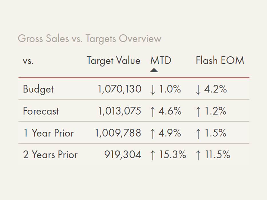
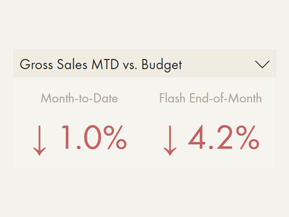
While Power BI is much more than only a reporting / data visualization tool, it is enabling more people to quickly and easily visualize their data without complex code. For the below business questions, we see examples for how Power BI can take more information-dense tables (before) and transform them to interactive visuals (after):
USE THE VISUALS IN THE DROPDOWN MENUS TO ANSWER THE QUESTION.
DO YOU ANSWER IT FASTER WITH THE ‘BEFORE’ OR THE ‘AFTER’ VERSION?
In the drop-down menus, use your mouse or finger to slide between before & after:


CREATING GOOD DATA VISUALS
A good data visualization bridges data and decision-making to make the actionable data points rise to the surface with the least amount of user time & effort. Instead of trying to show everything at once, we focus on creating the most effective visual to address the questions users are trying to answer. These questions will vary between organizations, groups and individuals, so we can’t expect a single solution to fit them all. Further, each individual differs in how they read, interpret and use data. So a good visualization will meld user’s needs and data visualization best practices to create a tailored & flexible solution that answers the business questions in the most effective way.
To that end, a good data visualization tool needs to enable many possibilities; flexibility is paramount. Without flexibility, it becomes difficult - if not impossible - to visually address specific business questions. The question is, then, do we have sufficient flexibility in Power BI? Unfortunately, most people creating visualizations in Power BI would say no… but why does it matter?
SO CLOSE YET SO FAR - THE COST OF VISUAL INFLEXIBILITY IN POWER BI

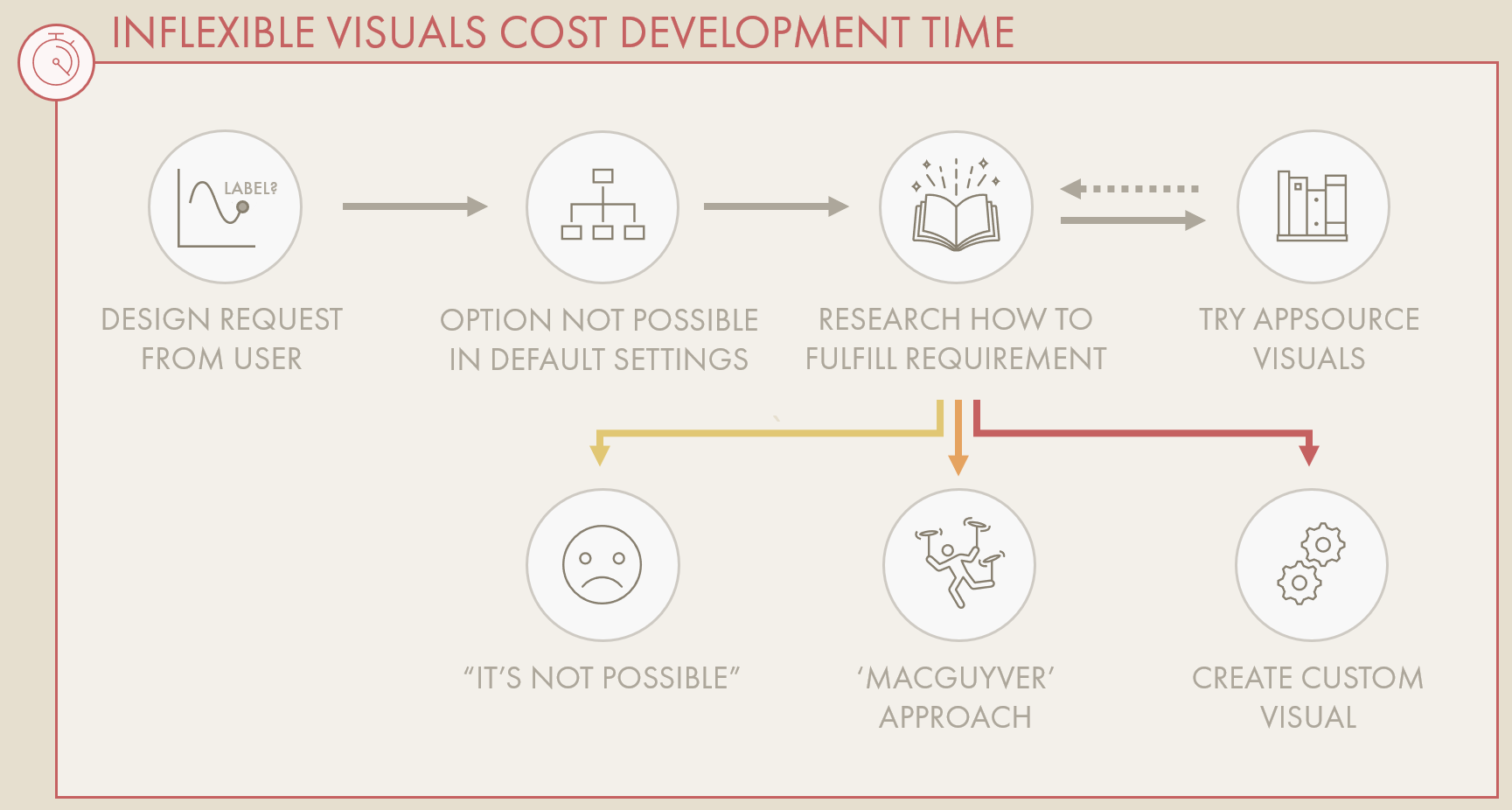
To fulfill visual requirements, we often need to resort to ‘Macguyver’-ing solutions with DAX- & Data-Model- Duct Tape; visual “hacks” & tricks.
Creating a decent report in Power BI is easy, but unfortunately, creating a great report in Power BI is difficult. This is because crafting good data visualizations in Power BI is a challenging exercise. The 39 default visuals - while a powerful starter kit - are notoriously inflexible to customize from the user interface. Once you move beyond basic reporting requirements, you often run into a brick wall. From creating simple slope or dumbbell charts, to conditionally formatting specific data points… it doesn’t take an advanced use-case to see this first-hand. In the mildest cases, one can ‘Macguyver’ their way around these roadblocks by bending visual settings & DAX to get the visual to behave the way they want. The problem is that this Macguyver-ing creates overly complex solutions that are fragile, difficult to maintain, and/or struggle to be performant. It is not uncommon to encounter report performance issues originating because of modelling or DAX decisions made to overcome a UI roadblock; to fulfill a visual requirement.
The brave may even venture toward custom visuals, either using frameworks like the impressive custom visual Deneb, or making their own from scratch. This is disappointing, as the default Power BI visualizations are built on the powerful D3.js (data driven documents) framework. So much of potential of D3.js lays untapped; the default visuals barely scratch the surface.
Unfortunately, most people lack the skills to programmatically define their own visuals, and it’s unrealistic to expect a typical user to turn to these solutions to fulfill basic visual requirements. If the user interface is too rigid and they can’t make what they need, many users will just give up. They will resort to half-measures (pun intended); ineffective visual options that can’t answer the user’s question, or worse, just doing a data dump - showing everything in tables & matrixes to be exported & re-analyzed, which costs everyone extra time and resources. Thus, inflexibility of DataViz tools has a real cost, from a negative impact on development time to model performance and even adoption of Power BI, altogether:
A DATAVIZ SWISS-ARMY KNIFE
Should Power BI be able create every visualization or address every visual requirement, out-of-the-box?
No, obviously not. We can’t expect to do everything. Power BI is a massive tool… We can’t expect product teams to divert priorities away from other significant features. That said, if we truly want to empower users with data and move the needle on data literacy, we need accessible and flexible tools. We need to be able to solve simple visual requirements with a UI that gives us a data visualization swiss army knife, so we can focus on more meaningful tasks that bring value… Make better & more sustainable reports, faster.

What formatting options do we still need in order to design & create good data visualizations with default Power BI visuals?
But what does this mean compared to what we have, today? What changes might improve flexibility, and what are the use-cases? Let’s get specific.
In the rest of the article, I discuss my personal wish list for absent Power BI visualization features I think would be valuable. For each feature, we’ll look at what we should be able to do, why (the business value) and how it might work. We also examine how we could ‘Macguyver’ the solution, today.
The purpose of this post is not to try and persuade anyone to change anything in Power BI, nor to complain. The purpose is to share & document solutions to existing pains & reflect on how we could design & create better Power BI reports in the future.
POWER BI VISUALIZATION WISHLIST
Since the below items are common among many visuals, they are grouped by visual element instead of the visual itself. More important items are flagged (🚩). Wherever you see an image with a divider, use your mouse to view the visual before & after implementing some of the wish list features.
TEXT: TITLES, LEGENDS AND HEADERS
Text are essential elements in visualizations as they instruct and inform the reader about how to use and interpret the visual. In Power BI, formatting text today is limited to entire elements; it’s not possible to specify more granular control. Further, it’s not possible to conditionally set font properties like size, thickness or style (italic, underline). If you want more nuance, you need more elements, which can block interactions, slow down your report, or layout in an unexpected way in the service or on other screens.


📝 Description:
It would be helpful if the UI would allow formatting of individual text characters, and/or if you could specify fields to use for formatting of those characters. Today it’s only possible to bulk-format full text elements.
🚧 How to fill this requirement, today:
To my knowledge, the only way to do this is by overlaying a text box or cards on the visual. The disadvantage of this approach is that it clutters the layout, blocking other elements, or can negatively impact report performance when over-used.
🔧 How it might work:
The simplest way to accomplish this might be via the future on-object formatting experience; highlighting an element and changing the formatting. Conditionally formatting specific characters or character combinations is obviously more complicated, and would require some element of pattern-matching. Perhaps using on-object formatting, you could highlight characters and in that formatting context, select a DAX measure that could apply formatting to the selected characters (where the DAX measure conditionally returns a style string, i.e. colour hex code, font style, font size, etc.).Thinking more creatively, Visual Calculations, announced recently, state the ability to “refer to visual structure”. If that’s true, then one might hope that it can identify elements and sub-elements to apply formatting, such as hex codes for colour or markdown/HTML-like style for font.
💎 The Value:
Using this functionality, we can create clearer and more dynamic titles so that users can more clearly and quickly understand & interpret visuals in reports.
👍 Vote on relevant ideas from the Power BI Ideas site:
📝 Description:
It would be helpful if all visuals had the option to add subtitles, like with Dashboard tiles. The subtitles could by default automatically match font formatting with 50% font size reduction, but be independently configured and formatted.
🚧 How to fill this requirement, today:
To my knowledge, the only way to do this is by overlaying a text box above the visual and formatting a second line (subtitle) below the first (Title).
🔧 How it might work:
This would be relatively simple, as it would just be another text element between the text & visual.
💎 The Value:
The subtitle allows us to provide concise context or instructions for users about certain visuals without over-filling the title. In the simplest scenario, it can indicate unique elements like visual-level filters or visuals designed for drilldown/drillthrough/focus mode.
👍 Vote on relevant ideas from the Power BI Ideas site:
📝 Description:
It would be helpful if we could easily conditionally format transparency. Today you can only do this from DAX measures; the UI doesn’t allow you to select alpha values in hex codes, RGB or HSL values.
🚧 How to fill this requirement, today:
You can conditionally format transparency using conditional DAX measures which feed a hex code based on a specific evaluation returning TRUE or FALSE. See the below hypothetical example:
// DAX Measure: Conditionally return a colour hex code for visual formatting
// Colours
VAR _Green = "#52957e"
VAR _Red = "#cc7776"
VAR _Transparent = "#ffffff00"
// Condition
VAR _SelectedProductColour =
SELECTEDVALUE ( 'Product'[Color] )
VAR _ConditionalColour =
SWITCH (
_SelectedProductColour,
"RED", _Red,
"GREEN", _Green,
_Transparent
)
RETURN
// Result
_ConditionalColour
🔧 How it might work:
Put naively, the formatting UI just needs to allow the alpha values in the hex input; instead of fixing to 6 characters after “#”, it should go to 8 and be able to parse the result.
💎 The Value:
While a small item, this enables the ability to conditionally hide elements. If combined with sub-element formatting, it gives the user complete control over what text should be displayed when, allowing flexible display of custom messages, instructions, etc, or hiding elements altogether when no data is present.
👍 Vote on relevant ideas from the Power BI Ideas site:
Set transparency for colours in Power BI
Should be possible with the UI for all cases where the colour can be changed
📝 Description:
With many of the visual configuration, today, it is not possible to set the position of an element to a specific X,Y coordinate for the specific visual canvas. If the title fits neither “top left” or “top center”, there is no alternative in-between. If the user could set the specific position of the element from an ‘advanced’ menu, it could give complete control of where it appears, irrespective of padding or other elements.
🚧 How to fill this requirement, today:
To my knowledge, the only way to do this today is with a text box overlay.
🔧 How it might work:
As described above, this could work similar to how the X,Y coordinates of elements are changed in i.e. PowerPoint. From an advanced configuration dropdown menu, the X and Y pixel positions could be default set to “auto”. If they are changed, they override the justification settings (i.e. “Top Left” and “Responsive” setting) to render wherever the coordinate is set.
💎 The Value:
Controlling where elements render on a visual gives the creator control of their real estate. If the element and its padding are restricting how much of the actual graph can be displayed, it forces specific design decisions. By allowing an “unplugged” position setting, the user gets complete control about where static text elements render.
👍 Vote on relevant ideas from the Power BI Ideas site:
Set the position of a visual element using X, Y coordinates
Should be possible using absolute coordinates and relative to data point
TEXT: DATA, CATEGORY & SERIES LABELS
Like above, text labels lack a complete suite of formatting options, although they are arguably one of the most important elements in a visual. If a user cannot identify the data point value from your label, or worse, they are overwhelmed by many, large labels, they will waste time in understanding your visual. See the below visual where the label formatting has a significant impact on visual fidelity:

📝 Description:
Most visuals you make in Power BI that display data labels will have ‘auto’ configured for both display units and decimal places. However, this tends to favor larger outliers. If the top 3 are > 5M but the other 80% of datapoints are < 500K, ‘auto’ will default to #.#M. What’s worse is that display units don’t update to the filter context. In a widely-scoped report, unfiltered numbers will get quite large. However, once RLS and user filters are applied, figures may be a fraction of the total. If auto display units configure to “M” or “bn” then you will see figures like 0.00001M after filtering, which looks absurd to end-users.
To fix this problem, the ‘auto’ configuration should be able to define a rule for each data point (row) that is sensitive to the visual / filter context. You should be able to have a mix of both “M” and “K”, and different decimal places to reach the same # digits.
🚧 How to fill this requirement, today:
Since the release of Calculation Groups with dynamic format strings, you can create a calculation group to do this manually. To do this, you need to follow the below instructions:
Open Tabular Editor 2 or Tabular Editor 3
Connect to your dataset
Create a calculation group by right-clicking on 📂 Tables > Create… > Calculation Group
Create two calculation items called ‘Power BI Format String’ and ‘Calc. Group Format String’ by right-clicking “Calculation Items”
Enter SELECTEDMEASURE() into both (since you’re only altering the format string)
Change the dropdown from “Expression” to “Format String Expression”. For the format string expression of ‘Power BI Format String’, enter “SELECTEDMEASUREFORMATSTRING()”
For the format string expression of ‘Calc. Group Format String’, enter the below code:
-- Placed inside a calculation item
-- Adapted from https://dax.guide/format/
VAR _Value =
SELECTEDMEASURE ()
VAR _LogRatio =
IF ( _Value > 0, DIVIDE ( LOG ( _Value ), LOG ( 1000 ) ) )
VAR _Number =
ROUNDDOWN ( DIVIDE ( LOG10 ( ABS ( _Value ) ), 3 ), 0 )
VAR _FormatString =
SWITCH (
_Number,
0, "#,0; -#,0", -- Integer number
1, "#,0,.#K; -#,0,.#K", -- Thousand
2, "#,0,,.#M; -#,0,,.#M", -- Million
3, "#,0,,,.#B; -#,0,,,.#B", -- Billion
"#,0,,,,.#T; -#,0,,,,.#T" -- Trillion
)
RETURN
_FormatString
8. Refresh the model (calculate process of the calculation group)
9. Add the calculation group to the visual and apply the ‘Power BI Format String’
10. If the visual evaluates other expressions (i.e. that return strings, percentages, or dates), the above DAX code has to be adjusted to conditionally handle those cases, returning SELECTEDMEASUREFORMATSTRING().
Dynamic format strings are done with Calculation Groups, but are complex and impact performance.
As you can see, the above process is hardly intuitive. It’s long and complex, just to make numbers more readable for users. I actually had to go back and double-check a few things in my notes from two years ago just to write this out. Worse, this solution can cause a significant performance impact on the model, especially if the measure already being evaluated takes > 1 second to evaluate.
🔧 How it might work:
The simplest way to handle this would be altering how ‘auto’ works to make it more flexible. The simplest solution might be offering different “auto” approaches that the user can select, with different level of restriction. A complex solution might be entering the format string at the visual level, though this would be difficult to implement and test for various cases.
💎 The Value:
End-users need numbers to appear in a readable format for accessibility and interpretability of visuals. If this isn’t the case, they will resort to “show as table”, which costs extra clicks and time, not to mention the time the report creator spends making the solution.
👍 Vote on relevant ideas from the Power BI Ideas site:
📝 Description:
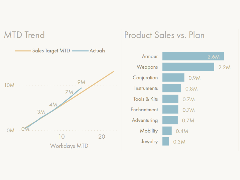
When labelling data points, it’s usually not helpful to label everything. Instead, specific datapoints-of-interest should be labelled. For a time series line chart, this might be the latest data point, but it could also be the earliest, or the anomalous values (highest, lowest). Selectively labelling specific points in the series🚧 How to fill this requirement, today:
This can be done in three ways -Method 1: Conditionally formatting data label color, which is a new feature
1. Create a new measure that conditionally specifies the datapoints-of-interest.
2. If the measure evaluates to the condition specified in (1), return a hex code colour for the datapoint.
3. For all other values, return “#FFFFFF00”, which is fully transparent
4. Add the measure as the field value to be used for the conditional colour formatting
The result is that the datapoints will show only where the colour is not transparent. It only works with data labels and will not conditionally colour / render markers.
-- Method 1: DAX Measure for conditionally showing the data label point
-- Pro: No visual config steps
-- Con: Doesn't work with markers
-- Max workday in scope
VAR _MAXWD =
CALCULATE (
MAX ( 'Date'[Workdays MTD] ),
'Date'[IsDateInScope],
ALLEXCEPT ( 'Date', 'Date'[Calendar Month Year (ie Jan 21)] )
)
-- Max date in scope
VAR _MAXDT =
CALCULATE (
MAX ( 'Date'[Date] ),
'Date'[IsDateInScope],
ALLEXCEPT ( 'Date', 'Date'[Calendar Month Year (ie Jan 21)] )
)
RETURN
-- If the selected workday = the max workday in scope, return the value
-- Otherwise return blank (don't show the marker / value)
IF (
MAX ( 'Date'[Workdays MTD] ) = _MAXWD
|| MAX ( 'Date'[Date] ) = _MAXDT,
"#6e8c95",
"#FFFFFF00"
)
Method 2: Creating a new series that conditionally shows only the datapoints-of-interest, evaluating BLANK(), otherwise.
1. Create a new measure that conditionally specifies the datapoints-of-interest
2. If the measure evaluates to the condition specified in (1), return the measure value, otherwise return blank.
3. Add the measure to the chart and enable datapoints for only that series.
4. For bar charts, the other series needs to specify the inverse to hide the data points that will be labelled from 1-3.
This method requires more futzing around with the visual configuration, and will lead to issues like excessive values in the legend and tooltip that may confuse users. For this reason, the first method is preferred. Unfortunately, however, the first method only lets you conditionally apply data labels, not data labels & markers.
-- Method 2: DAX Measure for showing only the latest data point
-- Pro: Works for markers + data labels
-- Con: Doesn't work with bars unless do the opposite for 'normal' series
-- Con: Requires a lot of messing around in visual config:
-- 1. Set colour to match line
-- 2. Enable data labels / markers only for this series
-- 3. Disable or config legend to avoid confusing output
-- Max workday in scope
VAR _MAXWD =
CALCULATE (
MAX ( 'Date'[Workdays MTD] ),
'Date'[IsDateInScope],
ALLEXCEPT ( 'Date', 'Date'[Calendar Month Year (ie Jan 21)] )
)
-- Max date in scope
VAR _MAXDT =
CALCULATE (
MAX ( 'Date'[Date] ),
'Date'[IsDateInScope],
ALLEXCEPT ( 'Date', 'Date'[Calendar Month Year (ie Jan 21)] )
)
RETURN
-- If the selected workday = the max workday in scope, return the value
-- Otherwise return blank (don't show the marker / value)
IF (
MAX ( 'Date'[Workdays MTD] ) = _MAXWD
|| MAX ( 'Date'[Date] ) = _MAXDT,
[Actuals MTD]
)
Method 3: Using Calculation Groups. Check out this article by Štěpán Rešl from Data Brothers if you’re interested!
These approaches are overly complex for what is a simple and very common request. To illustrate from my personal subjective experience, in the last three years, every report I’ve made with a time series had this as a design requirement at one point. Enabling a property to label datapoints-of-interest would help save time and also help users create better trendline visuals.
🔧 How it might work:
This should be a simple toggle to render both markers and data labels at the point-of-interest. For markers, this is already possible using Sparklines, today, so a UI precedence already exists to allow this feature.
There’s a UI to do this for markers in Sparklines. What about for data labels/markers in all charts?
💎 The Value:
Labelling only the relevant datapoints makes charts more efficient so that users spend less time knowing the values.
👍 Vote on relevant ideas from the Power BI Ideas site:
Data labels need a more flexible way to specify their position along both X,Y axes, for every chart
📝 Description:
Today, data points don’t ever seem to appear where you want them to. You can choose between “auto” as well as some other options like “Above” or “Under”, but the data label may either obscure part of the chart or render somewhere that it is illegible. This is particularly true if it appears near the edge of the visual canvas.
In other Microsoft tools like PowerPoint, the user has the option of specifying manually the X,Y coordinate of any element. Ideally, controlling elements in Power BI visuals should have similar controls instead of fixed justifications / alignments. For data labels this would work best like how it does with programmatic visualization tools, where you specify the position of the data label relative to the data point (“row”) that is evaluated.
🚧 How to fill this requirement, today:
There is no way for me to fulfill this requirement, today, to my knowledge. If data labels don’t appear where I want to and it is really a deal-breaker for the end-user, we are forced to explore programmatic solutions with Deneb, R or Python.
🔧 How it might work:
The easiest way to do this is to have an input box to specify the position of the data label relative to the X,Y coordinate of the datapoint, or using a DAX measure. This is similar to how the UI for error bars works, today. For example, you could select either a point addition, a percentage addition, or a more complex formula with the DAX measure.
💎 The Value:
Controlling where elements render on a visual gives the creator control of their real estate. If the element and its padding are restricting how much of the actual graph can be displayed, it forces specific design decisions. By allowing an “unplugged” position setting, the user gets complete control about where static text elements render.
Having the ability to set label elements relative to specific data points will also unlock many more design possibilities currently not feasible today, expanding the visual “swiss army knife” in Power BI visuals.
👍 Vote on relevant ideas from the Power BI Ideas site:
📝 Description:
Today, the font size of text elements in Power BI are limited to 8 points. Likely to prevent inexperienced users from deviating from best practices & accessibility guidelines, it is not possible to go lower. Unfortunately this creates some rigidity, particularly with larger, thicker fonts. It should be possible to enable the user to set fonts lower than 8 points down by increments of 0.25 or 0.5 points.
🚧 How to fill this requirement, today:
Today I fill this requirement by exploiting the custom theme .json file. Therein you can set the default font size of text elements in a visual to whatever value you wish. However, if this is changed in the Power BI Desktop UI, the only way to restore it is to revert the label settings to default. It’s also not possible to set different default font sizes for visuals of the same type with this approach.
The font size of each text element can be manually set below 8 points in the theme
This is a template from David Eldersveld’s github repo.
If you are new to Power BI themes, they are explained in the Microsoft Learn page, here. David Eldersveld also provides a wonderful git repo with templates you can use to customize elements for each visual type.
Similarly you can use this Macguyver trick to make line points smaller (i.e. 0.5 pt gridlines) as well as markers and other things.
🔧 How it might work:
There should be a UI toggle to “enable small font size” or “enable advanced font formatting”. This way, inexperienced users are still prevented from creating inaccessible visual elements, while advanced users get more control of font sizes. Further, it should be possible to conditionally specify the font size in points using a DAX measure, as is possible for with data label colours today.
💎 The Value:
In getting more control over font sizes, report creators can include subtle labels to guide attention to important points. For example, a format string might only return 🟢 or 🔻 depending on whether the value vs. target is positive or negative. This small indicator in size 3-4 point font is just a subtle indicator of performance, but at size 8+ will be too visually overwhelming.
👍 Vote on relevant ideas from the Power BI Ideas site:
A better solution would be visually showing the difference and putting the data labels to the left of the bars, but we will get to that when we talk about “bars”, below…
📝 Description:
Often, users want to be able to visualize one result but obtain additional contextual information. With the tooltip, they can retrieve this information by hovering on the data point. However, if this context is critical or the tooltip is occupied by a report visualization, a second visual is needed to callout this information. Often this is just a difference with the target, in value or percent.Being able to add supplemental information to data labels with additional measures can be a simple solution to this, although it makes sense to limit this to 1-2 additional measures.
🚧 How to fill this requirement, today:
The best way to provide additional context is using tooltips, but that might not be the desired solution from the end-user’s point-of-view. So, we turn to calculation groups. It’s possible to evaluate additional measures in the dynamic format string expression of a Calculation Item. This enables you to specify a second measure to include in the label, and is similar to the solution for the ‘auto’ format string mentioned, above. It’s even possible for the user to select how the format string appears, if you combine this method with the various DAX measure selection approaches.
The problem is that this method is overly complex to fulfill the requirement. It can easily cause a heavy performance burden, return unexpected results due to calculation group precedence or composite models, and will affect unintended visual elements, like Axes or other series unless the DAX is made very specific (and thus rigid / complex). Users need to create & understand calculation groups and format string expressions, which are extremely advanced concepts.
Demonstration of the calculation group approach to enrich format strings programmatically.
It has a significant performance impact (demo is cached) and will affect other elements like the Y-axis.
🔧 How it might work:
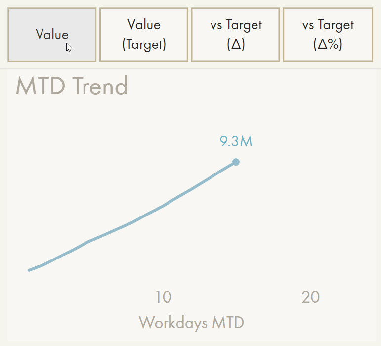
A simple solution might be an additional field area in the visual options for “Data Labels”, where any measure will be evaluated based on the filter context of the data point. The result could render adjacent to the main measure in parentheses, automatically with 50% opacity (so that attention is not drawn from the ‘main’ label). An example is 9.3M (+12%). Ideally, this additional context can be (conditionally) formatted separately from the main data label, i.e. to only render it when below the target using conditional transparency.
💎 The Value:
Giving additional context is important for actionability and time-to-insight. If end-users can - without mouse actions - see obvious context information, they can skip right to investigative or prescriptive actions, rather than searching for the context among tooltips, other visuals, or even drillthrough pages.
👍 Vote on relevant ideas from the Power BI Ideas site:
[Declined] Conditional formatted measures using SWITCH
Here is pointed to the calculation group solution.

It should be possible to format & conditionally format all text elements for these properties
📝 Description:
The simplest request — it should be possible to conditionally style fonts, not just colours, but also transparency, size, as well as whether they are bold, italic or underlined.
🚧 How to fill this requirement, today:
It is not possible to conditionally style text elements beyond colour and (if you are using field-driven formatting) transparency. Even then, not all text elements / labels support conditional formatting (or any formatting, for that matter).
🔧 How it might work:
It should be possible to provide a font style string, returned via a DAX measure, which will be used in formatting the data points. This can use a simple markdown or HTML-like syntax, for example:
IF ( <Condition>, “font-style: bold, font-size: 11”, “font-style: regular, font-size: 10” )
A conditional formatting UI might also enable this, similar to how it’s done with colours, today, but perhaps limited to conditional font size.
💎 The Value:
Being able to draw attention to specific text elements is essential. There are many ways to do this visually, among which colour is just one option. Using size, thickness and shape with conditional font styling, report creators have an extended toolkit to make sure their visuals are effective and users know where to look.Further, consistency in formatting & conditional formatting options is arguably important for the holistic UX of Power BI. It is confusing for a user who can format an element in one chart, but not another.
👍 Vote on relevant ideas from the Power BI Ideas site:
TEXT: AXES
Axes are the roads upon which your visual drives. A clear axis is essential to steer attention & interpretation of a reader, without cluttering the visual canvas with thick lines & dark text.


📝 Description:
There is presently no option to toggle or format axis “ticks”. These are the annotations for values called out along a given axis. Reducing the “tick range”, or the minimum distance between two axis labels, would make it easier to create clear axes for users to follow the chart. This is challenging with both continuous and categorical axes. For continuous axes, the chart automatically fits into the visual container, but has a very liberal gap between axes labels, which cannot be changed. For categorical axes, the chart defaults to horizontal scrolling, with limited options to densify the visual width.
A preferred option would be to control the intervals between axis labels. This would give the user full control over the width & compactness of the chart, but would also enable more clarity of continuous axis labelling.
🚧 How to fill this requirement, today:
The only way to Macguyver this today is by disabling the axis and instead setting constant lines for each point where a tick would be present. This is obviously an over-engineered solution that itself is inflexible to visual filtering, unless you use multiple measures, in which case performance is impacted.
🔧 How it might work:
A simple solution may be a slider where the user can input the minimum distance between ticks in percent, where 0% results in ticks being fully overlaid and 100% is the current “default” (with a maximum of 200%).
Why might you want to overlay the ticks? This is actually a possible solution to create a dot or strip plot, where each category is represented by an overlaid marker instead of adjacent bars. Further, there are many chart designs where overlaid elements enhance readability and interpretability, as well as making the chart more compact. This is because the eyes need to do less work to compare length and size of overlaid elements than elements separated in space.
💎 The Value:
A simple formatting option like this unlocks not only clearer axes on default visuals, but also the possibility to use these visuals to create new visual types. This is a necessary ingredient to bridge the gap between a clustered bar/column chart and a dumbbell plot or bullet chart. In adding more flexibility with formatting & visual control, we not only enable better visuals, but also a broader spectrum of visual types. This means that users can create these chart types, instead of using custom visuals or requesting new default visuals from the Power BI team.
👍 Vote on relevant ideas from the Power BI Ideas site:
📝 Description:
Similar to one of the above suggestions to set the data point position, it would be helpful to get more precise control about where categorical axis labels render. Often, they take up more space than is needed, but can also be affixed to only the axis. It’s not possible to put them in another position, like adjacent to or across from data points.
🚧 How to fill this requirement, today:
Except for inverting the axis (Left/Right side of graph), it is not possible to control where category labels appear.
🔧 How it might work:
Ideally, it would work identically to the data point position indicated in the section, above. A percentage, value or field could indicate how many points the label should be moved from its original position, so that the user can control exactly where it renders.
💎 The Value:
Like the immediate suggestion above, this extends the flexibility & functionality of the default visuals to enable creation of more visual types & formats
BARS: BAR & COLUMN CHARTS
Together with Tables & Matrixes, bar/column charts are the most prolific in Power BI reports, or reports made in any tool. They are easily understood by any reader and can be used for a wide range of use-cases. Given their high prevalence and application, Bar/Column charts should exhibit some of the most flexibility.

📝 Description:
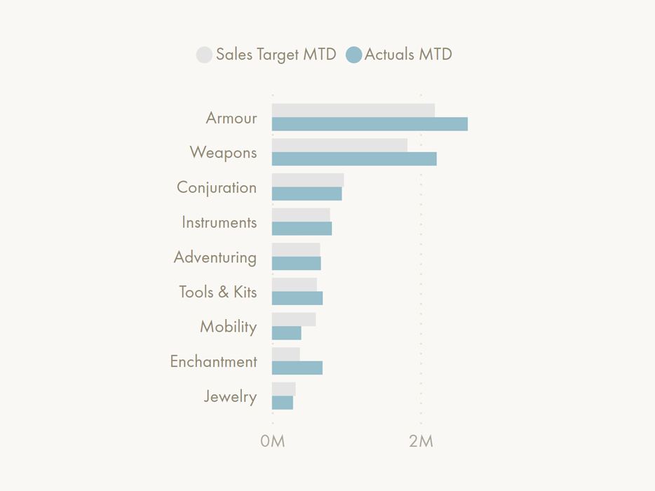
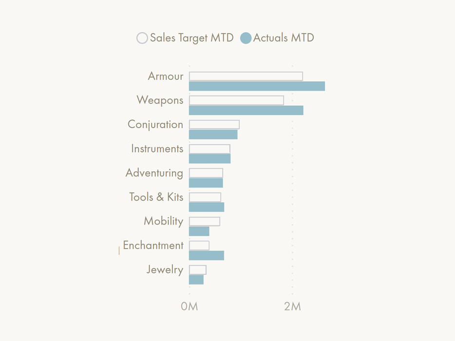
This is effectively the same functionality as controlling the axis tick range. The difference here is that horizontal space between series is controlled, rather than the global axis. This way, clustered column & bar charts can have overlaid bars & markers. This is essential for creating commonly-requested chart types like bullet charts, dumbbell plots, etc.Below is a mock-up of what the bar chart would look like


🚧 How to fill this requirement, today:
This is not something possible to do without custom visuals today, to my knowledge.
🔧 How it might work:
Like the axis tick range, a slider could control the minimum distance between series. Today, we can control spacing and category width, although this serves little functional purpose. Placing in that same section a slider for series distance will allow overlapping bars. This is such a simple feature that would unlock so many visual possibilities.

💎 The Value:
This is arguably one of the higher value changes, as it unlocks a number of additional visual types from the default visual. It also enables better practices when comparing to target, by having the bars overlaid partially or fully so that they are easier to compare by eye and identify the gap.
👍 Vote on relevant ideas from the Power BI Ideas site:


📝 Description:
This is something already possible in Line and Column chart types, but only for the lines. It is not possible to enable markers for bars at their height. This functionality would work identically to that of the line charts, though. When enabled, markers would appear at the bar height depending on the evaluated value. Markers would have the same properties as they do for line and area charts, today, and be capable of (conditional) formatting by series.
Like the above functionality, this unlocks additional visualization types, including lollipop charts, dumbbell plots and bullet charts. It would be trivially easy to create good visuals that compare actuals to target.
🚧 How to fill this requirement, today:
This is not something possible to do without custom visuals today, to my knowledge.
🔧 How it might work:
This would work identically to the marker UI that already exists in line and area charts. When enabled, the selected marker shape would render at the bar’s height. It should be possible to then format the marker differently from the bar, or disable the bar entirely (i.e. format transparent) to use only the marker(s).
💎 The Value:
This is too is a high-value change, as it not only allows better visuals but unlocks additional visual types. Together with the above change, these two changes alone could enable 3-4 new visualization types from the default bar / column charts, which are frequently requested to be made as new visualization templates. These templates are thus not necessary if the tools are flexible enough to shape these visuals, themselves.
👍 Vote on relevant ideas from the Power BI Ideas site:


📝 Description:
This option is more specific, but means to render a line between two bars / bar markers. The purpose would be to use the angle of the line to more quickly & easily see the magnitude of change between the series. Further, this might be used as a method to create slope and dumbbell charts for different categories.
🚧 How to fill this requirement, today:
This is only possible by using a combination of measure selection and helper tables in the default line chart. Depending on the selected value in the helper table, a measure is evaluated within the line chart, which automatically draws lines between the markers. This method has a lot of limitations and is very complex, so I won’t go further into detail about how to do it.
🔧 How it might work:
Ideally, the markers should have a toggle “draw line between series”.
💎 The Value:
This brings an important functionality — the ability to easily create dumbell charts. When series are overlaid, the connecting line is the missing piece to visually indicate the magnitude of the difference between them. This toggle will allow that. The main value is that it helps use angles & lines for users to more quickly see changes / differences between metrics, and might allow a better method to create (small multiple) slope charts.

📝 Description:
It should be possible to format the bar fill and bar border differently. Today, the bar border does not exist as a formatting option; it is only filled. Similar to the border of visual containers, it should be possible to round the bar edges by a specified radius, which would make it possible to create thermometer charts if width control & series overlay are possible.It should be possible to conditionally format the border: the colour, thickness, and transparency. Formatting thickness might seem strange or niche, but it is a very nuanced way of drawing user’s attention to an element without relying on colour, like conditional formatting of fonts & lines.
🚧 How to fill this requirement, today:
This is not possible without resorting to custom visuals, to my knowledge.
🔧 How it might work:
A separate visual formatting option for “border” would exist in the “bar” and “column” chart types, with options similar to what is seen today under “bar”. It would also contain a slider for round edges, similar to what is available for visual container borders, today. The border formatting should not be tied to the bar (fill) or data label format, and ideally, the border could be drawn either on the inside, the center or the outside of the bar edge.
💎 The Value:
This would allow cleaner visuals where the actuals are displayed with fill and targets displayed with only border. This not only improves accessibility but is also a better practice than using different colours. Like pattern fill, having a mix of bar fill & border formatting makes visuals easier to read & interpret.
👍 Vote on relevant ideas from the Power BI Ideas site:
📝 Description:
Bar width / size is a property that should be controllable both from the visual configuration and conditional formatting. When combined with the overlay & marker possibilities above, it also enables lollipop charts, dumbbell plots, and more. Differential width between series in a bar/column chart is commonplace for bar visuals, and should be a standard formatting setting that can be configured.
🚧 How to fill this requirement, today:
This is not possible without resorting to custom visuals, to my knowledge.
🔧 How it might work:
A width slider that has a conditional formatting “fx” option, and the ability to set it for “All” as well as each series (where conditional formatting for a single series is possible).
💎 The Value:
As stated, this unlocks additional visual types and facilitates best practices. It’s a powerful formatting setting that is commonly used in other tools to create more effective bar / column charts.
👍 Vote on relevant ideas from the Power BI Ideas site:

📝 Description:
A simple change, this allows the specification and formatting of gridlines not only at axis ticks / values, but also precisely between them. Dividing bars using gridlines visually separates them, which for some designs or users helps with reading or interpreting the chart.
🚧 How to fill this requirement, today:
This is not possible without resorting to custom visuals, to my knowledge.
🔧 How it might work:
Under the axis options for bar/column charts, for “gridlines”, be able to toggle “vertical gridlines” (x-axis) and “horizontal gridlines” (y-axis), specifying their width and colour, as one can do in tables and matrixes.
💎 The Value:
This is a smaller formatting option that might improve visual accessibility for specific niche cases. When combined with the below option to add supplemental context charts, the gridline helps the user visually follow the row to be sure of what they are looking at. This is relevant today when using small multiples. If there are 3+ columns, it is difficult to be sure of what category you are looking at in the right-most visuals.
👍 Vote on relevant ideas from the Power BI Ideas site:
📝 Description:
An advanced - yet surprisingly common - use-case, this would work similar to small multiples. A second plot rendering another measure would display other contextual information, such as difference to target in value or percentage. This is commonly done in many reports, but is something difficult to do today without resorting to custom visuals. The main difficulty is ensuring two charts are synchronized and not obfuscating information of one another.
🚧 How to fill this requirement, today:
This is loosely possible by using two charts which have identical configuration, disabling the axis for the second. This typically is not a very elegant solution, as the charts can easily come out of sync when doing a drilldown, scrolling, or filtering. There is no way to synchronize scrolling or dropping a hierarchy level in visuals.

🔧 How it might work:
The simplest way to make this work might be using small multiples. If a measure is dropped in the small multiples instead of a dimension, the visual could recognize that the user intends to create a second plot with the same dimensions for the extra measure(s). This plot would be aligned with the original and synchronized when scrolling or drilling.
A more complex way might be to make it a separate option specifically tailored to target comparison, since this is the primary use-case of the visual.
💎 The Value:
Like adding additional context to data labels, these supplemental charts provide valuable insight about the values shown. It ensures that the visual can retain a focus on the absolute volume while still giving the user relevant information about performance.
BARS: WATERFALL CHARTS
A personal favourite, the waterfall chart is one of the best options available when visualizing parts-of-whole data (instead of pie charts or doughnuts). It’s performant, simple, and very intuitive. Unfortunately, it is also one of the most limited visuals when it comes to formatting and configuration.


📝 Description:
Despite being ubiquitous in financial reporting, the waterfall visual is quite bare in its formatting options. First, the waterfall should be able to display horizontally as well as vertically. For bar/column charts, these are configured as separate visual templates. It would be worthwhile having this also available for the waterfall, particularly with longer category labels.
🚧 How to fill this requirement, today:
It is not possible to do this without custom visuals today, to my knowledge.
🔧 How it might work:
The simplest way would be to implement this as a new visual template. Alternatively, a toggle could switch between a horizontal and vertical layout, although that is likely much more complicated to configure, and has not been done for any of the other chart types.
💎 The Value:
Horizontal waterfalls are commonly requested. It makes it easier to read the category labels and consume charts with more dimensions. It’s a perfect option for P&L reporting or analyzing which categories have had the highest impact on a specific business process.
👍 Vote on relevant ideas from the Power BI Ideas site:
📝 Description:
The waterfall visual has not inherited many of the changes to other visuals, such as conditional formatting of bars. Ideally, it should be able to format each category as a separate series rather than only formatting “increasing” and “decreasing”. It should be possible to conditionally format each bar, both the fill as well as the border, similar to what was proposed, above.
🚧 How to fill this requirement, today:
It is not possible to do this without custom visuals today, to my knowledge.
🔧 How it might work:
This would have an identical (conditional) formatting UI as for bar/column charts. To avoid regression, the “increase” / “decrease” formatting options can remain as default, but be overwritten by any series-specific formatting. This is similar to when “show all” is done to format specific categories/dimensions.
💎 The Value:
Formatting waterfalls is a minor but significant quality of life improvement for the visual. Without it, there is no way to draw attention to a specific category other than the total.
👍 Vote on relevant ideas from the Power BI Ideas site:
📝 Description:
The waterfall visual is not only limited to parts-of-whole. It could also be used to compare to target. This is particularly useful, for example, when comparing the margin to previous year. You can illustrate the margin calculation in the breakdown (parts-of-whole; gross - cost - rebates), then compare the “total” bar to a target (prior year), and visualize the difference.
🚧 How to fill this requirement, today:
It is not possible to do this without custom visuals today, to my knowledge. You can come close by using the “measures as dimensions” trick, making the target negative, then overlaying a textbox on top of the “total” to rename it. However, this is a bit of an ugly hack which will inevitably lead to strange visual bugs.

An example where the waterfall compares to a target. To do the comparison, the target must be made negative. To re-name the total, a textbox is overlaid on top of the “Total” x-axis label.
🔧 How it might work:
Ideally, a “Target” field value could be provided, which would compare to the “Total” bar, computing the difference as a final right-most column, “Gap”. The “Target” and “Gap” series would be formatted distinctly from other categories, and both “Total” and “Gap” could be re-named for clarity.
💎 The Value:
This is a very powerful and elegant visual to show how our actuals roll into our final numbers to compare to a target. It can show breakdowns across metrics (i.e. shipments + sales) or dimensions (i.e. Areas, Product Types). Including the ability to compare to target greatly extends the utility of what is already a very robust and effective visual.
👍 Vote on relevant ideas from the Power BI Ideas site:
📝 Description:
The waterfall is very rigid in the fields it accepts. It’s not possible to add only measures and show their part-of-whole distribution, like you can with doughnuts, pie charts and tree maps charts. This is unfortunate, since the waterfall is arguably the best default visual for showing part-of-whole in most use-cases.🚧 How to fill this requirement, today:
This is something possible using either the SWITCH() or Calculation Group TREATAS() approach for measure selection. The former option is not as performant, though the second option requires both a calculation group and a disconnected table. Alberto Ferrari explains it here in a YouTube video.Below is an example of a waterfall made with only measures in Power BI:
In this example, the 5 open orders measures add up to the total open orders, showing which have the greatest contribution (In Progress).
🔧 How it might work:
Ideally, this should just work. Similar to how it does for pie charts, doughnuts, tree maps and bar charts, waterfalls containing only measures should render the evaluation of those measures alone (using i.e. ROW() ), and their cumulative result.
💎 The Value:
This is a common request that is relatively easy to implement, but often requires cluttering the model with unnecessary calculation groups or helper tables. Since all the other part-of-whole visuals have this functionality, it makes sense that the waterfall should be able to do it, too.
👍 Vote on relevant ideas from the Power BI Ideas site:
LINES: LINE, AREA & COMBO CHARTS
Time series drawn with line charts are some of the most common chart types in any report. Especially since the COVID-19 pandemic, we are very used to seeing line charts portray trends and data patterns over time. It’s strange, then, that there are so few options for customizing and formatting the lines, themselves.

Examples of line formatting from the Python Seaborn package.
Examples of line formatting from the Python Seaborn package.
Another trivial example of conditional line (color) formatting, taken from Stack Overflow.
In practice, most lines would be differentially formatted when decreasing vs. increasing.
📝 Description:
Presently, there are no conditional formatting options available for markers or lines in line, area and combo charts. If you want the line to be thicker for certain conditions and can’t manually set it for the series, it’s not possible. Likewise, if you want the line to be green when it’s above a threshold (0 or a target), but red when below, you can’t do that.All of these things are basic formatting options that should be available to users.
🚧 How to fill this requirement, today:
The only way to Macguyver conditional formatting in Line Charts is to configure it first in a bar chart, then change the chart type. The conditional formatting will be retained on the markers. While better than nothing, this is a strange Macguyver that few know about, and is done by bending the arm of the user-interface to get what you want. To format the line colour or stroke width conditionally, you must rely on custom visuals.I would love to demonstrate this, but unfortunately, it seems that the conditional formatting UI isn’t working for me in the September 2022 release of Power BI:
Some issues with the conditional formatting UI.
🔧 How it might work:
This should just have the conditional formatting “fx” next to the line colour and stroke width options, where you can either set conditions via the UI or provide a field value through a DAX measure.
💎 The Value:
Conditionally formatting lines would dramatically increase the power of the visual. For stroke width / thickness, this gives a more accessible way to draw attention to specific lines, which is better for colourblind people.
👍 Vote on relevant ideas from the Power BI Ideas site:
📝 Description:
Conditionally formatting the area under the curve or between two measures has long been a request, particularly for plotting the difference between two values. At the moment, there is only a toggle to enable “shade area” for combo charts (not line charts), and area charts lack the ability to configure the area formatting distinctly from the lines.
🚧 How to fill this requirement, today:
Until recently, there was no way to do this. For formatting the area under the curve, that is still true. For shading the area between lines, however, a recent trick using the error bars lets you do this. This method is described in detail by Sven Boekhoven on his blog, here. It involves using the minimum between the two series ( MIN ( [Measure 1], [Measure 2] ) ), where the “Upper Bound” is applied for the actuals and the “Lower Bound” for the target. Below you can see an example where I tried the approach, myself:

Using Error Bars and some DAX to Macguyver shading between lines
🔧 How it might work:
Ideally, there just should be a new property, where you can select or conditionally format the area underneath or between curves, similar to how lines are formatted, today. You should be able to set the transparency as well, similar to the formatting controls available for “Error Bars”.
💎 The Value:
Shading the area can be a powerful yet subtle visual context to a trendline. It takes away any cognitive load of the user because they don’t need to compare the lines; they see in the shading whether it is above or below. They can also see with both the area and the angle the magnitude of increase/decrease. This is all working toward quicker time-to-insight and helping users take action on their data more effectively.
👍 Vote on relevant ideas from the Power BI Ideas site:
MARKERS: LINE & AREA CHARTS, SCATTERPLOTS, BAR/COLUMN CHARTS
While very small, subtle portions of a chart, the markers are sometimes the most important. This is because they signify where we should look for a given data point. It’s the most concise representation of the data. Bars and markers alone can configure numerous chart types when flexible enough configuration options are available.

Example of a scatterplot with heatmap + KDE. Once the data point density crosses a threshold, instead of filtering out data points, a heatmap shows distribution.
📝 Description:
There are presently 8 different marker types to choose from. Unfortunately, however, it’s not possible (to my knowledge) to customize or extend these to other shapes or icons. If we could customize markers, we could add custom characters or images to use, or DAX measures that conditionally return different shapes (through image links or .svgs).
🚧 How to fill this requirement, today:
It is not possible to do this without custom visuals today, to my knowledge.
🔧 How it might work:
Ideally, it would be possible to give a measure definition that evaluates an image link or .SVG, which in turn could be used as the marker. This would allow the markers themselves to become valuable information rather than just indicating an X,Y intersection. For example, a 🔻 icon where the value has fallen below a target, or another icon to signal anomalies.
This is obviously not the most simple solution, which may be the option to upload a <= 100 KB image file to use as a custom shape, like when inserting images or background pictures.
💎 The Value:
This is a minor change that would turn markers from abstract design elements to informative data points that give more context to a visual. Further, if used in Bars like suggested above, they could be used to re-create the ever-popular “bar chart race”-like visuals

📝 Description:
It should be possible to conditionally format the fill and border of shapes. The line shapes obviously have no fill, so would not be affected by the fill options. Among the formatting options that would be possible are the ability to conditionally format fill colour, border colour, border thickness, shape size and shape fill / border transparency.
🚧 How to fill this requirement, today:
It is not possible to do this without custom visuals today, to my knowledge. The exception are scatterplot visuals, which allow you to select whether shapes are filled or have a border, only. It is not possible to format them, separately.

In the scatterplot visual you can select a border or fill option for shapes.
🔧 How it might work:
Inside “shape” there should be both “Fill” and “Border” selections which let you (conditionally) format each independently.
💎 The Value:
This is a relatively minor change. The main benefit is being able to create more subtle visualizations and to differentiate between filled and unfilled markers, which might be more accessible for vision-impaired persons. Further, it would enable selective display and colouring of markers explicitly across all visual types.

Example of a scatterplot with heatmap + KDE. Once the data point density crosses a threshold, instead of filtering out data points, a heatmap shows distribution.
📝 Description:
This is an advanced use-case. In the present scatterplot visual, when the point density reaches a certain threshold, data points are randomly (?) filtered out; they are not rendered. This is problematic because data is excluded from the visual. The moment this happens, you should put on a default filter, otherwise you are showing inaccurate information in the scatterplot.A good alternative would be the approaches possible in some programmatic tools. Here the dense areas are replaced with heatmaps, or density plots (KDE) are overlaid to show the distribution of the data points without rendering the individual elements.
🚧 How to fill this requirement, today:
It is not possible to do this without custom visuals today, to my knowledge.
🔧 How it might work:
This would be a change in behavior from the existing scatterplot that would involve likely layering a second visual ontop of the first, for example a heatmap or hexbin. The high-density sampling option would then enable the binning visual overlay when data points cross a density threshold, causing them not to render but rendering the heatmap/hexbin overlay, instead. Selecting the bin would filter to all the selected data points in that area, allowing drillthrough / cross-filtering to identify the underlying members without rendering many individual shapes.
💎 The Value:
This is just an idea to overcome the problem of filtering out data points. This is problematic for any analysis as it will lead to wrong insights and conclusions, and ultimately wrong actions. With this solution, the data points are not rendered, but the density and data distribution is still reflected in the visual.

Example of joint plots where both bars and lines are shown for both X and Y axes.
📝 Description:
There are very limited tools available in Power BI for checking data distribution. Among them are the scatterplot and now error bars; there is nothing else outside of custom visuals. One further enhancement to enable scatterplots to better show the data distribution is to add joint plots. These are axis-specific area, line or bar/column charts that reveal the data distribution along that axis. This is a helpful way to see how the data distributes along that single dimension. Together with the scatterplot, joint plots provide very valuable information about the shape of the data.
🚧 How to fill this requirement, today:
This is not possible without resorting to custom visuals, to my knowledge.
🔧 How it might work:
This could be possible by having a toggle to add the joint plot for each axis. When toggled, the user could select between bars/columns, lines, combo, or grid/ticks. The resulting visual can then be configured, i.e. the stroke of the line, width of the bars, and the colour of the visual elements. This is similar to some of the elements toggled from the analysis pane, today, but would appear above/beside the scatterplot instead of overlaid on the datapoints (i.e. with regression lines).
💎 The Value:
While an advanced use-case, these plots facilitate understanding of how the data is distributed in a scatterplot. Data distribution is an area largely under-represented among Power BI visuals, which is unfortunate, because of how important it is in analyses.
TABLES & MATRIXES
Last but not least, there are numerous open points regarding table & matrix formatting options. Popular among users, tables and matrixes are the go-to chart type when we need the raw data, or when the raw number is most important. Although, with the right visual formatting, tables can present the data in a visually effective and appealing way. Sparklines, for example, were an impressive addition to the table toolkit, and are surprisingly robust (although I wish it was possible to toggle a shared axis).
📝 Description:
Possibly one of the more requested features (I’ve heard it requested 3 times in the last week, alone), users want to be able to set in pixels (or percent) the width of columns. The main reason is so that columns are identical between tables or each other.🚧 How to fill this requirement, today:
The column width can be manually set by clicking and dragging the table boundary after disabling “auto-size width” under “column headers”. However, there is no way in the UI of setting column width numerically. There is a way of doing this using the external tool pbi-tools, though. Ensure that if you do this that you take a back-up of your .pbix. To do this method, you have to decompile the .pbix and open the .json for the table or matrix visual. Therein, a column width property will have a value. You can set it to be identical for all columns / tables / matrixes, then re-compile the .pbix. After this, the columns will all be the same width.
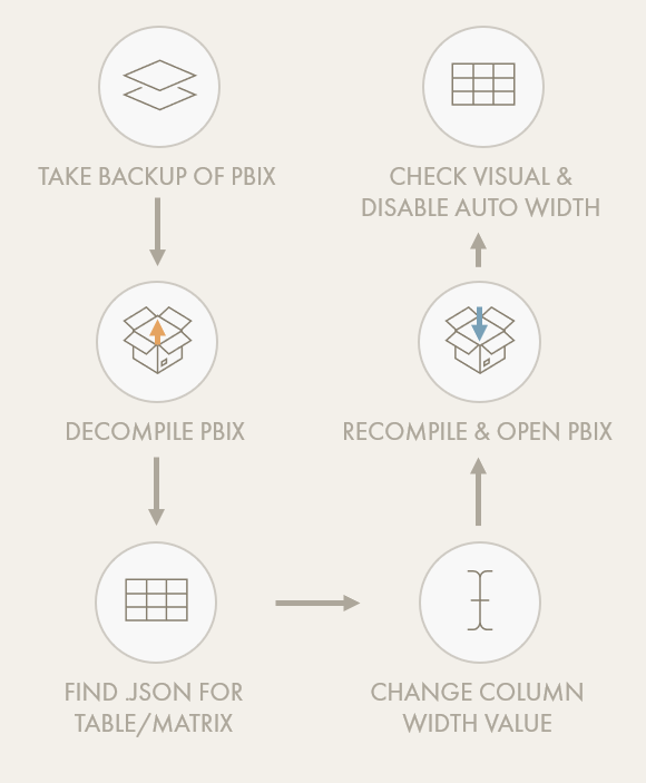
Overview of method for fixing column width using pbi-tools.
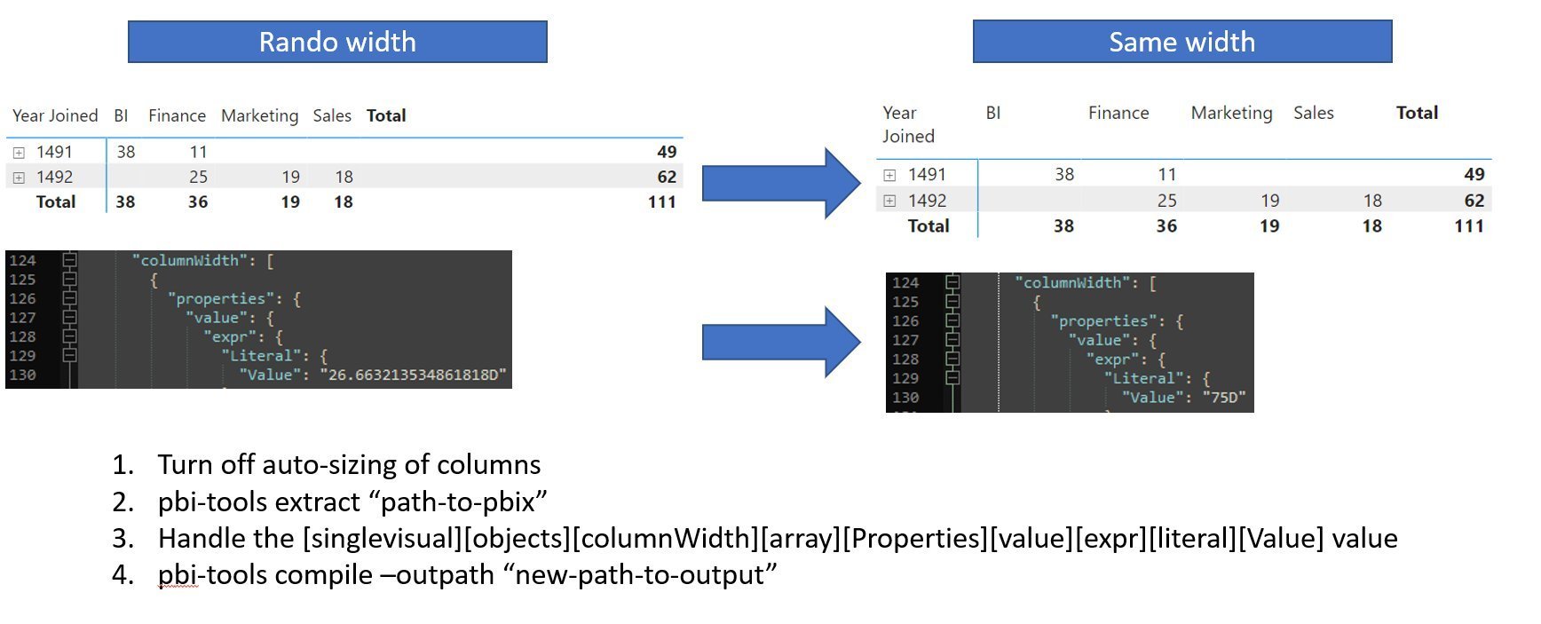
Short instructions on how to get columns to be the same width in a Power BI table or matrix.
Warning: Ensure that you take a back-up of your .pbix before doing this.
While a creative solution, modifying the underlying .json structure of the .pbix is not supported. It can break your report file if you make a mistake, costing a lot of lost work if you forgot to take a back-up. Further, it doesn’t guarantee that the columns will remain locked at the fixed width. The moment you accidentally grab & drag the column, or re-enable auto-size width, you have to repeat the exercise.
🔧 How it might work:
A simple numerical input would allow you to specify the column width in pixels. Alternatively, you could also input the width as a percentage of the entire table width, or distribute the columns over the table. These formatting options are already available in other Microsoft products.
💎 The Value:
The main value is that tables will look more consistent and professional. This will improve usability and is a small thing that for some users will make a big difference.
👍 Vote on relevant ideas from the Power BI Ideas site:
📝 Description:
Set transparency or hide the sort indicator triangle.
🚧 How to fill this requirement, today:
This is not possible without resorting to custom visuals, to my knowledge.
🔧 How it might work:
A transparency slider under “Column Headers” would suffice.
💎 The Value:
In visuals like bar or column charts, there is no sort indicator. It’s just implicit from the number order. Logically, it should be possible to have the same in tables & matrixes. The sort order is also indicated when you go into the ellipses menu (…)
📝 Description:
Providing ‘miniature’ visuals in tables is a powerful feature. These smaller visuals can give a quick visual indicator about how a given category is performing. Until recently, Sparklines were a huge gap in Power BI Desktop, but until now, bullet charts are still supported. These charts are small bar charts where the target is indicated as a line against the actual. Usually the final target is the “end” of the bar, which is conditionally coloured depending on the achievement. This can be an incredibly powerful visual performance indicator and would be adopted widely.
🚧 How to fill this requirement, today:
Today this is done using scalable vector graphic (svg) visuals. In a nutshell, these are created using a specific syntax inside of a DAX measure, rendering as an image when the data type is set to “Image URL”. Two YouTube video examples are provided below if you want to know more
(A) An explanation of svg visuals by David Eldersveld:
(B) An example of a bullet chart svg visual by Brian Grant
This approach affords a lot of flexibility, but is incredibly complex if you’re unfamiliar with svgs. The syntax is complex and difficult to manage. Handing over a report with a .svg visual is almost guaranteed to result in confusion for the poor person who inherited it, unless it’s extremely well documented and the DAX is well-formatted.
🔧 How it might work:
This functionality would work very similarly to the “Sparklines” feature. A user could provide the actual, target-to-date and target at end of period. No other information is needed; the user would just have to configure the visual settings and appearance (i.e. of the bar, line, colour…). While users will need to ensure good performance of their tables/matrixes, especially when combining bullet charts and Sparklines, this is already the case, today. Whatever the solution, it’s likely to be more performant and scalable than using .svg’s, anyway.
💎 The Value:
Bullet charts are some of the most popular and in-demand visuals for tracking performance against a target in a period. If this was possible, it would enable powerful tables & matrixes with another visual solution for concise performance tracking.
👍 Vote on relevant ideas from the Power BI Ideas site:
📝 Description:
In the sections about lines & markers, we talked about the need to have a full suite of conditional formatting options. This holds true not only for the core out-of-the-box visuals, but also the “sub-visual” experiences like Sparklines in tables. Conditionally formatting Sparklines and Sparkline markers in the same way will help ensure charts are effective & useful.
🚧 How to fill this requirement, today:
This is not possible without resorting to custom visuals, to my knowledge.
🔧 How it might work:
The same formatting options as were described in the “Lines” and “Markers” sections, above: Conditional formatting of colour, stroke and size. Further, it should be possible to choose for a shared or fixed axis across the Sparklines, so they are not misleading when differing greatly in magnitude.
💎 The Value:
These options will help design more effective Sparklines. For example, Sparklines with red lines will draw attention (perhaps because they are conditionally formatted red when declining), whereas the rest are grey. This saves time of users and helps them interpret the charts.
📝 Description:
In the sections about Bars/Columns, we talked about the possibility of moving clustered columns along the axis, changing column width and adding column markers. These changes enable new visualization types and more effective comparison to targets. If the same formatting options were available for data bars, we would similarly be able to create miniature versions of these charts. The advantage is that, unlike data bars, a lollipop or dot plot will show the same information with less ink. Instead of a thick bar that consumes most of the cell, a thin line ends with a single dot, accomplishing the same goal in a more concise way.
🚧 How to fill this requirement, today:
This is not possible without resorting to custom visuals, to my knowledge.
🔧 How it might work:
Additional formatting options in the “data bars” dialogue to bring parity with the “Bar/Column” chart formatting options. Further, it should be possible to format the axis line so it isn’t always dotted/dashed; that it can be hidden or styled differently.
💎 The Value:
The main value of this is conciseness. Further, if the data bars formatting options are comparable to bar/cluster charts, it may even be possible to create bullet charts or even dumbbell plots simply using the data bars UI. For this to be effective, though, there should be the option to enable a shared axis.
📝 Description:
This limitation pertains specifically to svg visuals, explained above in the “bullet charts” dropdown. The big restriction here is that svgs are rendered in a container fixed to a 1:1 ratio. The result is that the .svg visual is either too small, or the row is excessively big. If you’re creating a bullet chart, for example, you typically want to use a 16:9 container, or something similarly wide; the bar doesn’t need to fill a square container. This is unfortunate, as the .svg visuals unlock a lot of flexibility if you’re willing to look into it, although it’s held back by this one limitation.
🚧 How to fill this requirement, today:
This is not possible without resorting to custom visuals, to my knowledge.
🔧 How it might work:
This would require a technical change/fix and has nothing to do with the UI (that I’m aware of), unless they change how images are rendered in tables.
💎 The Value:
This would allow .svg visuals to get a lot more use in tables; they wouldn’t be locked to a strange aspect ratio and could take up less space so they look more “natural” to users.
👍 Vote on relevant ideas from the Power BI Ideas site:
OTHER / MISC
As long as we are daydreaming about changes to Power BI Desktop, these are a few other points that are personally important to me. They might not fit with a specific visual, or might not have to do with visualization at all; they are just among my top wishlisted items I’d love to see in future implementations.

1. Change the colour of selected items in horizontal slicers, which are one of the only elements that can currently not be changed at all, even in theme .json files, to my knowledge.
2. Disable drop shadows in UI elements, which cause a lot of problems for people with vestibular disabilities.
3. Quality-of-Life improvements to “set interactions”, so that a single visual can enter the canvas without any interactions (without disrupting existing interactions) or having an “interactions pane” similar to “Sync Slicers” where interactions can be set with checkmarks instead of clicking over icons that litter the canvas.
4. Mark any visuals that have visual-level filters in the visual header, using a numerical indicator to highlight how many visual-level filters are active (i.e. in a filter icon).
5. Use a distinct icon, colour or shade for report-level measures, so they are easily differentiated from model measures while working on thin reports.
6. Hide format string measures in thin reports to avoid confusing users and wasting time selecting measures/fields which are guaranteed to evaluate blank.
7. Provide a UI or programmatic way to view and extract which measures are used / unused in visuals (and which visuals) for documentation purposes. Today you can get this from pbi-tools by decompiling the pbix and parsing the resulting json files, but this is a lot of effort. You can also do this in other tools that access the .pbix json similarly, but have the same limitations & risks.
8. Automate execution of the performance analyzer and export of results using a UI or CLI to improve and automate performance testing, rather than relying on manual interrogation of report pages & visuals. Further, the “Render” and “Other” results in a perfect world would return more useful information about the specific processes being executed to aid in performance optimizing.
9. Group tables into folders so that technical tables (calculation groups, field parameters, etc.) can be sorted apart from model tables (dimensions and facts).
10. Be able to refer to report / visual metadata from within DAX, to allow interactions with and display of report metadata for various purposes.
It costs extra time to find and develop solutions when you cannot fulfill a visual requirement.
During requirements gathering for reports, a design is often agreed between creators and end-users. This is true both in enterprise and self-service usage scenarios. A common way to create this design is using mock-ups, either on whiteboard / pen & paper, or with wireframing tools. However, problems often arise when attempting to realize this design in Power BI. Certain functionalities, formatting or configuration become difficult. Examples might be:
Configuring the tick label interval on a continuous x-axis
Creating a slope chart
Conditionally formatting the last bar or data point in a time series
Using a mix of units (i.e. M for millions, K for thousands) in data labels
Conditionally formatting specific words (i.e. bold, itallic, size, colour) in titles or any text object
From the user’s point-of-view, these are simple requests that should be easy to realize. In reality, these options require custom visuals and/or specific DAX / model changes. The consequence is that the creator needs to choose between either disappointing the end-user or investing more time in fulfilling the requirement.
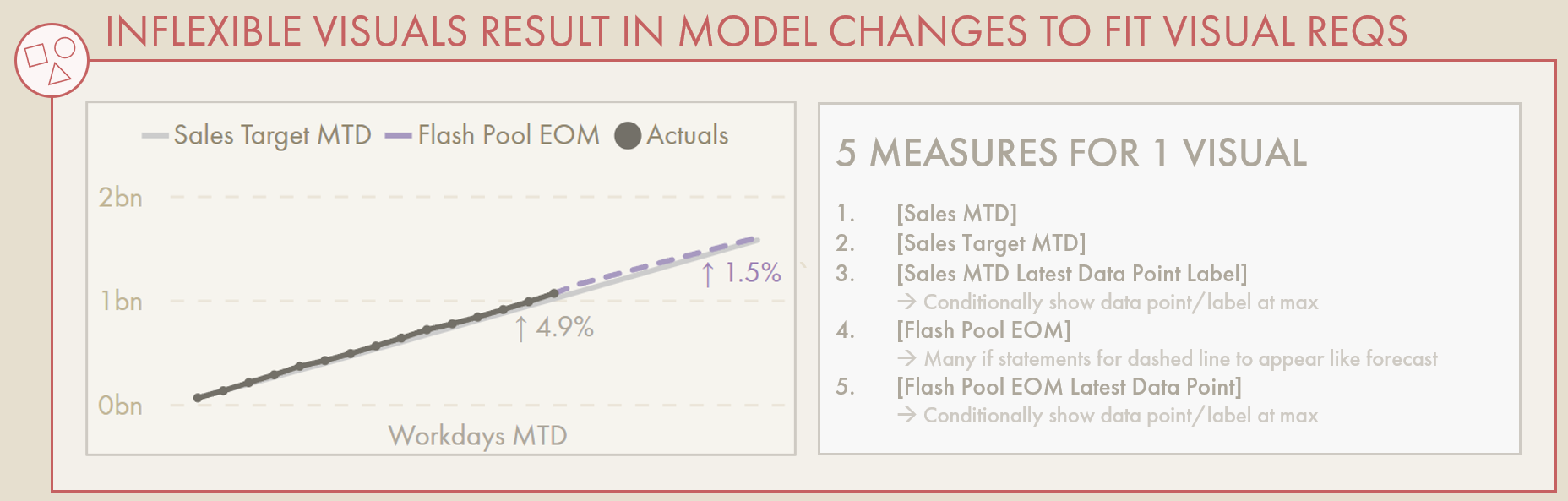
The data model & DAX can quickly become complex just to fulfill a few visual requirements in reports.
One of the most common ways to overcome visual limitations are to make model objects specifically to fulfill one or more visual requirements. This ‘Macguyver-ing’ turns to the flexibility of the DAX language and tabular model to fill gaps in the visual toolkit. Measures, calculation groups, disconnected tables or calculated columns arise to display data in a specific way for the visual. This has a negative impact on both the governance of the model and the performance of the resulting report.
Model Governance cost:
Any objects created to cater to specific visual requirements will pollute the model, making it harder to find generic model objects. While some of this can be mitigated with good dataset hygiene, it will become cumbersome for model maintenance. This is compounded when the data model is given to someone else, who will find it incredibly difficult to understand and maintain these atypical objects.Report Governance cost:
In the past, ‘report measures’ created for specific reports or visuals were defined in the “thin report” .pbix instead of the data model. This is a good practice on paper, as it keeps the model cleaner and prevents users from evaluating these measures in other contexts. However, it is incredibly difficult to maintain. Outside the .pbix, there is no way to govern these calculations, and they are not visible from external tools like Tabular Editor.Report Performance cost:
Any additional measures or calculation objects placed in a visual will increase the complexity of the visual’s query. What may start as a simple query can become more complex, with measures conditionally specifying the colour or the title, conditionally showing or hiding data, etc. Many times I’ve been asked to help with a report’s performance, only to find most issues arose due to bad modelling practices or chunky custom visuals implemented to overcome a simple visual limitation.

As users become increasingly frustrated with the effort required to customize visuals in Power BI, they may turn to other tools. Ultimately a tool is just a tool, so this isn’t a problem per se (you can even connect Tableau to a Power BI dataset). However, this is problematic when you are trying to drive successful Power BI adoption in your organization.
TO CONCLUDE

A good visualization will keep us away from gut decision-making.
Power BI is a powerful tool that has also enabled millions of people worldwide to easily visualize & explore their data. Despite that, inflexibility to the visualization configuration and formatting can make it difficult to fulfill visual requirements. In this article, we’ve gone through some examples of limitations, how they might be overcome today, and how they might hypothetically be addressed in the user interface. In reflecting on and sharing this feedback, we can potentially shape the direction of Power BI’s DataViz toolkit to promote curiosity, flexibility and best practices so that all visuals are made with the shortest time-to-insight and action in mind.